Friday, 12:00am
4 June 2010
Poundtastic bombastic
Is there is a graphic mismatch between Poundland’s presentation and its ambitions? Critique by Rick Poynor
Web-only Critique written exclusively for eyemagazine.com
It caused quite a stir when Poundland opened in my local high street a couple of months ago. A Facebook group had apparently tried to stop it and there was another online petition, though it only managed 21 signatures. Poundland moved into vacant premises previously occupied by Woolworth’s, which went into administration in November 2008. Woolworth’s was hardly the classiest of retailers, but some local people felt the arrival of Poundland, a store where every item in a range of 3000 products costs £1, was an affront to the dignity of a town that had no need of heavy discounting, even in a recession.
Before Poundland moved in I had barely noticed its existence, let alone visited a branch. That was my oversight because the chain has been steadily building its customer base since 1990. Its directors are drawn from long experience at other supermarkets – Safeway, Sainsbury’s, Somerfield – and there are now more than 260 Poundlands, from Blackpool to Exeter. The eventual goal is 650. Initially, Poundland targeted needier locations. It has now set its sights on more affluent areas and the strategy is working. One local resident quoted in the London Evening Standard described the store as an ‘embarrassment’, while freely admitting she shopped there.
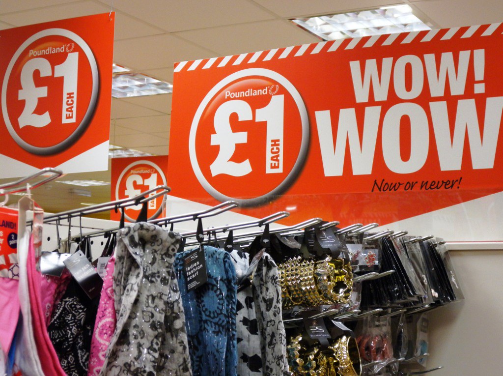
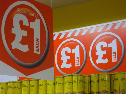
Poundland’s visual identity hasn’t been in the slightest way softened to make it more acceptable to the tender sensibilities of middle-class purchasers accustomed to the aspirational branding of shops like Waitrose and M&S. Even though everyone who ventures through Poundland’s doors knows what the place is offering and why they are there, the shop bawls out its simple sales message at every turn, as if instructing an incorrigible dimwit who might fail to appreciate the point. The most basic unit of communication is the legend ‘£1 EACH’ reversed out of a red shield. Dozens of these placards hang from the ceiling, above the aisles, sometimes in combination with the words ‘AMAZING VALUE!’ and – pure copywriting genius – ‘WOW! WOW!’ This message is reiterated in a red banner with warning sign slashes along the edge for greater urgency, which runs around the shop. Any remaining uncertainty that everything on offer in Poundland can be yours for just £1 is eliminated by repeating the news several hundred times in a red strip that runs along the front edge of every shelf.
The graphic overkill generates a trumped-up feeling of excitement that might make sense, might actually add something to the experience, the first time someone visits. But it’s the genuinely exciting feeling of saving money, of getting more for less, that will keep customers coming back. It’s hardly surprising that middle-class shoppers are falling for Poundland in spite of themselves. With or without a recession, who in their right mind wants to pay 50 or 100 per cent more for everyday necessities, in other supermarkets, once the opportunity to grab a bargain presents itself on the doorstep?
Nevertheless, there is a mismatch between Poundland’s in-store presentation and its expanding clientele that it might need to address before long. The graphics are too heavily class-coded for a broader audience. Poundland’s graphic repertoire is the retail equivalent of celebrity magazines and budget airlines. A business assumption is made – in which graphic rulebook is it written? – that only the most basic graphic language will appeal to the poorly educated, low-income, lower-class consumer. We don’t talk about the proletariat anymore, but that’s what this is: proletarian design. It’s as highly specified and refined, in its methods and mannerisms, as any other kind of graphic design, only the outcome is intended to look crude: big type, capital letters, unsubtle sans serif; loud colours, probably primaries; lots of pictures; close-fitting boxes around everything; as much packed into the space as possible to connote value for money; nothing frilly, fancy or poncey; plain-speaking design for plain-speaking folk.
These graphic conventions evolve over time. They habituate their own audiences. Someone who reads Closer and Heat and flies regularly with Ryanair is not going to find anything odd about the graphic design in Poundland. Yet the assumptions this kind of design makes are hugely patronising. It is no different from saying that a person has a limited vocabulary, that they can’t be expected to understand subtleties, that they will only respond to the most bombastic kinds of encouragement, that they can’t be credited with much aesthetic sensitivity – that they are just plain thick. Poundland provides a real service. Now it should give its customers a bit more credit.
All photographs by Rick Poynor.
Rick Poynor, writer, founder of Eye, London
Eye is the world’s most beautiful and collectable graphic design journal, published quarterly for professional designers, students and anyone interested in critical, informed writing about graphic design and visual culture. It is available from all good design bookshops and online at the Eye shop, where you can buy subscriptions and single issues.