Winter 2005
The big picture

The Guardian’s new Eyewitness page uses single images on a central spread for maximum impact. Critique by Rick Poynor

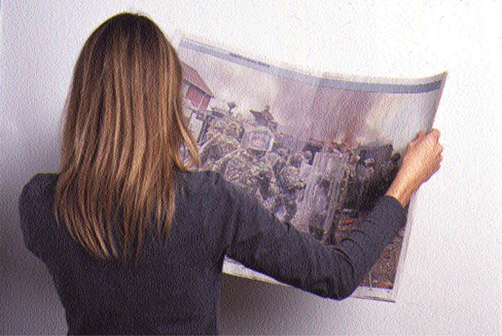
One of the most striking new features of The Guardian’s redesign last September was the main newspaper’s use of its entire central spread to carry a single colour image. The Berliner page size may be smaller than a broadsheet, but the image area this permits – roughly 42 x 60 cm – is still bigger than a broadsheet page and large enough to cover the screen of a widescreen television. It packs the punch of a good-sized Cibachrome on a gallery wall.
No British newspaper, including The Guardian in its previous format, has shown this kind of commitment to using photography at this scale. Some readers immediately labelled the Eyewitness feature a waste of space. The surface it occupies could, after all, be used for thousands of words of national or international news and a few small photos. Judged purely in news terms, that puts a lot of pressure on the picture to say something that is best communicated in this way. If the story is minor or peripheral, the image will look arbitrary and overblown.
The first month’s worth of papers gave a good sense of what is possible. The hard news pictures were often stunning, starting with a shot of soldiers at a riot on the streets of Belfast on the new design’s first day. In a photo of a destroyed school in Gaza City, taken from above, it took a glance at the caption to grasp that the shrouded figures filing past the bomb site, their heads no bigger than bits of rubble, were the pupils who could no longer study there. This detached, panoramic view movingly conveyed the bitter human cost of such destruction. At this scale, close-ups can be even more involving. After hurricane Stan hit El Salvador, the paper showed a small, bare-skinned boy standing in flood water, his brow wrinkled with anxiety, in front of his house. He was close to life size on the page and the picture was shot at his eye level, pulling the viewer into his world.
In the most shocking image to date, The Guardian printed a man’s decomposing body hanging on a wire fence 22 days after hurricane Katrina devastated New Orleans. This picture offended some readers and such images must be used sparingly if the paper is to avoid accusations of sensationalism and exploiting tragedy for pictorial effect. But this is the dilemma that journalists face every time they publish representations of violence and death. Only if the picture reveals something new and provokes thought can it be justified.
During the first month, picture editor Roger Tooth and creative director Mark Porter – who came up with the idea for Eyewitness – tried a number of approaches in consultation with the editor, Alan Rusbridger, and deputy editor of news, Paul Johnson. The huge image area proved highly effective for crowd scenes such as the triumphant England cricket team’s entry by bus into Trafalgar Square and for a thronged mosque in Jakarta on the eve of Ramadan. Sometimes the editors resorted to several images. They recorded the annular eclipse of the sun with a spread consisting of a main photo of a couple on a beach wearing protective glasses and ten smaller pictures. Photography itself was twice the subject. One of the least expected Eyewitnesses showed an award-winning picture of a kestrel perched on a branch feasting on termites. Roger Fenton’s sepia photograph of a deserted ‘valley of death’ littered with cannonballs transported readers back to the Crimea 150 years ago.
Pictures such as this, though engaging, can never deliver the pulse-quickening jolt of images that plunge the viewer into a dramatic news event that has just occurred or is still unfolding. The strongest spreads to date have tended to be those with a single image and the bare minimum of supporting text. Variety is vital, though, if Eyewitness – published five times a week so long as edition sizes permit – is not to become predictable. How many full colour scenes of disaster and destruction can a reader take over breakfast? The Guardian can now print colour on every page, but when the editors’ romance with this resource has cooled a little it would be good to see black and white from time to time. At this size, urgent, well lit, well composed shots by a news photographer such as Jan Grarup could have enormous impact.
In the first month, Eyewitness ran surprisingly few pictures showing intense close-up interaction between people. That’s a little odd for a newspaper. Over-aestheticising the news is a real danger when working at this art-like scale.
Rick Poynor, writer, founder of Eye, London
First published in Eye no. 58 vol. 15 2005
Eye is the world’s most beautiful and collectable graphic design journal, published for professional designers, students and anyone interested in critical, informed writing about graphic design and visual culture. It is available from all good design bookshops and online at the Eye shop, where you can buy subscriptions and single issues.

