
Summer 2015
California is a state of mind
Louise Sandhaus
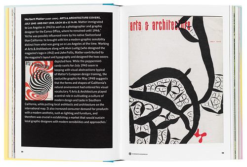
Herbert Matter
Alvin Lustig
Deborah Sussman
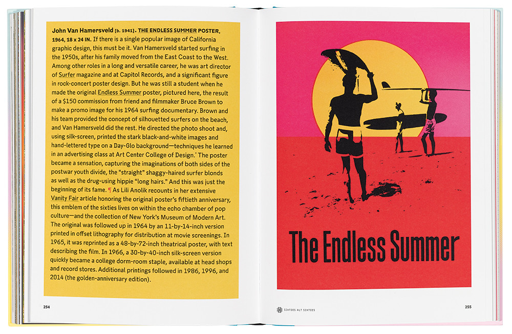
John Van Hamersveld
Graphic design
Reviews
Visual culture
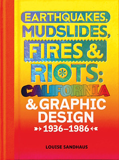
Earthquakes, Mudslides, Fires & Riots: California & Graphic Design, 1936-1986
Edited and designed by Louise Sandhaus<br> Metropolis Books, $55 / Thames & Hudson, £39.95 (hardback, 416pp)<br>
Rendered, on the cover of Metropolis’s American edition, in iridescent foil and set against a yellow-orange-pink sunset gradation, the capitalised words of the title announce the fraught terrain of Louise Sandhaus’s excellent new survey of California graphic design. However the bland and even-handed overtones of the word ‘survey’ are inadequate to describe the book’s discerning, idiosyncratic array. Working in the aftermath of more recent endeavours to document and celebrate the unique culture of California design – most notably the Getty Center’s ‘Pacific Standard Time’ project – Sandhaus pursues a more specific thread, mindful of familiar names and classics but unearthing far more obscure and interesting examples.
The great pleasure of this volume is the way in which the work commingles into a coherent whole, which, paradoxically, comprises many disparate sensibilities and genres. The author makes clear that her interests lie in the visual invention of the work itself, and the qualities that make it identifiably ‘Californian’. Sandhaus brings affection and pride to telling this story and will make many outsiders to the California scene feel a twinge of jealousy for the sense of cohesion and community, for having missed out on the hedonism that cheerfully circulates across the decades.
The timeframe of the book will frustrate some readers: it establishes 1936 as its starting point and 1986 as its conclusion. On the plus side, the 50-year span allows Sandhaus to set the stage with pioneering figures such as Merle Armitage, Oskar Fischinger, and Alvin Lustig. These émigrés found the West Coast fertile soil for their eccentric genius, and established a trope that is familiar from the trajectory of émigré architects such as Richard Neutra and R. M. Schindler. On the negative side, the 1986 cut-off – marked by the publication of April Greiman’s 1986 issue of Design Quarterly entitled ‘Does It Make Sense?’ – ends up excluding many elements that readers would expect to find, from Emigre magazine and foundry and the CalArts circle, to the vitality of the present. But what this focus prevents is perhaps more important: Sandhaus avoids the temptation to collapse the earlier material into a prelude to the present, while leaving the door open for another volume to take us through the subsequent years.
Spread from the section ‘Sunbaked Modernism’, showing two of Herbert Matter’s covers for Arts & Architecture (July 1945 and May 1948) which feature the magazine’s logo, designed by Alvin Lustig in 1942.
Top: Spread showing John Van Hamersveld’s 1964 promotional poster for The Endless Summer, a surfing documentary by film-maker Bruce Brown.
One of the many achievements of this book is its fluid incorporation and contextualisation of motion graphics for film and television, as well as video game design and even the incipient ‘light shows’ and visually driven events from the music scenes of LA and San Francisco. The resulting kaleidoscopic effect – reinforced by the book’s beautiful design – portrays California as an incubator and hothouse in which stylistic and commercial influences combined to create a distinct culture of design. The sense of multiple and overlapping currents is reinforced by a series of diagrams that represent key players within different zones of practice. This collage-like way of representing the topic extends to the way Sandhaus approaches text: well chosen primary documents are reproduced as photographs of spreads from the original books and magazines in which they appeared. In a further faceting of the kaleidoscope there are essays by a series of guest authors, including Lorraine Wild, Denise Gonzales Crisp and Michael Worthington.
‘Orange’, one of two very good essays by Wild, stands out for addressing head-on the question of what makes California design distinctive. If, as the book argues, California is a state of mind, Wild posits that the colour of its collective mood ring is orange. The Worthington and Gonzales Crisp essays both break the accessible tone established by Sandhaus in their effort to be ‘interesting’ in their literary form.
The book’s concluding chapter, ‘California Girls’, makes a persuasive case that the less traditional and hierarchical climate of California enabled a number of women designers to flourish, creating work that would have an impact beyond California. As with the preceding chapters, the imagery provides the best support to the argument. The supergraphics of Barbara Stauffacher Solomon and environmental graphics by Deborah Sussman are shown alongside less well known work by designers such as Marget Larsen and Betty Brader’s work for the department store Joseph Magnin. The euphoric tone of this chapter’s introduction is somewhat surprising, especially given the timeframe in which the work was produced. The inclusion of work by Sheila Levrant de Bretteville suggests that California had not magically escaped patriarchy: it would be interesting to know more about the countervailing tendencies lurking under the clear blue skies as well.
The legendary architecture critic Reyner Banham looms large in the background of the book and its temperament. His 1971 book Los Angeles: The Architecture of Four Ecologies captured the ethos of LA as ‘a cultural situation where only the extreme is normal’. Sandhaus has created a book worthy of its topic, with an engaging and provocative eye.
Foil-blocked cover of the (US) Metropolis edition of Earthquakes, Mudslides, Fires & Riots: California & Graphic Design, 1936-1986.
Abbott Miller, designer, Pentagram, New York
First published in Eye no. 90 vol. 23, 2015
Eye is the world’s most beautiful and collectable graphic design journal, published quarterly for professional designers, students and anyone interested in critical, informed writing about graphic design and visual culture. It is available from all good design bookshops and online at the Eye shop, where you can buy subscriptions, back issues and single copies of the latest issue. You can see what Eye 90 looks like at Eye before You Buy on Vimeo.