
Summer 2016
Design culture with constraints
anonymous designers
various designers
Klaus Wittkugel
Graphic design
Illustration
Information design
Visual culture
Masse und Klasse: Graphic Design in the GDR
Werkbundarchiv – Museum der Dinge [Museum of Things], Berlin, Germany, 13 March-29 August 2016<br>
Until recently, everyday commercial graphic design from East Germany was largely absent from the cultural stage. Food packaging, magazines or signage might have occasionally popped up as props in a historical context, but never as designed objects, worthy of contemplation for their own sake. But 26 years after the end of the German Democratic Republic (GDR), a new generation is taking a fresh look at its visual culture and likes what it sees. This exhibition at the Museum of Things – which challenges the widespread belief that life in East Germany was mostly grey and pallid – has been extended for another three months by popular demand.
Young people are snatching up the material past of the GDR in flea markets and online. And they are asking questions about what it was like to design within a repressive system marred by scarcity of materials, technology and goods.
The function of design in East Germany was fundamentally different to that in Western capitalist consumer societies. ‘The goal of GDR design was the cultivation of taste of a whole society, not the social differentiation of the individual by means of aesthetic design,’ writes curator Florentine Nadolni in the introduction to ‘Masse und Klasse: Graphic Design in the GDR’.
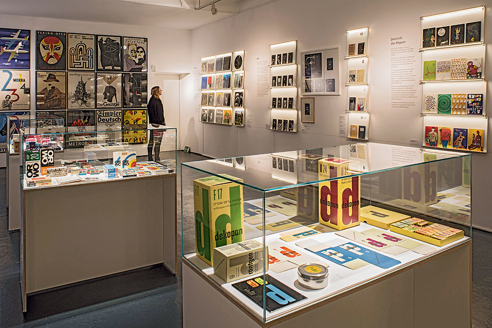
The small but ambitious exhibition explores the aesthetic that came out of this approach by examining mass-produced items that shaped the everyday visual culture of East Germany.
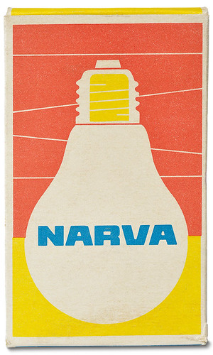
The centre of the room is taken up by three vitrines displaying consumer goods packaging. If there is only one product of its kind on the shelf, the packaging can focus on content. Consequently, the beautifully reduced graphics on NARVA boxes simply depict what is inside the box: light bulbs.
The influence of the Bauhaus is tangible in the typographic works. On show are original drawings of the sans serif typeface Maxima and its application on a public transport sign. Gert Wunderlich designed Maxima in 1963 as an alternative to Helvetica and Univers. It became the most widespread typeface of the GDR. Typefaces by Herbert Thannhaeuser and Albert Kapr show a concern with legibility rather than with aesthetic surprises.
In contrast, the cultural posters that fill the opposite wall of the exhibition space burst with artistic freedom, graphic wit and stylistic diversity. Rolf Felix Müller draws poignant black and white graphics for ‘Der Stellvertreter’ (1966), while Rudolf Grüttner depicts his ‘Arturo Ui’ (1967) in watercolours. With few typefaces available, designers often experimented with hand-drawn type, as in the case of Volker Pfüller’s ‘Totentanz’ (1986) poster.
Many graphic designers were employed by or had long-term contracts with cultural institutions. Equally long-lived were co-operations in the publishing sector. Lothar Reher shaped the graphic output of publishing house Volk und Welt from 1964 onwards and designed more than 270 volumes for the book series ‘Spektrum’ alone. Another prolific relationship was that of illustrator Werner Klemke and Das Magazin, a monthly publication about literature, art and fashion. From 1955 to 1990 Klemke drew 423 covers.
The varied visual culture of the GDR has many facets that resonate with a contemporary audience. Modernist ideals, and an emphasis on functionality that can be seen in the first generation of GDR designers, appeal to the UX generation. The reuse of materials in a spirit of improvisation, which originally stemmed from a chronic scarcity of means, is now practiced in the Maker scene. The subversive energy and complicity between designers and audience both under political censorship, is inspiring to young people disillusioned with consumerism. Let’s see what they make of it.
Box for NARVA photo enlarger bulb by an anonymous designer. Photo: Armin Herrmann, © Sammlung Werkbundarchiv / Museum der Dinge.
Top: Installation view at the Museum der Dinge including a range of dekopan film material designed by Klaus Wittkugel. Photograph: Werkbundarchiv – Museum der Dinge.
Rose Epple, designer, Berlin
First published in Eye no. 92 vol. 23, 2016
Eye is the world’s most beautiful and collectable graphic design journal, published quarterly for professional designers, students and anyone interested in critical, informed writing about graphic design and visual culture. It is available from all good design bookshops and online at the Eye shop, where you can buy subscriptions and single issues. You can see what Eye 92 looks like at Eye before You Buy on Vimeo.