
Summer 2012
Fear of the black
Pierre di Sciullo: En esthète de gondole
Galerie Anatome, Paris 19 January – 24 March 2012
Last winter, as queues formed outside Paris’s Musée des Arts Décoratifs for retrospectives on graphic designers Jean-Paul Goude and Stefan Sagmeister, a more modest show at the Galerie Anatome was also attracting well deserved attention. The contrast between the high-profile designers and low-key French practitioner Pierre di Sciullo worked to the advantage of the latter. While Goude and Sagmeister were jubilant, heroising the commercial dimension of their work, di Sciullo stood out as someone still operating outside the framework of platitudes.
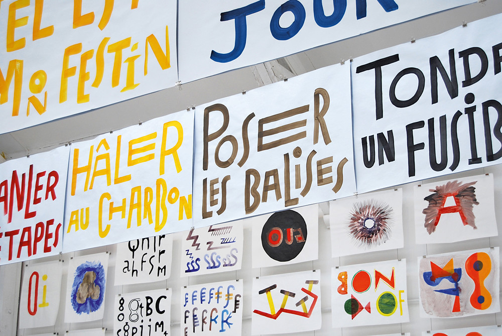
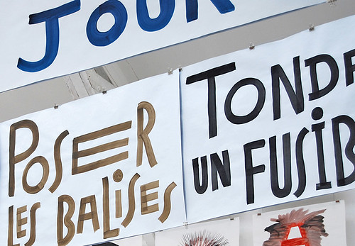
First, di Sciullo is unambiguously colour happy. While most type designers believe that letters of the alphabet look their best in black, when their forms are as substantial as that of graphite molecules, cannonballs, anthracite rocks, or liquorice candies, di Sciullo thinks of typefaces as ethereal vibrations. His letterforms are musical notations, graphic expressions of auditory impressions, and he uses all the shades of the rainbow to give letters, vowels and words a new resonance. ‘The experience of reading aloud is what interests me,’ he explains. ‘I want words to be heard not seen.’
In 2005, he created the poster for ‘Ecrire à voix haute’ (‘Writing aloud’), at the Ferme du Buisson art centre in the eastern suburbs of Paris, a watershed exhibition that ushered in a new trend among French graphic designers: an attempt to revive the oral tradition.
Di Sciullo’s letterforms are awkward. He is the first to admit it. Their lack of fluidity not only gives them character, it also forces readers to slow down as they decipher the text. Colours emphasise some strokes but not others. The words are fractured but glow like stained glass (playing with transparency is one of his techniques). Like a kid learning to read, you experience the thrill of watching text turn into speech. In fact, di Sciullo’s approach is often childlike. He messes up words the same way he messes up letter forms. He is a master of Spoonerisms and phonetic reversals. He likes to tease the brain as much as the eye. His witty typefaces, often derived from geometric forms, are most effective in large sizes – few are commercialised as text type – and they work wonders in declarative sentences.
In 2007, di Sciullo created N’importenawak (‘Anything goes’) for a Nuit Blanche instal-lation. It was a twelve-hour pasting marathon during which giant ‘bons mots’ were glued on the four surfaces of a cubic scaffolding, in a continuous word-puzzle performance. It has since become something of a road show, featuring at a number of festivals in France.
In May 2011, for a town-wide fair at Villeneuve-sur-Lot, di Sciullo hand-painted a series of signs that looked like protest banners, lampooning the work ethic. ‘I needed to reconnect with spontaneity. I chose not to use my computer-generated type experiments,’ he says. ‘I wantedto take the time to form each word in such a way as to involve my entire body rather than just a couple of fingers tapping on the keyboard.’
But di Sciullo is not an artist, he insists. He describes his most radical work as mere experiments – voice exercises. What about his Grandes vocalises watercolours? They are visual representations of the elocutions Prrr, Chf, Blbl, Gni, Kt and eMne, he says. His typographical glass sculptures, many of them tributes to Georges Perec? They are 3D models of transparent vowels. Even his conceptual magazine Qui? Résiste, published sporadically since 1983, is for him nothing but a chance to study editorial formats. ‘My father is a painter. I never want to be an artist – I never want to be part of the gallery system.’
Important commissions – signage for the Forum des images, the tramway stops in Nice, the Centre national de la danse, the Musée Champollion in Figeac and for the BnF Richelieu, the venerable Paris public library – are evidence of the high regard for him as a designer. Each project stands on its own, a typographical oddity that attracts the attention and holds it long enough to leave a deep imprint in the imagination.
In 2008, Di Sciullo contributed a series of short video sequences to the French film Peur(s) du Noir – literally ‘fear(s) of the black’ – a portmanteau compilation of horror stories by the likes of comic book creator Charles Burns and illustrator Lorenzo Mattotti. Di Sciullo wrote and directed four two-minute sequences: abstract black and white computer animations, in which spiky shapes morph into geometric patterns and serpentine blobs, a homage to Oskar Fischinger. His sequences are narrated by a woman with a rich and vibrant voice, alleviating his fear of the black in warm, audible tones – the next best thing to bright colours.
Part of a wall of calligraphic posters by Pierre di Sciullo at the Galerie Anatome.
First published in Eye no. 83 vol. 21 2012
Eye is the world’s most beautiful and collectable graphic design journal, published quarterly for professional designers, students and anyone interested in critical, informed writing about graphic design and visual culture. It is available from all good design bookshops and online at the Eye shop, where you can buy subscriptions, back issues and single copies of the latest issue.