
Spring 1995
Fuse's envelope comes unstuck
Neville Brody
Jon Wozencroft
Tobias Frere-Jones
Luc de Groot
Rick Vermeulen
Just van Rossum
Erik van Blokland
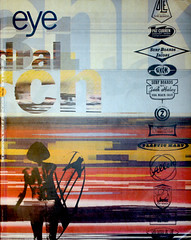
Fuse ’94
Royal College of Art, London<br>23-27 November 1994The suffix ’94 seems to suggest that the organisers of the Fuse conference expect to repeat the exercise. On this evidence, once may have been enough. There is only so much cant, cod philosophy and disorderly abuse that an audience can take. Indeed it is difficult to know with which complaint to begin. The fact that half the speakers had not bothered to prepare? That others were unwilling or unexperienced? The offhandedness with which Neville Brody treated his audience? Or the presumption of Jon Wozencroft, who moved the goalposts in the final session, when no one could answer back?
This was no unremitting disaster, more a slight to the intelligence. The conference was well organised; the FuseLab gave a polyglot collection of design students the chance to meet and exchange ideas; there was even a handful of fine presentations of serious typographic research by Tobias Frere-Jones, Rick Vermeulen, Luc de Groot, Erik van Blokland and Just van Rossum; the eloquent Jeffery Keedy left nobody with the excuse that they didn’t know what he meant by post-modernist and deconstructionist design.
Elsewhere there was an inexcusable failure of attitude and manners expressed in shallow contempt for audience and ideas, with too many ‘stars’ asserting their status in casual apathy – late arrivals, shambling speech, platform members mocking audience questions, and foul language substituting for articulation.
Somehow, something had gone wrong with a superficially attractive rostrum of speakers. Perhaps it was the tidy mind that had restricted the platform to contributors to Fuse magazine, for the assumption that, as such, they would all have something to say that was worth listening to was evidently false. There is also, in this community of typographers and graphic designers, an unhealthy homogeneity. In a pre-conference soundbite, Neville Brody claimed that ‘the only thing these speakers have in common is that they all push the edge of the envelope.’ This ignores the rather obvious point that they are exclusively white and male.
The result was a serious imbalance in favour of a Boys’ Own typography and a flashy show of casually worn and easily discarded rhetoric. Take Brody’s own speech: in the space of 20 minutes we learnt not only that ‘the end of the word is nigh’ but also that ‘text is dead’, ‘design is dead’, that visual language is ‘a structure of 26 main characters’ and that ‘typography doesn’t have to carry information any more.’ Words become interchangeable in this easy-going intellectual playground. Spoken language is confused with written language, visual language with the alphabet. Is it irony or tragedy that Brody has to use words to make sure statements and murders language in the process?
Fortunately for Brody, one of the two instigators of Fuse, he can always rely on the other, Jon Wozencroft, to come along and make apologies for any excess of zeal. Thus on the second day of the conference we discovered that: ‘The end of the word is nigh … is not a wind-up. It’s actually quite a conservative statement. The word, the biblical word, has been gone for ages … If people think we’re winding you up in those statements we’re not. We’re actually trying to use these as entry points into much bigger arguments.’
It is apparent that an experiment in mere typography can no longer contain the intellectual ambitions of this pair, who have vowed to go ‘beyond typography’. This would be all very will if only their arguments were delivered with any clarity and, even better, connected to professional practice. For example, the nub of Wozencroft’s speech seems to have been: ‘The communications world we live in is total and utter chaos. We think that our magical typefaces and our wondrous design systems, and our nirvanas like the Internet are the answers. These are not the answers, they are escape routes. We need to be aware of all these barriers to communication, and one of the greatest is the video surveillance camera. And we say we want normal legible typefaces! It’s a bit ridiculous.’
This is not only going beyond typography, it is leaving it straggling far behind. Wozencroft goes surging into the distance to change the world on no sounder foundation than a narrow technological determinism wreathed in a fog of reactionary mysticism: for out of a generically incoherent speech it is difficult to extract anything other than a vague intention to reinvest the word with religious sanctity and return to the ‘magic’ of early communication systems, which focus on the ‘spirit that forms the base of the message rather than the message itself.
This obscurantist homily on technology could develop nothing more profound than a moral blandishments to be more ‘honest’ and to recognise the importance of the ‘generosity of actual human spirit’, without a scrap of analysis of the existing social relations which determine how technology is employed, or within which designers work. Wozencroft merely exhorted designers to use computers ‘with positive energy, in a positive, liberating way’ as a means of combating their perceived dangers, which constitute ‘really serious things on a social level – their use in banking, to marshal and control public space. The social effects of the computer involve everybody, everybody. So if we’re talking about design, about there not being enough female designers, female typefaces [sic], these are important, but we mustn’t let it drag us into a gender issue when it’s really a human issue.’
This argument will be depressingly familiar to anyone acquainted with a certain brand of pseudo left-wing politics in which white males attempt to overturn all social inequalities except those that benefit themselves. It was delivered with flamboyant bombast: said Wozencroft, the dangers of computers are such that ‘I’m going to propose that, in this Fuse experiment, in this larger project in which Fuse is just a blip, I say we have to remember, “Always march in the direction of gunfire”.’
I quote Wozencroft at some length because he introduced his speech as a summary of the proceedings – which it was not – and because if somebody presumes to organise a conference around typography and then at the very last tells its participants that their cares are ‘ridiculous’, they should not go unanswered; also because I was offended by the repetition of words, the pleading and cajoling, the laddish swearing which were used to conceal the emptiness of the message. If anyone had come to this event to discover what ideas really lie behind the magazine, they would almost certainly have come away confused by the gigantic conceptual chasm that exists between Fuse as a typography experiment and as a philosophical argument.
The experiment has merit; it was interesting to hear of Rick Vermeulen’s work with speech recognition and his attempts to create type that changes its character according to the voice and tone of the speaker, and to regard the wit of Erik van Blokland and Just van Rossum’s randomised and sound-emitting digital type and its effects on social communication.
The ‘philosophy’ is mere pretence, for the claim that there is a ‘bigger’, ‘very ambitious’ undercurrent to the Fuse project is, on closer examination, always shown to be hollow, precisely because it can never draw a connection between its own abstractions and the practical art of typography. There can be no objectification whatsoever to connecting typography to the greater world, to developing an underlying structural argument to guide us through a period of technical and social upheaval. The objection is simply that Fuse has yet to attempt this.
William Owen, design writer, London
First published in Eye no. 16 vol. 4, 1995
Eye is the world’s most beautiful and collectable graphic design journal, published quarterly for professional designers, students and anyone interested in critical, informed writing about graphic design and visual culture. It is available from all good design bookshops and online at the Eye shop, where you can buy subscriptions and single issues.