
Spring 2013
Letters on location
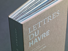
Lettres du Havre
by Elodie Boyer<br>Editions Non Standard, €88 / €130 for the numbered version<br>
Many francophiles would say that there are more interesting, beautiful cities to visit in France than Le Havre in Normandy. Mostly destroyed at the end of the Second World War by Allied bombing, its centre was rebuilt between 1945 and 1964 under the supervision of Auguste Perret, following an urban plan based on a modular grid. Le Havre is a masterpiece of Modernist architecture, where concrete stretches from the city hall to the harbour, up to the skyscraper of St Joseph’s church. In 2005 the city centre was included on the Unesco world heritage list.
I went to Le Havre – where a significant part of my family is located – many times as a child. The memories of my walks in this never-ending, unattractive greyscape, punctuated by words and names displayed on the shops, are mixed with a significant personal event, the purchase of my first book – an anthology of Greek myths.
Maybe Élodie Boyer had a similar experience. A branding and corporate identity consultant working in Paris, she has been a true havraise for many years. Her professional and personal interests in defining what makes an identity coalesced in Lettres du Havre (Editions Non Standard, €88 / €130 for the numbered version) the first project of her new publishing venture.
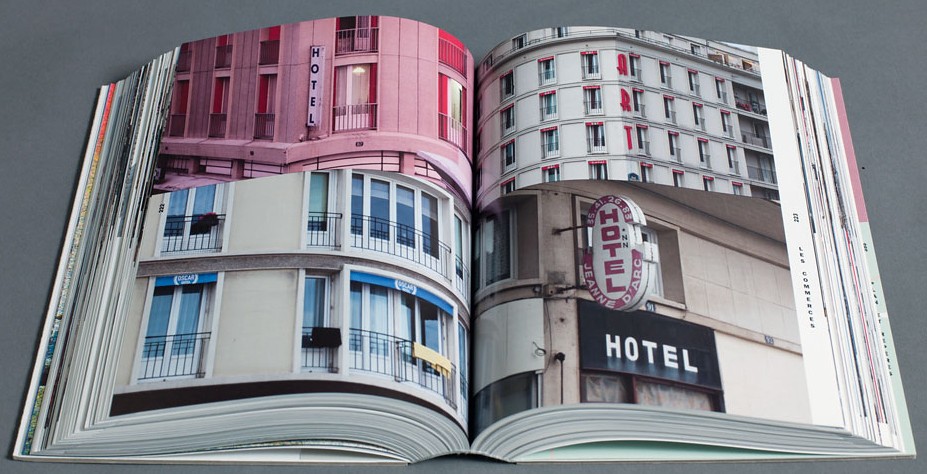
Lettres du Havre is an impressive book in many ways, and has, to my knowledge, no equivalent in the way it is conceived. In five sections (industrial companies, public services, commercial shops, chain stores and seaside signs), it deals with the city’s variety of signs and inscriptions, depicted in 417 photographs and 100 letters written by Jean Segui, each one addressed to an imaginary inhabitant of the city.
Sometimes one can catch a glimpse of unexpected, hidden poetry in the daily banality of life. Take a look at the store names, the vanishing painted letters, the neon signs, made with dull, artificially condensed Arial or with the everlasting, unavoidable typefaces of Roger Excoffon. Lettres du Havre has more to do with Ken Garland’s vision of the multiplicity of urban signs than with any academic study: we citizens are making the urban space together, not only as ‘designers’ but as users, travellers and observers.
This massive block – more than 800 pages – with its concrete-grey cover, protected by a cardboard box, was designed by Atelier Patrick Doan (Amsterdam) and printed in offset, Risograph and silkscreen. Its intricate binding mixes two books in one, as image spreads are interspersed with the (smaller format) letters.
Moreover, each photographed location and sign is located on a map, so that anyone can make their own path through Le Havre. Even for non-French-speaking readers, the book is the epitome of a well thought-out, carefully planned project, echoing the city’s chaotic ‘signosphere’ and architecture with subtlety and honesty.
Sébastien Morlighem researcher, writer, lecturer, Barcelona and Amiens
First published in Eye no. 85 vol. 22 2013

Eye is the world’s most beautiful and collectable graphic design journal, published quarterly for professional designers, students and anyone interested in critical, informed writing about graphic design and visual culture. It is available from all good design bookshops and online at the Eye shop, where you can buy subscriptions, back issues and single copies of the latest issue. You can see what Eye 85 looks like at Eye before You Buy on Vimeo.