
Winter 2014
One image, many photos
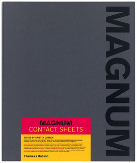
Magnum Contact Sheets
Edited by Kristen Lubben. Designed by Smith. Thames and Hudson, £45 (hardback, 524pp)
Near the beginning of Magnum Contact Sheets there is a photograph by Susan Meiselas of a set of metal shelves packed with battered ring binders. This unassuming collection is the archive of contact sheets deposited, over years, by members of Magnum Photos – the legendary agency set up by four photographers at the end of the Second World War.
Filed under each photographer’s name, these contact sheets have now become histories in their own right, tracing the trajectory of the photojournalistic narrative and of the reading of photographs. The collection, which includes both photographic paper contact sheets and transparencies, stands not only as a record of decades of intense photographic practice but also as an archive of photographers’ edits – the circling and marking of individual shots, many of which have become iconic images.
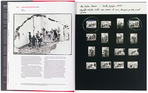
Kristen Lubben’s selection begins with Cartier-Bresson’s 1933 Seville series. Cartier-Bresson made the photographs during a three-month journey around Spain. He processed and printed his own contact sheets, remarking that the contact sheet was ‘a little like a psychoanalyst’s casebook. It is also a kind of seismograph that records the moment. Everything is written down – whatever has surprised us, what we’ve caught in flight, what we’ve missed, what has disappeared, or an event that develops until it becomes an image that is sheer jubilation.’
The contact sheet emerged as a photographer’s editing tool as the growing popularity of the miniature 35mm camera gave documentary photographers the ability to react quickly to fast-moving events. But 35mm negatives were small, so a set of miniature photographs, printed on a black background and viewed with a loupe (see below), made it possible for photographers and picture editors to compare images, and also to make a coherent narrative from photos that may have been taken quickly in difficult conditions. For photographers working in remote places and sending film back to the Magnum bureau, the contact sheet was often their first sight of the story.
From his Seville contact sheet, Cartier-Bresson ringed two images with a white Chinagraph pencil. From these emerged one of photography’s most memorable images: a group of ragged village boys around a jagged hole in a wall, one balanced on the wall like an urban ballet dancer. The contact sheet shows that Cartier-Bresson made many photographs of the group, always with the damaged wall as the framing device. As the boys gathered, Cartier-Bresson photographed their shifting, fragmenting presence, waiting for the moment when all the elements – architectural and human – merged, and the composition was made.
By the 1950s, Magnum’s membership had grown from the founding group of four – Robert Capa, Cartier-Bresson, David (Chim) Seymour and George Rodger – and a new generation of photographers began to look not only at life on the street and battlefield but also at intimate domestic life. Elliott Erwitt’s 1953 sheet includes 27 photographs of himself, his wife and their baby. Erwitt circled, in red Chinagraph, a frame that shows mother and baby in rapt communication; a cat looks on and the light shimmers across the bedsheets, illuminating both figures. Erwitt’s Mother and Child became an emblematic photograph of postwar American domestic life, simple and sublime.
By the 1960s, Magnum contact sheets also included meticulous edits of colour transparencies. Inge Morath’s 1960 study of refugee camps in Gaza – made for Bring Forth the Children, a photo book co-edited with the actor Yul Brynner – shows the precise way in which she concentrated on the minutiae of the lives of children. The archive of Morath’s sheets includes sets of typewritten captions, describing in detail the children’s studies, play and home lives.
A spread from the book showing, left, Henri Cartier-Bresson’s celebrated picture of children playing, framed by a broken wall, Spain, April 1933; and right, a reconstruction from unnumbered negatives of the original contact sheet.
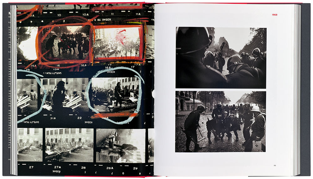
Top: Contact sheet and prints of Bruno Barbey’s photograph of the Paris riots, May 1968.
Reading these contact sheets unravels photographers’ methods. In 1961, the Welsh photographer Philip Jones Griffiths went to the village of Pant-Y-Waun, where he came across a group of children playing on a site of demolished houses. Early in the shoot, he photographed whole families; then he followed the children as they moved away in small groups on to the wasteland. The documentary gathers force as the children begin to explore the smashed site. Marked by both green and white Chinagraph and with a blue and a yellow sticker, there is a photograph of a boy completing the destruction of a grand piano. Watched by two smaller boys, he raises a rock to smash the piano’s damaged carcass. Boy Destroying Piano is a photograph that came to epitomise the poverty and deprivation of industrial Britain, while also recognising the resilience and energy of youth.
The British photographer Martin Parr used contact sheets extensively. In the 1980s he printed colour negatives as black and white contact sheets because ‘I couldn’t afford to print these in colour […] How strange to assess my first substantial colour project [The Last Resort, 1985] in black and white, but the idea was that the colour would look after itself and the action was what I had to edit.’ Now printed in colour, the sheet has taken its place in the Magnum archive.
These contact sheets were intimate documents, Lubben notes: ‘Their small size demands physical proximity, and they are often scrutinised with a loupe, a specialised magnifying glass held between the eye and the contact, bringing the sheet almost in contact with the face. Grease pencil or China Marker notations in different colours indicate personal observations; throughout the book, one can see how unique these are to each maker, and how the physical trace of the photographer’s hand can be felt on the contact.’
For almost all the photographers mentioned, the contact sheet remained an editing tool and archive. Only the US photographer Jim Goldberg, who came to Magnum as an art documentarist rather than a photojournalist, saw the contact sheet’s potential as art form. In Proof, he uses the contact-sheet formula to rediscover and re-examine his photographic production over the last decade. He says: ‘What has gone from a nine-image collage titled ‘Contact’ has grown into an archive of over 650 images. On one level, this piece illuminates my working / editing process and how I use markings and notes to make sense of what I’ve shot. On another level, it describes the way in which I conceptually address my subject. While the words “contact” and “proof” are technical photographic terms used to describe a set of photographic images or quickly made prints, I use them to illustrate that these are people with whom I have had “contact”, and my work perhaps acts as “proof”, certifying the existence of these individuals who otherwise would be invisible.’
These once private documents can now be seen as a valuable way of exploring photographers’ methodologies. Used in exhibitions as contextual material, they lend texture and depth to what can otherwise sometimes be seen as a trophy set of images. They prove that sometimes the whole is greater than the parts; that photographers work in different ways, often dependent on luck or circumstance, on the right light, or the fortunate juxtaposition of people and places. Martin Parr refers to this book as an ‘epitaph to the contact sheet’; and as photographers now self-edit and delete on screen, and editors choose the best photographs and discard the rest, the contact sheet, peered at, marked, discussed, becomes a part of photography’s past practice, as much a part of history as the photographs it preserves.
Cover of Magnum Contact Sheets, which mimics the design of a Kodak box of photographic paper.
Val Williams, writer, curator, Professor of the History and Culture of Photography at the University of the Arts London
First published in Eye no. 89 vol. 23 2014
Eye is the world’s most beautiful and collectable graphic design journal, published quarterly for professional designers, students and anyone interested in critical, informed writing about graphic design and visual culture. It is available from all good design bookshops and online at the Eye shop, where you can buy subscriptions, back issues and single copies of the latest issue. You can see what Eye 89 looks like at Eye before You Buy on Vimeo.