
Summer 2014
Prolific polymath
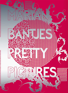
Pretty Pictures
Writtten and designed by Marian Bantjes<br> Thames & Hudson, £42, $75<br>
Pretty Pictures (Thames & Hudson, £42, $75) covers the astonishing body of work that the polymathic Canadian illustrator-designer Marian Bantjes produced over a period of nine years, following a radical mid-career reinvention. It is essentially a conventional monograph, but nothing about Bantjes is entirely conventional. A confessed control freak, she takes responsibility for editing, writing, design, production and indexing, and the result is comprehensive to the point of fanaticism. It includes almost everything she produced between 2003 and 2012, often with rigorous visual documentation of the development process, from early sketches through rejected prototypes and multiple iterations, and detailed commentary from Bantjes herself.
Bantjes originally trained as a typesetter, and her work is almost exclusively typographic and calligraphic. The projects here represent a series of experiments in turning words into pictures. So it comes as no surprise to discover that the text is just as important to this monograph as the images.
The captions shed fascinating light on her motivation and working methods. The stories behind the evolution of many projects are engrossing and offer intriguing glimpses of her relationships with some of her favourite art directors /patrons (including Stefan Sagmeister, Michael Bierut and Rick Valicenti). Above all, the commentaries convey her deep personal engagement with the work – what she calls in the introduction ‘the investment of the self’. She emerges as passionate, honest, profane, emotional and funny, and the force of her personality gives the book a vitality that most designer monographs lack.
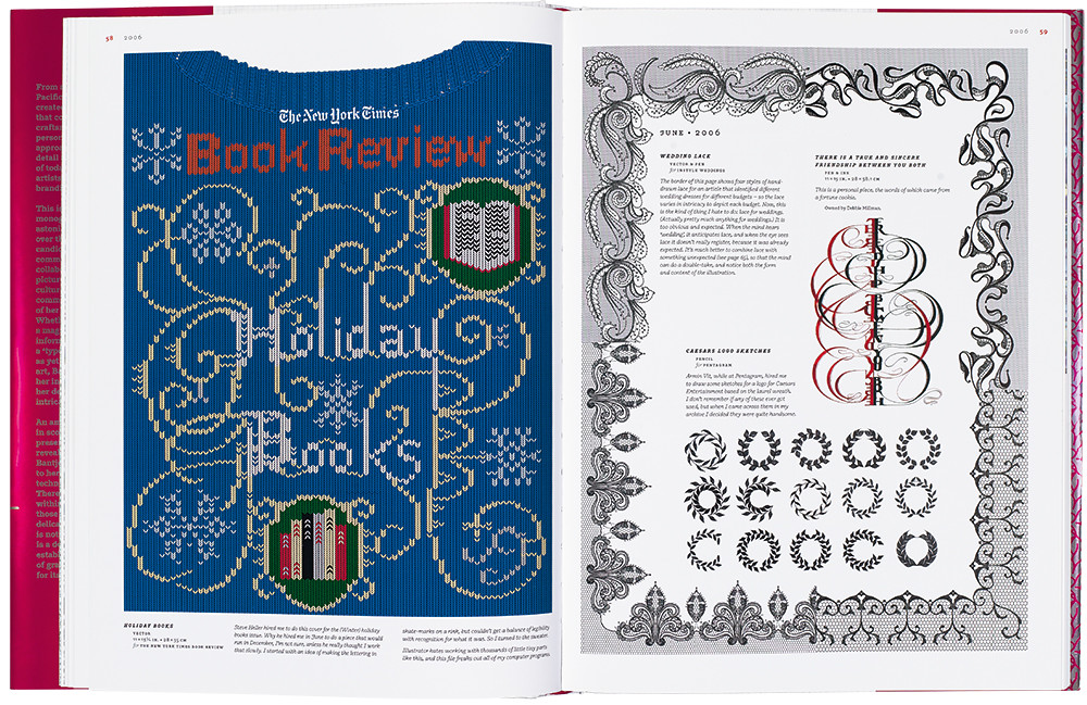
She does not hesitate to praise herself where she feels she deserves it, but she can be endearingly self-critical, painting a refreshingly honest picture of the reality of creative life. The spread shown above includes, alongside a Christmas cover from the New York Times Book Review, a lace border ‘too obvious and expected’ for an article on wedding dresses and sketches for a laurel wreath logo for Caesars Entertainment: ‘When I came across them in my archive I decided they were quite handsome.’
But in the end, most people buy designer monographs for the pictures, and this book will not disappoint. Bantjes’ free-form gridless design and the intricacy of the content mean that some layouts verge on the chaotic, but the page is big and the work crisply reproduced.
Some of the projects are familiar; many are not. As a casual admirer, I was surprised by the breadth and variety of Bantjes’ work, in terms of the media she uses – pencil, pen, computer and 3D materials from flower petals to sugar – and her thinking and solutions to briefs. There are moments of breathtaking beauty and occasional flirtations with kitsch. Most overwhelmingly, there is the sheer intensity of her craft. It is often said that good design looks effortless: Bantjes’ work never does. Even for a fan, the relentless complexity can be exhausting. This is a book for dipping into rather than reading from cover to cover.
To those who don’t ‘get’ Bantjes – and she admits there are many – Pretty Pictures will be no more than what it says on the cover. But for enthusiasts, it offers a genuine insight into the world of a unique talent.
Cover and spread (top) from Marian Bantjes’ Pretty Pictures.
Mark Porter, principal of Mark Porter Associates, London
First published in Eye no. 88 vol. 22 2014

Eye is the world’s most beautiful and collectable graphic design journal, published quarterly for professional designers, students and anyone interested in critical, informed writing about graphic design and visual culture. It is available from all good design bookshops and online at the Eye shop, where you can buy subscriptions and single issues. You can see what Eye 88 looks like at Eye before you buy on Vimeo.