Winter 2008
Putting the graph in graphic
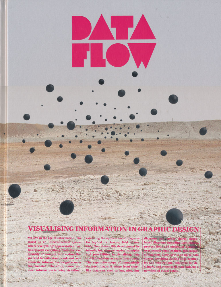
Data Flow: Visualising Information in Graphic Design
Die Gestalten Verlag, £40, USD78, €49.90
Data Flow: Visualising Information in Graphic Design (Die Gestalten Verlag, £40, $78, €49.90) is publisher DGV’s latest Zeitgeist-surfing compilation volume. Here the theme is information graphics, and among talk of new online tools and expanded datasets, the beautiful and the rigorous share pages with the dangerously decorative in a way that might make that guru of information presentation Edward Tufte shake his head.
A million colour-coded lines radiate and arc, circles pulse with meaning and there isn’t a PowerPoint default bar chart in sight on these stimulating pages, which include Nicholas Felton’s witty Feltron Annual Report, in which he analyses a year in his life in the form of a graphic corporate report, and pages from Joost Grootens’ wonderful Metropolitan World Atlas, with the shape of the world auto industry by Christina Van Vleck.
Short interviews punctuate the sections. Catalogtree sum up their approach thus: ‘An infographic should be a data-driven image, not an illustration of the data.’
If the examples are varied and strong, the explanations can be weak and there is little attempt to add detail or context and no biographical information: perhaps one is supposed to go online for that. This is a book that has been edited rather than authored, but as a visual survey of current thinking it is well worth having.
Top: Cover of Data Flow: Visualising Information in Graphic Design.
Simon Esterson, Eye art director, London
First published in Eye no. 70 vol. 18, 2008
Eye is the world’s most beautiful and collectable graphic design journal, published quarterly for professional designers, students and anyone interested in critical, informed writing about graphic design and visual culture. It is available from all good design bookshops and online at the Eye shop, where you can buy subscriptions and single issues.