
Autumn 2009
Shouting from the shelves
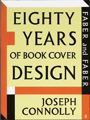
Eighty Years of Book Cover Design
By Joseph Connolly<br>Faber, £25 pbk, £40 hbk
Faber and Faber, the independent British publisher founded in 1929 by Geoffrey Faber (there was only one Faber), has a rich and immediately recognisable tradition of cover design. The archetypal Faber book, typically by Beckett, Eliot, Plath or Durrell, shouts from the shelves of literary bookshops with strong, strident lettering and typography. Many of its most iconic examples were made by art director Berthold Wolpe (1905-89), a German refugee who joined the publisher in 1941. Wolpe’s reign continued until his retirement in 1975. Pentagram’s John McConnell masterminded an extensive rebrand in the 1980s (a version of their company logo is still in use) and Faber continues to commission designs that hark back to the company’s earliest days: big type and a strong, idiosyncratic colour palette.
However, Faber and its designers deserve a better book than Joseph Connolly’s Eighty Years of Book Cover Design. Connolly, a former secondhand bookseller and Faber author, opts for an awkward, ‘unaccustomed as I am to public speaking’ tone of voice that’s
off-putting to newcomers and annoying to anyone familiar with the work.
After two sections covering the company and Wolpe himself, there is a chapter for each decade: a short text is followed by a mass of covers, presented without captions or credits, an organisational strategy that is frustrating for anyone interested in the design and illustration of the covers.
The Pentagram 1980s are given very short shrift – ‘for every ardent fan there may be found a furious detractor’ – and there is no mention of Andrzej Klimowski’s Milan Kundera covers (see Eye 14), for example. A glance at the final decades shows that Wolpe continues to cast a long shadow, particularly in poetry, plays and novels, with the calligraphic cover for Paul Auster’s Collected Novels vol. 1, and Andy Smith’s mix of lettering and illustration for novels by Mario Vargas Llosa. (We are also treated to the covers for five of Connolly’s own books.)
The most compelling part of the book, once you get past the author’s flowery style, is a short appreciation of Wolpe, who had designed Albertus, soon to be termed ‘the Faber typeface’, while still in Germany, nine years before he joined the publisher.
A long and entertaining excerpt from the correspondence with Lawrence Durrell about the iconic ‘handprint’ cover of Justine gives a vivid impression of Wolpe’s confidence and tact: ‘Dear Mr Durrell. Thank you for your letter which did not reach me until Tuesday. The printer had started printing the jacket and I am sorry to say it was therefore impossible to make any alterations.’
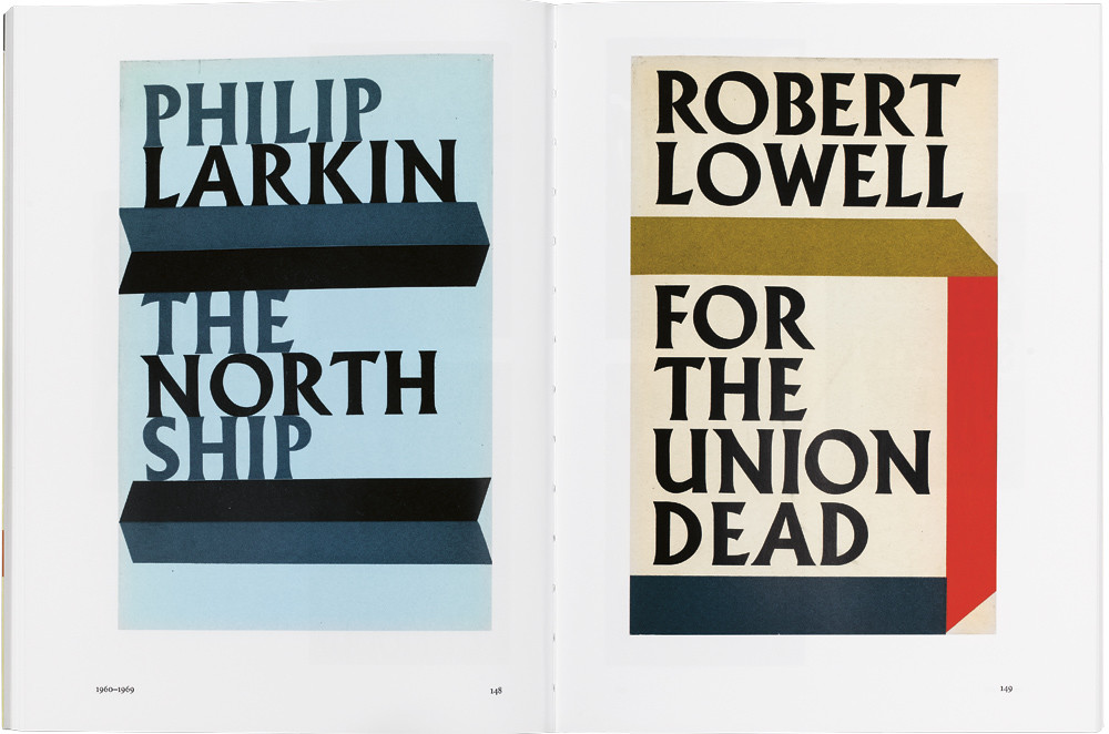
Top: spread from Eighty Years of Book Cover Design, showing two of Berthold Wolpe’s archetypal poetry covers from the 1960s.
First published in Eye no. 73 vol. 19 2009

Eye is the world’s most beautiful and collectable graphic design journal, published quarterly for professional designers, students and anyone interested in critical, informed writing about graphic design and visual culture. It is available from all good design bookshops and online at the Eye shop, where you can buy subscriptions and single issues.