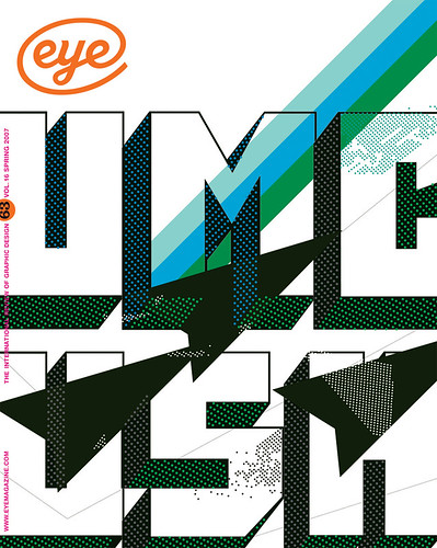
Spring 2007
The Catalogue As Exhibition

The Most Beautiful Swiss Books 2005
Published to conincide with an exhibition at the Design Museum, London, 5 December 2006–28 January 2007.<br><br>Design Laurent Benner & Jonathan Hares. <br><br>Swiss Federal Office of Culture, £19.95An inescapable fact about exhibiting books is that the essential ingredient of a book – its engagement with time – is impossible to show. Sculpture you can walk around, a painting can be seen from left and right. Books, though, are untouchable – under glass, either resolutely closed or spread open more or less at random. But the real experience of a book has more in common with music or architecture: you can’t understand a piece of music from a phrase in isolation, or a building from inside a room.
Laid out in three vitrines in the Design Museum café, ‘The Most Beautiful Swiss Books 2005’ is a collection put together by the Swiss Federal Office of Culture. This is the domain of the ‘fine’ – fine printing, poetry, fine art – the kinds of books whose covers are generally expected more to reflect their contents than to distinguish themselves from other books. The reserved, slightly opaque quality that results is highlighted by their presentation here.
All these natural limitations are sidestepped by Laurent Benner and Jonathan Hares’ ingenious catalogue design. Elements of the 32 selected books are teased out and grouped together according to a strictly physical taxonomy: cover, pages, paper, type, print. Each element is presented like a specimen in itself. There is a leaf from every book, printed recto and verso by its original printer on its original stock, bound into the catalogue as in the original, with only crop marks to signify that the page amounts to a quote. The same order is repeated in blank leaves of the same papers; then there are showings of all the typefaces used in the books, again in order of appearance. All this followed by a collection of indexes that, in a surreal touch, includes an index of formats.
What is brilliant about this analytical approach is that it gives a real, if fleeting, taste of the physical substance of the books. The catalogue makes slightly less sense without the exhibition as a starting point – seeing the books gives at least some idea of their dimensionality. So the catalogue and the exhibition are co-dependent: each is lessened by the other’s absence.
An interesting detail is that of the 40 typefaces used in the 32 books, about half are Helvetica, Akzidenz Grotesk, Univers, Futura and their close relatives. These are the types of the definitive era of Swiss graphic design, and the boundary between a straightforward expression of ‘Swiss-ness’ and a re-appropriation of Helvetica’s colourlessness is almost indistinguishable – if it is there at all.
Among the other highlights are Cornel Windlin’s sublime book / catalogue for Vitra (see Critique, Eye no. 56) and Norm’s layered navigation for Simon Starling’s Cutting, but in this exhibition the catalogue itself is the star.
Mark Thomson, art director, HarperCollins, London
First published in Eye no. 63 vol. 16 2007
Eye is the world’s most beautiful and collectable graphic design journal, published quarterly for professional designers, students and anyone interested in critical, informed writing about graphic design and visual culture. It is available from all good design bookshops and online at the Eye shop, where you can buy subscriptions and single issues.
