
Spring 2025
Future casters

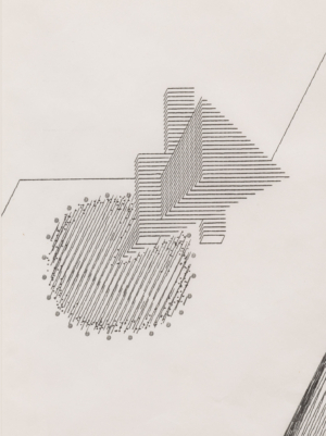
Studio Bergini
various designers
Bob Cobbing
Fortunato Depero
Ian Hamilton Finlay
Dom Sylvester Houédard
Marinetti
Hansjörg Mayer
Tullio Crali
John Furnival
Reviews
Typography
Events and exhibitions
Breaking Lines
Estorick Collection, Canonbury, London. 15 Jan – 11 May 2025. Designed by Studio Bergini. Reviewed by Andy Altmann
I am lucky enough to live a stone’s throw from London’s Estorick Collection in Canonbury. Set within the splendid walls of a Georgian town house, this is a private gallery known internationally for its core collection of Futurist works.
‘Breaking Lines’ (15 Jan – 11 May 2025) is two exhibitions for the price of one. Both are focused on experimental poetry and illustrate how Futurism laid the foundations for concrete poetry in postwar Britain. But experimental poetry goes hand-in-hand with experimental typography – you cannot have one without the other. As a designer, I see typography before the poetry, so although the exhibition is marketed as a poetry show it is possibly more of a typographic show; not everything exhibited is in the form of poems.
I first saw Futurist typography when fellow student Phil Baines (see Eye 106) handed me a copy of Herbert Spencer’s Pioneers of Modern Typography in 1983. Until this point I had considered typography a dull occupation. The content, layout and energy of this book blew my mind, in particular the work of poet Filippo Tommaso Marinetti whose Manifesto of Futurism (1909) pioneered a typographic revolution with the birth of his radical experimental poetry, labelled ‘words in freedom’. On display at the Estorick are an original copy of Fortunato Depero’s ‘bolted book’ and copies of manifestos, journals and newspapers. These reflect the Futurists’ radical, experimental use of letterpress, combined with hand-drawn lettering and mark-making. They broke the rules of form, structure and visually interpreted the sonic meanings of words that reflected their rapidly evolving industrial and war-torn era. I was pleasantly surprised to see the inclusion of Blast magazine by Vorticists Wyndham Lewis and Ezra Pound (1914-15) which contrasted with, and complemented, the work of the Futurists.
The second part of the exhibition celebrates the work and influence of Dom Sylvester Houédard (1924-92), a Benedictine monk, theologian and artist-poet (see Eye 20), also known as ‘dsh’, whom many see as the godfather of concrete poetry and whose collaborators included Yoko Ono and John Cage. His elaborate, colourful, typewriter-composed visual poems are beautiful, but it is the work of the British concrete poetry exponents – John Furnival, Ian Hamilton Finlay and Bob Cobbing (see Eye 93) – whom he influenced, that drew me in. Though everything is behind glass, you can view many of the publications’ inside pages on page-turning digital displays.
Whether you are a designer, typographer or poet, there is plenty to catch the eye. Zang Tumb Tuuum!
Andy Altmann, founding partner Why Not Associates, London
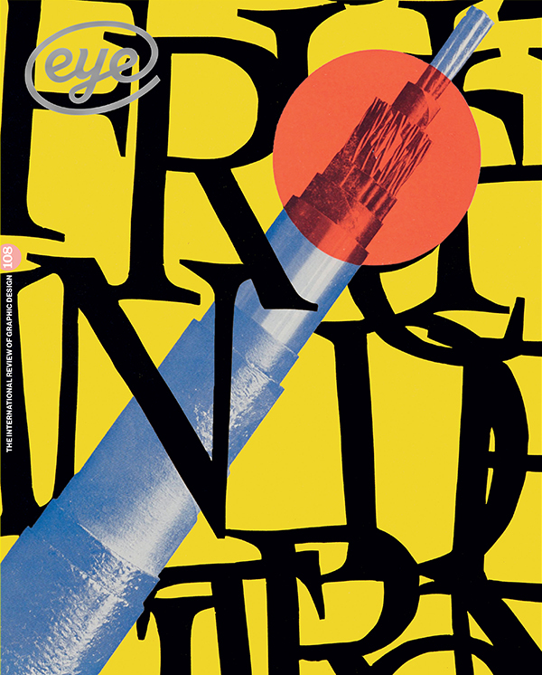
First published in Eye no. 108 vol. 27, 2025
Eye is the world’s most beautiful and collectable graphic design journal, published for professional designers, students and anyone interested in critical, informed writing about graphic design and visual culture. It is available from all good design bookshops and online at the Eye shop, where you can buy subscriptions and single issues.