Spring 2025
Japan’s seismic changes
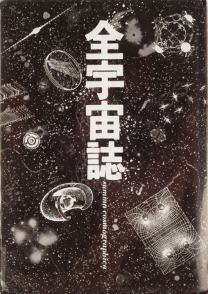
Fracture: Japanese Graphic Design 1875-1975
Written and designed by Ian Lynam Set Margins, €32 Reviewed by John Warwicker
Much of the work shown in this impressive historical overview has rarely been published in the West. The laudable and much needed intent of Fracture is to position Japanese graphic design within a broad historical and cultural context for western readers. However, there are missed opportunities, particularly in the introduction and first two chapters: ‘Before “Design”: The DNA of Japanese Aesthetics’ and ‘Making Waves: The Establishment of Japanese Graphic Design’. This is a book of two halves.
The first half places the work and its creators alongside political, economic, sociological and technological events in a framework that is not extensive enough in describing the influence that cultural thinking and aesthetics has had on Japanese graphic design.
For example, if one reads a page, spread or poster as a field that contains typographic and graphic elements, the placing of those elements has a distinct Japanese ‘flavour’. Its history of calligraphy, and the way letterforms are placed within the visual field, has had a huge effect upon Japanese graphic design – not to mention its three distinct writing systems (Kanji, Hiragana and Katakana) and the multi-directional options in the way text is set.
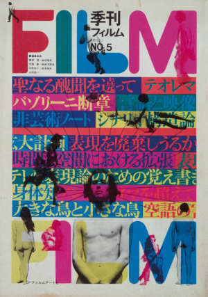
It is this flavour that has made Japanese design so attractive to outsiders. But there are deeper issues, such as the national ‘poetic’ within, that makes Japanese design so special, so singular.
Many outside influences have been merged or juxtaposed into the evolving DNA of Japanese sensibility and sensitivity to shape and influence Japanese creative thought in general.
The book’s historical framework proves that this process is not seamless but one of ‘fracture’ (great title!) in which seismic events, literally and metaphorically, have shaped the work.
I mention DNA because of the implication of a long historical tail (or tale) embedded deeply in the Japanese sense of identity. Lynam writes about the graphic montage of kimonos being an expression of this unique sensibility and sensitivity in a different form – but what of pottery, garden design, haiku, philosophy, the relationship between objects? These are all quintessentially Japanese, and have a subtle bearing on design in the period described here.
The bulk of Fracture, the second half, is a rich cornucopia of work, a timeline with detailed biographies of the designers. It is here, for western readers, that the real richness of this book lies. The work is excellently curated and the stories of each designer well told. There are graphic lessons of placement, space, form, composition and colour on virtually every spread.
While many western graphic designers have been intoxicated by Japanese graphic design, few have gone beyond this initial engagement and applied this learning in their own work – nor have many designers critically understood the processes involved within Japanese graphic design. The cultural and aesthetic exchange has been mainly one way: West to East rather than East to West. Fracture is a more than welcome addition to design history in its attempt to redress the balance.
Lynam concludes his book by writing ‘there is still work to be done’. If this means a second volume, from 1976 to now, then it is one we should look forward to with anticipation.
John Warwicker, designer, typographer, writer and educator, Melbourne
First published in Eye no. 108 vol. 27, 2025
Eye is the world’s most beautiful and collectable graphic design journal, published for professional designers, students and anyone interested in critical, informed writing about graphic design and visual culture. It is available from all good design bookshops and online at the Eye shop, where you can buy subscriptions and single issues.

