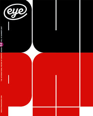
Summer 2007
Letters from Bologna

Imagine iT
Accademia di Belle Arti, Bologna, Italy <br>22-24 March 2007You could read the promotional material for this conference several times without getting a clear idea of the theme. ‘The Celebration of the Cultural Differences’ ran the strapline, with a Borat-like indifference to editorial niceties. The schedule revealed a good proportion of type design, typography and lettering, but the listings also included motion graphics, website design, illustration and a lecture on the ‘branding of fear’, plus a smattering of AGI members, such as Leonardo Sonnoli and George Hardie (see ‘The rules of the game’ in Eye no. 58 vol.15). There were times when the event seemed more like a party with a large, unpredictable collection of guests who are friends of friends of friends: risky, but with the potential to be unforgettable.
We were welcomed by Adriano Baccilieri of Bologna’s Accademia di Belle Arti, who explained that the city had had no Renaissance, and described its prosperous, independent, largely left-wing and ‘smiling’ traditions. To support his case, the streets were full of students, noses in books, riding bikes through the red-painted streets or debating in street cafés under the shelter of Bologna’s ubiquitous porticos. Even beggars greet you with a handshake.
Jan Middendorp’s keynote speech set the eclectic tone of the conference by racing through hundreds of images: Italo Calvino, Hipgnosis’s cover to Moroccan Roll by Brand X, ‘boring’ Dutch book covers (compared to interesting Belgian ones) and ‘endangered practices’, such as hand-lettered signs in Tobago and Cuba. ‘I don’t understand why designers want to make things simple,’ said Middendorp. ‘Everyone will think they can design. Professional graphic design is also endangered, now that Microsoft has made it so easy for people to do it wrong.’
This set the scene nicely for an array of designers who generally do things right. Anette Lentz explained her identity design systems for two contrasting French theatres. Etienne Mineur (Incandescence) demonstrated his elegant microsites for Issey Miyake, one per fashion season (see page 68). Mineur stressed the importance of working with a small team: ‘Three people is enough for a website.’
Type and lettering obsessives were well catered for, with presentations from Meena Kadri, Michael Diebold, Andreu Balius and Adobe type designer Thomas Phinney, who had just put the finishing touches to Hypatia (a new extended typeface that covers Cyrillic alphabets), in his hotel room that morning. Where Phinney referred in passing to the inherently political nature of typography and type design, the point was investigated in some detail by Clare Bell and Mary Ann Bolger. Their double presentation addressed the significance of uncial letters in Northern Ireland, where they take on a specifically Republican meaning. Bell presented her findings as a short film; Bolger extended the discussion to the arbitrarily designed dual-language (and dual-script) road signs. Their specific, carefully researched pointers were fascinating, but a broader, sadder insight emerged: that many of the details that create our graphic landscape are determined not by fellow humans with compassion and wisdom, but by chance and blunder.
Cock-up theories were further explored in an intense but entertaining presentation by former St Bride librarian James Mosley, who traced the ‘rot’ in British lettering standards back to the malign influence of Edward Johnston and his back-to-basics cohorts, who insisted that lettering be done with a pen you make yourself. At this point, declared Mosley, building up a fine head of steaming righteous indignation, ‘Trajan lettering became iconic . . . mandatory’. We were treated to a series of visual examples of this regrettable trend: the door of 10 Downing Street, the name on the stern of the otherwise perfectly restored HMS Victory and the refurbished Somerset House, whose signs, thundered Mosley, show a ‘crass ignorance of letterforms that only architects are capable of’ [see Mosley’s blog typefoundry.blogspot.com].
Brian Lucid made a break with convention by showing some student work: some precocious motion typography. His classes are apparently spurred into action by sudden exposure to hardcore avant-garde music graphics (including Cage, Berio and other examples shown in ‘Sound, code image’, Eye no. 26 vol. 7). So if there was a theme, it wasn’t (like the aforementioned Cage scores) something you could whistle. And while cultural differences are the stuff of every decent conference, it’s the content that counts, and ‘Imagine iT’ had plenty.
John L. Walters, Eye editor.
First published in Eye 64, Summer 2007.
Eye is the world’s most beautiful and collectable graphic design journal, published quarterly for professional designers, students and anyone interested in critical, informed writing about graphic design and visual culture. It is available from all good design bookshops and online at the Eye shop, where you can buy subscriptions and single issues.
