
Autumn 1994
Type paintings of a digital artist
The Graphic Language of Neville Brody 2
Jon Wozencroft, Thames & Hudson, £24.95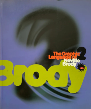
‘For the past five years, Neville Brody and his studio have embraced the computer as a new medium that allows the artist to explore and create a completely new set of codes in visual language.’ If you read this sentence without cringing, then you will like this book and should ignore the rest of this review. But if the use of the words and phrases ‘new medium,’ ‘artist’ and ‘completely new set of codes’ leaves you even a little irritated, then it would be better to save your money.
For six years Neville Brody’s work has rarely been seen in Britain. He is remembered as the designer of The Face, the magazine which changed the parameters of graphic design and redefined notions of style. Currently he is best known as the unapologetic evangelist for the Macintosh and for his work for FontShop (where he is a partner) and its publication Fuse, to which he contributes considerable behind-the-scenes energy as well as a poster and a bonus font each issue. Since his exhibition at the Victoria & Albert Museum in 1988 and the publication of Graphic Language, the bulk of Brody’s work has come from Japan and Germany, and the Neville Brody Studio (established in 1987) has embraced the Macintosh and explored its possibilities at every turn.
The Graphic Language of Neville Brody 2, written by studio collaborator, Fuse editor, Brody confidant and Central St Martin’s lecturer Jon Wozencroft, sets out to tell the story of the past six years, from the fumbling beginnings with bitmapped type and FreeHand 1.0 to the fluid complexity of the PhotoShop ‘type-paintings’ of today. With 597 (mainly) full colour illustrations over 176 matt-art pages, the book is by turns fascinating and frustrating, highlighting both the strengths and weaknesses of the Brody studio.
The strengths are all to do with the work itself – rich, diverse, interesting, even beautiful. The studio emerges as having produced a much wider range of design than most people are aware of: logos, arts posters, signing systems, record covers, typefaces, TV identities, advertising and magazines display an impressive spectrum of approaches and an enviable sense of colour. But the fact that the book is a compilation proves its undoing. There is much unnecessary repetition of subjects, while seen en masse the work exhibits a curious flatness. The high points for me are the Premiere TV identity and its implementations, where scale, colour and space combine to convey both humanity and authority, and some of the work for Haus der Kulturen der Welt.
The weaknesses of the book lie in the text and the design. I still cannot decide if the text is a serious polemic or just sixth-form philosophy; certainly I was unable to carry on reading it for very long, maddened by its over-simplifications and its blind devotion to new technology. My fundamental quibble is over its central claim that the Macintosh is a new medium. Of course, the Macintosh is a new way of generating images and / or type, but as long as the end means of communication is ink on paper (as with the majority of the items here), then the computer is no more or less relevant than whether I use a pen or a pencil. What matters is the effectiveness of the finished product.
The design of the book also reflects the priorities of the studio. Although their headline type is always interesting and engaging, secondary information is often treated with indifference. This weakness is not theirs alone. The widespread use of the Macintosh – inspired to some extent by Brody – has made possible all manner of exploration, deconstruction and abstraction in the field of display typography, but no significant explorations have been made in the area of detailed text typography or the ordering of information. In The Graphic Language of Neville Brody 2, the text is set in two columns of 8.25 / 10.25 point Franklin Gothic Book justified to 80mm. Like most of the studio’s text treatments, this gives a featureless grey block and shows little imagination or sensitivity.
The design does not seem to respond to or articulate the content in anything other than a superficial way. No distinction is made between essays which provide context and those which are direct explanation, between work displayed in virgin, non-applied form and work reproduced. There is no mention of scale, no index, and numbered captions with unnumbered illustrations. Work of a detailed nature that would repay close scrutiny – the ORF identity manual, the Bonn Museum guide – is reproduced unreadably small. Many pieces are shown without any indication of where their borders lie.
These details are the practicalities of design and they have been ignored. What should have been a celebration of a body of work of great merit and interest has been done a disservice. Perhaps in another six years someone with more critical distance will write a more considered survey. Until then, we will unfortunately have to make do with this flawed self-promotion.
Phil Baines, typographic designer, London
First published in Eye no. 14 vol. 4 1994
Eye is the world’s most beautiful and collectable graphic design journal, published for professional designers, students and anyone interested in critical, informed writing about graphic design and visual culture. It is available from all good design bookshops and online at the Eye shop, where you can buy subscriptions and single issues.