Autumn 2000
Urging cuspers to take a trip
Tate Poster Campaign ‘Look again, think again’
To launch Tate Modern and Tate Britain, the organisation Tate (an appellation which, however much sense it makes, does sound weirdly truncated) ran a poster campaign urging the public to ‘Look Again, Think Again.’ Given that invitation, the absence of images of art on these posters – something to look at – became conspicuous. No longer a freestanding set of art objects, which in themselves are worthy of contemplation, the collection at the Tate is reframed as part of an overall art experience, a mind-bending trip.
With the help of the agency TBWA, the Tate began promoting itself as a brand experience two years ago, with the dual purpose of encouraging potential audiences to overcome the perceived elitism of museums and galleries and of paving the way for the launch of the new Bankside site. The first Tate brand campaign consisted of two posters, one with a photograph of a conker which resembles an opening eye, and the other with an image of a pair of beansprouts propped up to look like sparring swans. These posters have considerable charm. The black and white photography is satisfyingly dense – an homage to Man Ray – and the straplines: ‘A conker (or Beansprouts) noticed after a visit to the Tate. Minds open from 10am’ (almost certainly a forgivable homage to the Minneapolis Walker Art Center’s ‘Open to Interpretation. Closed Wednesdays.’) are a cute appeal to liminal experience.
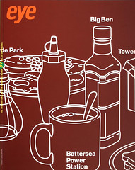
As a continuation of this campaign, what is striking about the more recent set of Tate posters is that they are totally charmless. The Tate Modern set relies largely on the idea that contemporary art will prompt a significant perceptual shift. The drug references here are tired and obvious – mind-altering experiences being as much of a sorry trope in British advertising as women’s breasts are in the advertising of the French – and the graphic devices used by these posters amount to no more than overblown visual clichÈs swimming on 48 sheets of flat colour. Worst of all, the straplines make no sense: ‘Do you dream in black and white, in colour, or in Salvador Dali?’ offers readers an incoherent set of alternatives, while ‘Minimalism: Where do you draw the line?’ is straightforwardly meaningless.
While contemporary art is sold on its ability to alter your overall vision (third strapline: ‘When was the last time you had your eyes tested?’), British art is sold on its potential to challenge your perception of the national identity. In accord (maybe inadvertently) with the current Government’s much mocked attempts to rebrand Britain (see Eye no. 36 vol. 9, p. 87), we are asked ‘What could be less British than showing off our work?’ and ‘British Traditions – wish you could see them broken?’ Selling art on the strength of a specious reworking of the British national character seems highly dubious. Art’s co-option by those who wish to promote a certain take on the state of the nation is never comfortable – witness the absurd and undignified tussles by Tory and Labour politicians over the ownership of Britain’s early 1990s cultural rush. It is totally inappropriate that the objects of art on display at Tate Britain should be charged with the task of infusing British visitors with a new, noisy and irreverent self-image. The idea that anyone should even want them to is pitiful.
Common to all the recent Tate ads is a white stripe along the bottom which houses the logos of all the corporations and institutions that gave money to the project. This ugly addition is the side-effect of the Tate’s fantastic success at raising sponsorship: perhaps it is inexcusably precious to carp at the
visual detritus that it has created. But the typographic mess that clutters Tate’s posters is not all the fault of outside forces – Tate has created some nasty stuff all of its own. The current Tate logo is a painfully literal metaphor for the organisation’s new mission to deliver an uncertain buzz of experience rather than an exactly measured portion of edification, and
the round-edged Tate typeface is a particularly unimaginative exercise in supposed typographic friendliness. Devised by Wolff Olins, these graphic elements seem to be evidence of the lumbering thought processes at work in the large design agencies. Tate took a chance by appointing a fresh practice of architects – they might have done well to do the same with their graphic design.
According to John Allen of TBWA, the purpose of the Tate advertisements was to attract the ‘cusper’ – the footloose individual for whom advertising acts as a decisive prompt. As Allen admits, the advertisements for Tate Modern proved not to be necessary: the press and public reaction to the project has been overwhelming and the cuspers have flocked in their droves. However, Tate Britain is a different story; this gallery will always have to work hard for its audience and it is hard to see these advertisements being much of a help.
The motives for the advertising campaign as explained by Allen seem impeccable: to encourage audiences to overcome the perceived elitism of museums and galleries, to get around the problem of representing Tate by a single art image and to preserve unity across the various sites in the UK. It is just a shame that the product is so lamentable. Though poster ads may be peripheral to the whole project, Tate should take more care over the graphic imagery with which it strews the environment.
First published in Eye no. 37 vol. 10, 2000
Eye is the world’s most beautiful and collectable graphic design journal, published quarterly for professional designers, students and anyone interested in critical, informed writing about graphic design and visual culture. It is available from all good design bookshops and online at the Eye shop, where you can buy subscriptions, back issues and single copies of the latest issue. You can also browse visual samples of recent issues at Eye before You Buy.