
Monday, 9:00am
6 November 2017
Books received #30

Here Design
Jonny Hannah
anonymous designers
Saul Bass
Vincent Sardon
John Morgan
Book design
Illustration
Music design
Reviews
Visual culture
This Is Me, Full Stop., Jonny Hannah, Hi-Fi Living, Sardon’s Stampography and drawings of UFOs
Here is yet another selection of books that caught our attention in recent weeks and months, reviewed by Lindsay Hargrave.
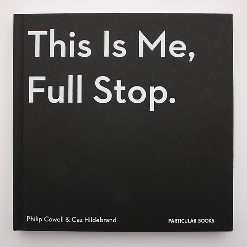
Philip Cowell and Caz Hildebrand’s This Is Me, Full Stop. brings a bit of attitude and fun to the most basic of punctuation marks.
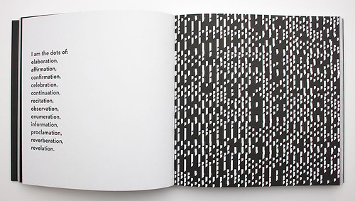
Using short sentences and bold black-and-white illustrations, Cowell and Hildebrand (a director of design agency Here) personify punctuation such as quotation marks, commas and ellipses. The simplicity of the punctuation collages allows for a variety of typefaces to be used throughout, as the only other element included in the illustrations are various arrangements of punctuation on the page, usually opposite a short piece of text. The book gives an appropriate personality and voice to the markings we find so commonplace that we often overlook them, as well as providing a few bits of valuable information about their origins.
Philip Cowell & Caz Hildebrand, This Is Me, Full Stop, Particular Books, £14.99.
Spread from This is Me, Full Stop.
Spread showing parentheses, brackets and braces.

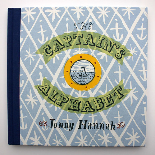
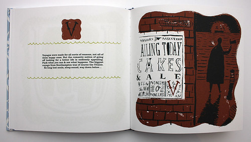
Jonny Hannah’s The Captain’s Alphabet first appeared seventeen years ago as a box set of screen prints. Now published in book form (by Joe Pearson’s company Design For Today), it celebrates the sea in an A to Z of illustration, personal anecdotes, advice and poetry. A nostalgia and longing for the ocean is clear throughout, even if the subject matter jumps around thematically. Hannah’s distinctive curly lines and whimsical illustrations bring the realities of life at sea to the picturebook format, and he has fun with alliteration and rhyme along the way.
Jonny Hannah, The Captain’s Alphabet, Design for Today, £25. A separate sixteen-page book, Southward Ho! is tucked into a pocked glued to the inside back cover.
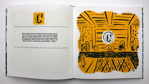
Spread from The Captain’s Alphabet, showing ‘C’ for cabin. The book was printed in five spot colours.
‘V’ from The Captain’s Alphabet.
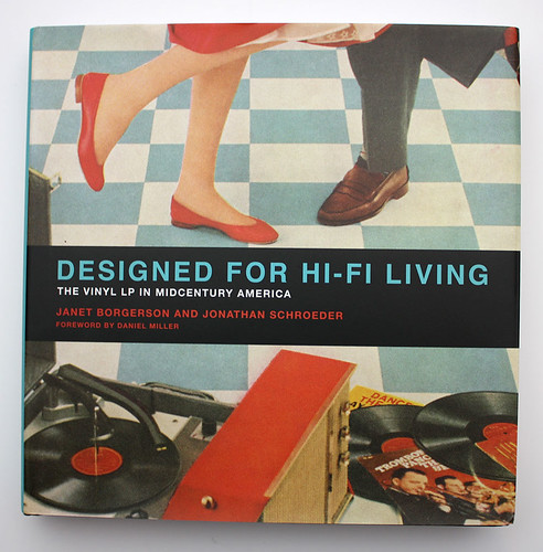
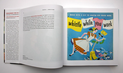
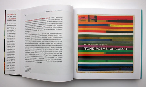
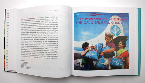
Janet Borgerson and Jonathan Schroeder’s Designed for Hi-Fi Living provides some amusing examples of mid-twentieth century LP sleeves. Many of these records were marketed as ‘lifestyle’ music, and the imagery employed often reflects the advertising (and social attitudes) of the time – the 1950s and early 1960s. The 420-page book is packed with examples, some of which feature artwork from artists such as Jackson Pollock and Franz Kline, while others employ interior design, travel imagery and even space travel as a way of establishing their modernity.
Janet Borgerson and Jonathan Schroeder, Designed for Hi-Fi Living, The MIT Press, £27.95.
Uncredited, almost Soviet-style lithographic illustration for a records of ‘music with a lilt to lighten her house work’.
Cover design by Saul Bass for an LP of mood music (what might now be termed ‘ambient’) conducted by Frank Sinatra, better known as a crooner. Composers recruited include Nelson Riddle and Elmer Bernstein.
The modernity and exoticism of air travel is invoked for a Dave Brubeck jazz album in ‘stereo fidelity’. Photo: Bob Willoughby.
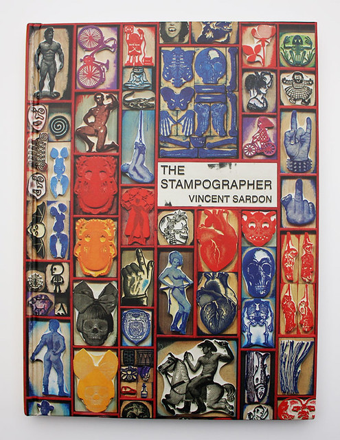
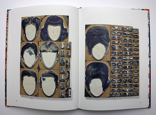
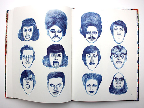
The biting and sarcastic work of Parisian artist Vincent Sardon finds a colourful home in the pages of The Stampographer. Sardon creates rubber stamps to use for satire, grotesque insults and mix-and-matchable faces, reminiscent of Mr Potato Head. The authoritarian anonymity of the traditional rubber stamp adds further irony to Sardon’s largely cynical and anti-establishment illustrations. The book presents both physical rubber stamps and the images they produce, often side by side, to give the reader an idea of the mirroring that takes place in the stamp-making process.
Vincent Sardon, The Stampographer, Siglio Press, $32.50.
Spread of rubber stamps and the endless possibilities of arranging them.
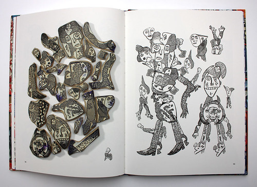
The makings of thousands of unique faces …
… and just a few of the possibilities.
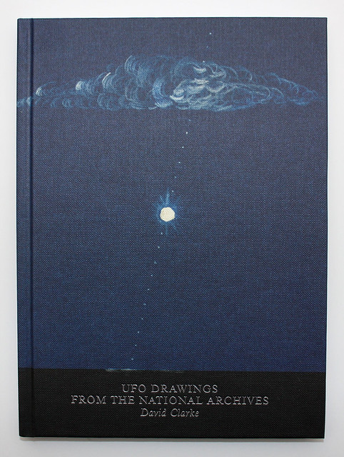
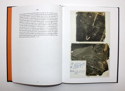
David Clarke’s UFO Drawings From the National Archives includes documents and images from the long-awaited release of UFO-related information by the British government. It is primarily focused on illustrations, which range from charts for classification to amateur illustrations (and pictures by children) of ‘encounters’ with UFOs (unidentified flying objects). The images are accompanied by background information about the circumstances under which the ‘sightings’ occurred, as well as a handful of photographs. The slim, casebound book is part of ‘Four Corners Irregular’, a series of what the publisher calls ‘visual histories of modern British culture’.
Lindsay Hargrave, Eye intern and journalism student at Temple University, Philadelphia
David Clarke, UFO Drawings From the National Archives, Four Corners Books, £12. Design: John Morgan Studio.
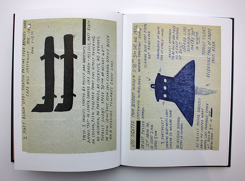
A spread from UFO Drawings From the National Archive showing an amateur drawing and description of UFOs sighted in 1954.
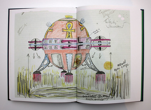
Drawing of a UFO enclosed in a letter to secretariat Air Staff 2 in 1998.
Spread showing irregular crop circles thought to be created by aliens.
Eye is the world’s most beautiful and collectable graphic design journal, published quarterly for professional designers, students and anyone interested in critical, informed writing about graphic design and visual culture. It is available from all good design bookshops and online at the Eye shop, where you can buy subscriptions and single issues.