
Monday, 10:13am
6 September 2010
Graphic appetiser
‘We consume things visually before we consume them physically’
‘Appetite’, a forthcoming exhibition hosted by the Herb Lubalin Study Center at New York college The Cooper Union, will explore how design influences our day-to-day relationship with food.
Covering everything from restaurant signs and menus to supermarket price labels and take-away packaging, this visual feast looks set to provide visitors with plenty of food for thought. Eye spoke with Alexander Tochilovsky, director of the Herb Lubalin Study Center, about the exhibition.
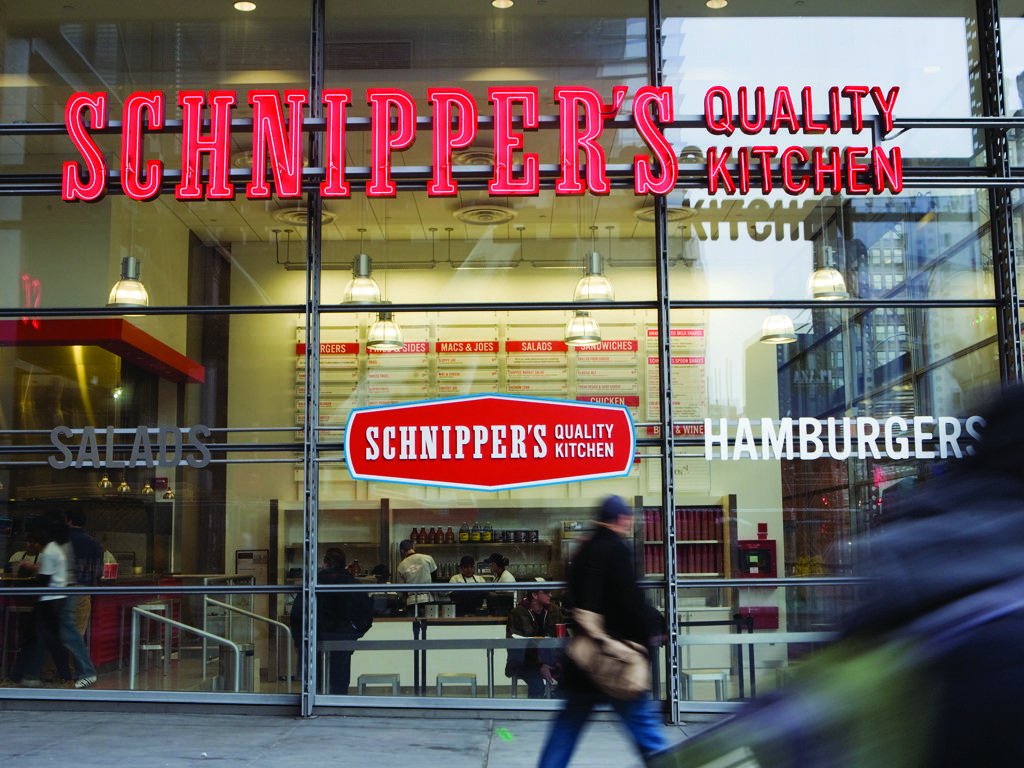
Top: Schnipper’s Quality Kitchen brand identity by Memo NY, 2010.
Eye: What inspired you to put on ‘Appetite’?
Alexander Tochilovsky: The idea came from the two things I really care about. I am a graphic designer by training – I’m an alumnus of the School of Art at The Cooper Union – but at a certain point also considered taking up cooking professionally. I saw a lot of overlap in the process of both professions. There was a similarity in the way I approached both, and when I was thinking of ideas for an exhibition this was one of the first things that came to mind.
I am interested in the way we perceive food and the way that design influences it. We as consumers are very adept at reading signs, even if subconsciously. We consume things visually before we consume them physically. My interest lies in trying to understand these signs and who is responsible for them.
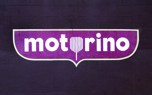
Above: Motorino Pizza logo by Derick Holt, 2008.
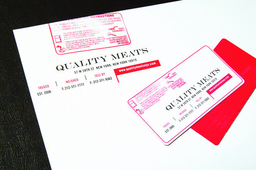
Above: Quality Meats restaurant identity by AvroKO, 2006.
Eye: How has the healthy eating agenda forced packaging/marketing design to change?
AT: I think it has certainly made an impact in the way things look and are designed. For example there are now a whole range of labels being added to packaging promoting certain health benefits (for some examples see here, and for an opinion see here) The problem is it’s not entirely regulated yet and it is hard to know what’s fact and what is being glossed over by the attention-grabbing ‘front-of-pack’ labels. It's probably a small change but quite noticeable when you walk the supermarket aisles. And there is certainly a lot more green colour on the shelves.
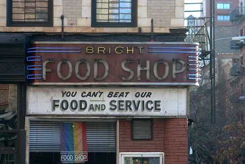
Above: Bright Food Shop in Chelsea. Photo by Paul Shaw, taken December 2006.
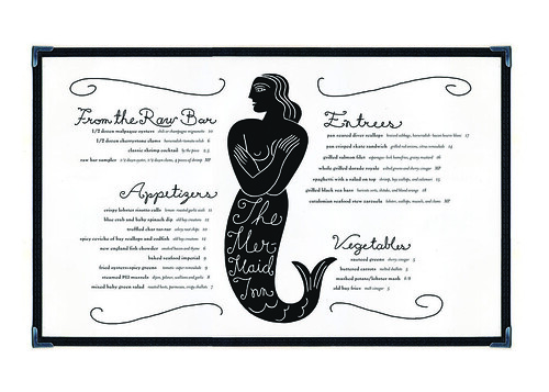
Below: Mermaid Inn menu by Louise Fili, 2003.
Eye: High end or ‘luxury’ products in supermarkets sometimes try to look more rustic, traditional or homemade – and the ‘economy’ or ‘value’ items seem deliberately branded to look as industrially produced as possible. How much cross-over is there between the design used by independent and chain food-suppliers?
AT: There is definitely a relationship between the vernacular design and the more high-end design, and a constant interchange exists. A product may suffer from the fact that its quality is not represented in its packaging. As for the ‘luxury’ products looking more rustic; I think that’s due to a growing emphasis on food quality. Designers have turned to things that suggest that higher quality, and quite often it can be found in older vernacular design. Perhaps it represents a slower-paced approach to food, less mass-production, etc. But I think that the most successful design is one that builds on those references, rather than using it like a direct quotation. Being able to take cues and mix them together and create a mood or suggest a feeling that you are familiar with, but in a new way, is quite a skill. The designers represented in this exhibition are very good at achieving this.

Above: Brooklyn Fare coffee cups by Mucca Design, 2009.
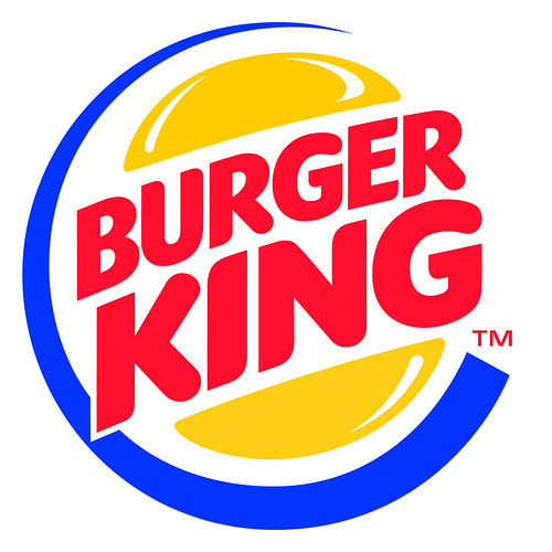
Below: Burger King packaging by Sterling Brands Design Studio, 2000.
Eye: Can design create appetite?
AT: I think that good design helps the consumer navigate, and stimulates a desire toward a specific product. There is something seductive about a beautifully packaged product; something very satisfying that makes us want to pick it up and try it. Good design can also create the right atmosphere in a restaurant or a space, adding to the satisfaction of eating a good meal. It is a nice feeling when things come together, when there is attention being paid to the overall experience of food and not to just the food itself. Good design creates the right context for our enjoyment of food.
14 September > 9 October 2010
Appetite
The Cooper Union
41 Cooper Gallery (3rd Ave. b/w 6th and 7th Sts.)
Lower Level 1
New York NY 10003
lubalincenter.cooper.edu
cooper.edu
Eye magazine is available from all good design bookshops and at the online Eye shop, where you can order subscriptions, single issues and back issues.
The summer issue, 76, out now, is a music special – full contents here, and you can see a selection of visual details on Eye Before You Buy on Issuu.