
Monday, 9:00am
23 January 2017
Information is everywhere
Awards tell only a fraction of the story, but there was plenty to learn from at the Information is Beautiful Awards, writes Max Gadney
The 2016 Information is Beautiful Awards were a generous and cerebral jamboree hosted by David McCandless, writes Max Gadney.
The annual awards focus attention on excellent work and have pretty consistently picked the best contenders. The outstanding winner this year was Buzzfeed’s investigation into American domestic surveillance, ‘Spies in the Skies’ – a project that initially draws you in through engaging data visuals and then socks you with the facts: these pretty patterns show spy planes in US airspace.
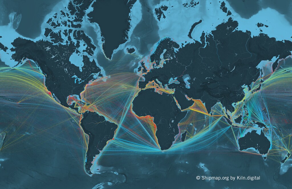
Images of successful work from the Information is Beautiful Awards, 2016.
Right Peter Aldhous and Charles Seife’s gold winning ‘Spies in the Skies’, Buzzfeed (USA),
6 April 2016, in the Data Journalism and Most Beautiful categories.
Top: ShipMap.org by Kiln (Duncan Clark and Robin Houston) which won Gold in the Interactive category.
Like any awards, these tell only a fraction of the story of the whole industry. History has seen several major waves of information design. In the eighteenth and nineteenth centuries, we had Playfair’s economic graphs, Florence Nightingale and John Snow’s diagrams of mortality and the Brookes slave ship poster. In the 1970s and 80s, the marriage of Modernism and corporate information publishing created a confident, clear canon of work – our industry’s nostalgia for the Modernist aesthetic has ensured the status of Vignelli’s NYC transport maps (and try finding a copy of Herdeg’s Graphis Diagrams for less than £150!)
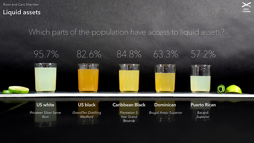
Gold prize in the Dataviz project and Outstanding Individual category went to Data Cuisine by Moritz Stefaner (Germany). IIB Awards, 2016.
We’re now in the middle of another wave, which has attracted several labels. Many talk about ‘data visualisation’, but that is limiting. The real value is not in giving a view of a data-set, but in enabling the data to power a service. Clients have more data than ever and smart studios are using it to solve two key business problems: improving customer experience and improving operational efficiency. The means to do this have become much more accessible, thanks to cloud-hosting and open-source visualisation software.
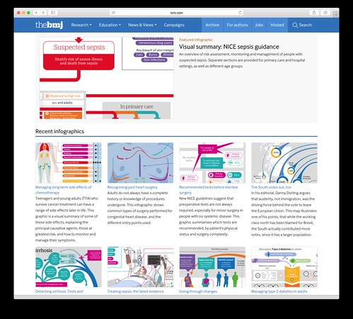
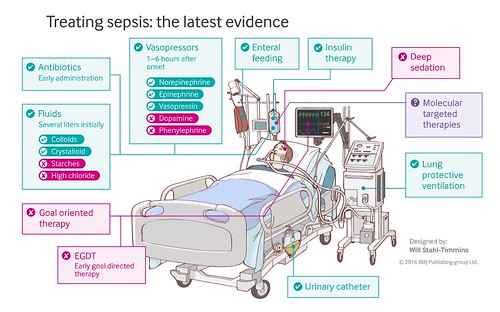
Will Stahl-Timmins’s gold winning infographics for The BMJ (British Medical Journal) in the Rising Star category, IIB Awards, 2016.
This new kind of information design has been thriving for a dozen years now, and its practitioners come from widely differing schools of thought and practice. Many gained a grounding in accuracy and deadlines from online journalism. (The Malofiej awards [See ‘Bart and Lisa go infografista’ in Eye 64], run by Javier Errea and the Spanish Society of News Design are a major influence on teams at the New York Times, the South China Morning Post and The Guardian.) Others learned how to design complex information systems in the booming financial services industry, where new user-focused methods of digital product development allow projects to prove their worth early on – an ever more important factor in the post-financial crisis economic reality. Data is under the fingers of these designers as ink is under a typesetter’s.
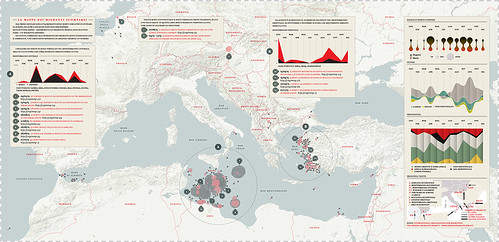
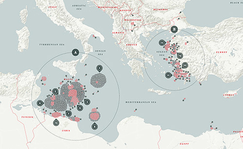
Valerio Pellegrini and Michele Mauri’s The Missing Migrants Map which is based on based on the data tracked by the Missing Migrants Project, a joint initiative of the International Organization for Migration’s Global Migration Data Analysis Centre (GMDAC) and Media and Communications Division (MCD). IIB Awards, 2016.
One trend visible at the 2016 Information is Beautiful awards was for designers to develop their own products: the London-based data visualisation studio Kiln is now turning away from client work to delivering a new data design platform (top). Another trend is acquisition: the data design agency Signal | Noise was recently bought by the Economist.
The work that made it through to the shortlist was all very accomplished, but I would like to see more projects that had been delivered for clients – accomplished resolutions of business, user and project complexities – rather than work that is self-initiated or enabled by luxurious long deadlines. It is odd that the awards have a separate category for ‘Commercial Work’ – after all, most design is commercial. I would like to see the balance redressed, and if these awards don’t do it then perhaps we need others to recognise the people breaking new ground in health, AI, security, finance, sports and analytics.
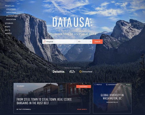
Gold in the Commercial or Business project category went to Data USA by Datawheel, Deloitte and Macro Connections. IIB Awards, 2016.
To my mind, discussion of data design is a step above much other design critique, because it involves the science as much as the art. But the truth is that the vanguard of digital data design is far beyond the understanding of most of the awards-giving industry, which sticks to acknowledging things that everyone can understand. That is fine for book covers, but not for a system that, say, writes algorithms to help libraries manage unique inventories. Just as design museums struggle to display digital work, so the design-celebration industry struggles to acknowledge it.
In 2016 most digital experiences involve a combination of different data sets. To do anything original with the design of a product or interface, you need not only to display the content, but to mediate the data – creating new data, new algorithms and new meaning, before it is visualised. Design has often sought to go beyond the surface into the true value that a company creates; data design gives us a real opportunity to do that. (At a recent conference, some esteemed peers showed off an airline rebranding project. It was great work; but I was happy that my own company, by contrast, works on interface designs for the software that runs airports and travel networks.)
The Information Is Beautiful awards were an excellent survey of part of a wider industry. It was a great night out, and David McCandless is a cracking host. You should go next year. But are awards the best way to celebrate all this? Well, maybe they are part of it. As we all know, prizes are a waste of time – until you win one.
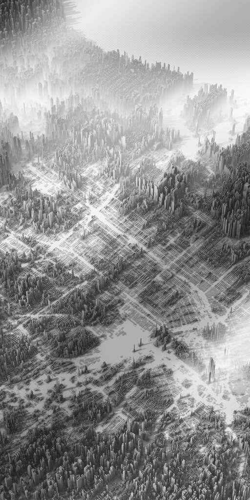
Herwig Scherabon’s gold-winning Income Equality in LA and Chicago in the student category. IIB Awards, 2016.
Max Gadney, founder and design director, After the Flood, London
Eye is the world’s most beautiful and collectable graphic design journal, published quarterly for professional designers, students and anyone interested in critical, informed writing about graphic design and visual culture. It is available from all good design bookshops and online at the Eye shop, where you can buy subscriptions and single issues.