
Friday, 12:48pm
21 October 2011
Less is more
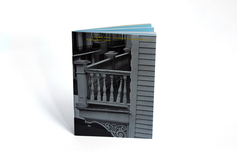
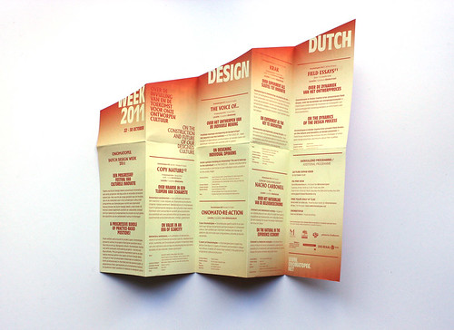
Dutch Design Week’s unfolding flyer; and Hyphen Press’s slim A6 catalogue
Editorial offices are swamped with promotional materials of all kinds: press releases, flyers, bloated brochures, glossy catalogues and stiff cards and folders that become more bulky and extravagant by the week: one embossed invitation was delivered wrapped in a big box as if it were a precious object.
Not to mention the assorted graphic items that are difficult to know what to do with, the designer stuff that Ralph Caplan termed ‘Too good to throw away, not good enough to keep’.
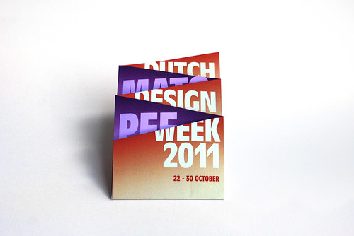
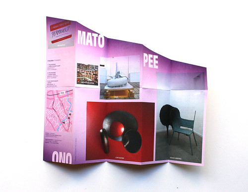
So it was refreshing to receive a couple of promo items this week that were small, informative and well designed. First: a folding flyer for Dutch Design Week (which starts tomorrow, 22-30 October), from Onomatopee (above and below). Full of information in two languages and plastered with sponsors’ logos, it is a slim printed item that also has a satisfying three-dimensional form, thanks to the way it is cut and folded in a design reminiscent of some of Richard Hollis’s work (see Reputations in Eye 59).
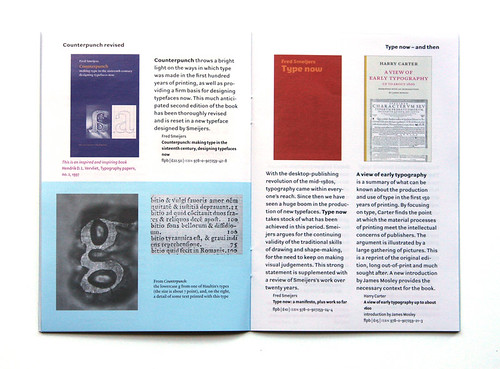
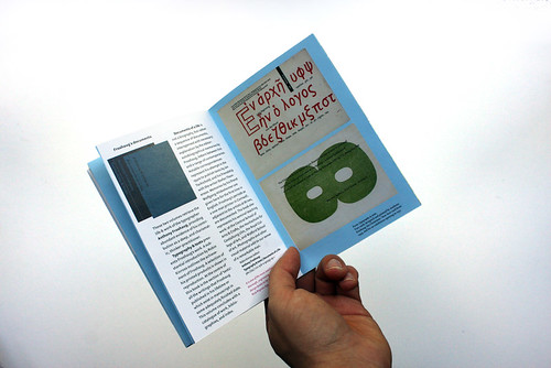
The other item is the A6 Catalogue & almanack 2011-2012 (below) from Hyphen Press, edited and designed by Robin Kinross, the subject of the Reputations interview by Rick Poynor in Eye 80. Set in typefaces designed by Fred Smeijers, this 32-page A6 booklet is packed with interesting writing and images.
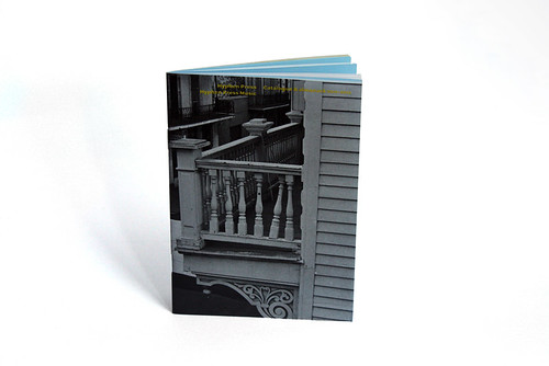
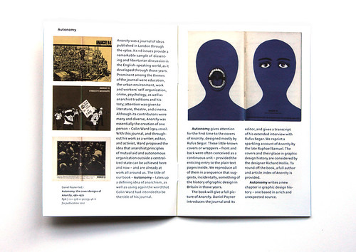
The catalogue pages, including information about new and forthcoming books such as Jazzpaths and Autonomy (above) are in Ludwig Pro on white, while the ‘almanack’ pages are in Haultin Pro on blue. The blue sections include details from The Transformer and Counterpunch (below).
Hyphen Press Music items are on yellow pages at the back.
The almanack’s centrefold contains an entertaining account of Kinross’s request for the typography / graphic design equivalent of the ‘Dogme’ manifesto for making films.
An immediate response from the late Paul Stiff is printed in full, starting with ‘Readers come first, second, and third. Designing is not done for peer approval or prizes,’ and ending with ‘No-go logo (the planet is already too heavy).’
Hyphen Press, of course, has no logo.
Eye is the world’s most beautiful and collectable graphic design journal, published quarterly for professional designers, students and anyone interested in critical, informed writing about graphic design and visual culture. It’s available from all good design bookshops and online at the Eye shop. For a taste of the new issue, see Eye before you buy on Issuu. Eye 81 has gone to press.