
Monday, 9:00am
20 July 2020
Pier review
various designers
Johnson Banks
Joby Carter
Hemingway Design
Design history
Graphic design
Photography
Typography
Visual culture
Decorative typography and lettering evoke the halcyon days of the British seaside. The fourth in Justin Burns’s series about coastal graphic design
Lettering, typography, and accentuated three-dimensional signs dominate the British coast, writes Justin Burns.
The bright, decorative signage is large in scale and big on personality, promising fun, escapism and fish’n’chips. While painted and illuminated visual signs identify, inform and promote, they also play a significant part in creating our experience of the seaside.
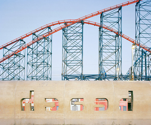
Rob Ball, Blackpool Beach Sign, 2018.
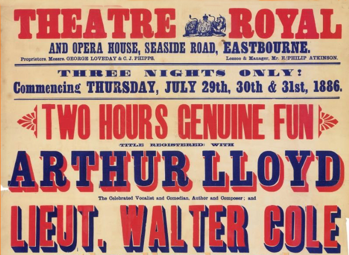
Top. Theatre Royal Eastbourne, Poster detail, 1886.
Rob Ball, Circus, Marine Parade, Great Yarmouth, 2018.
Documenting the seaside since 2009, Photographer Rob Ball has documented more than 35 coastal towns. His images record a unique culture that is at risk of disappearing forever.

Historically, British seaside towns have portrayed their desired status through architecture and town planning, which have subsequently informed the designs of attractions, piers and promenades. Lettering and its relationship to architecture and place – if sometimes misunderstood and under-valued – has been fundamental to the identity and formation of British resorts. As Nicolete Gray wrote in Lettering on Buildings (1960), while architecture and lettering have a ‘utilitarian function’ and formality, it is also the intention of designers to ensure any visual representations are ‘pleasing, as well as useful.’ Language and its representation are never without intention or meaning, however successful within the environmental context.
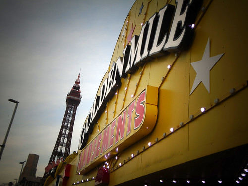
Blackpool Promenade, 2018. Photo: Justin Burns.
Land Prom Grayson Dodgems, Heritage Blackpool, 1958.

Photograph from the Blackpool Archive of Foxhall Square Stalls, Blackpool, Heritage Blackpool, 1963.

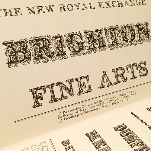
Graphic design, lettering and typography play a significant role in constructing the recognised ‘image’ and experience of the seaside. In assessing the origins of the typographic landscape on the seafront, piers, theatres and theme parks, we can observe nineteenth-century vernacular sources within the environment. During this period, industrialisation had a significant impact on commercial printing, with the advent of new bolder letterforms to communicate to the masses. Ornate and heavy-weight typefaces are still in existence today along the promenade, referencing Egyptian Slab Serif, ‘Fat Faces’, and Tuscan letterforms from the early 1800s. The Fat Face, inspired by the English architectural vernacular of this period, with exaggerated strokes and delicate serifs, was a fundamental tool in advertising theatres, pier shows, and circuses of the period.
Anna Fox (Hyman Gallery), Hayling Island, 1986.

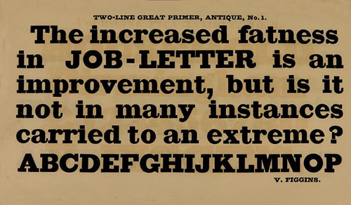
These bold faces were developed by Robert Thorne before 1810 and can be found in William Thorowgood’s 1821 publication of New Specimen of Printing Types. Thorne’s Fann Street and the Foundries of William Caslon IV and Vincent Figgins were the key innovators of the fatter, bolder face. In 1815, Vincent Figgins published his specimen books outlining a range of Modern Styles, Egyptians and numerous ‘jobbing typefaces’ that were three-dimensional. Figgins developed faces that appeared physical in their communication of language, bold and decorative signs to be seen from a distance. Jock Kinneir described Egyptian faces as the ‘letterforms of emphasis’ displaying strength and clarity when applied to buildings of juxtaposing styles.
V. Figgins Type Specimen, 1834.
Detail of page from Nicolete Gray’s Nineteenth-Century Ornamented Types and Title Pages, 1938.
The identifiable visual language of these shores was documented and analysed in Nicolete Gray’s Nineteenth-Century Ornamented Types and Title Pages (1938), assessing the need to ‘explore’ and not to ‘exclude’ the breadth and diversity of British letterforms. Gray argued that the visual, environmental tools available were limited, lacked ‘typographic ideas’, association and overly driven by the notion of legibility. In considering the integration of lettering with architecture, Gray proposed that ‘identity and character’ should take prominence over legibility.
V. Figgins Type Specimen, 1834.
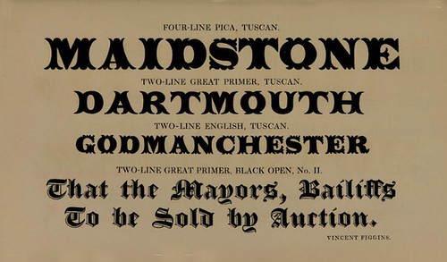
The decorative characteristics of the Tuscan letterforms have a rich association with advertising and recreational promotion. Vincent Figgins introduced the first Tuscan faces in 1817, and further ‘English’ Tuscan typefaces were produced by Thorowgood in 1821 and Caslon in 1830. Independent commercial foundries subsequently produced ‘novelty’ derivatives that would attract passers-by, a visual language later associated with communal leisure and retail.
Morelli’s Ice Cream Parlour, Broadstairs, ca. 1980.

Coastal towns, as with the city and provincial areas, are spaces that facilitate diverse dialects and communicative means, via cafés, restaurants, amusement arcades, and ice cream parlours. Many cafés and eateries still evoke the typographic approach deployed during the postwar period when Britain looked to both reflect and to look forward within an era of austerity. The Festival of Britain, that ‘tonic for the nation’, celebrated domestic innovation and industrial creativity through displays on The Land, Dome of Discovery and The People – in which the British seaside was also showcased. Identified as a ‘beacon for change’ it was a contemporary platform showcasing arts, design, and craft. Many observers, such as architectural critic Reyner Banham, questioned its ‘Englishness’, its originality and its influence. In establishing a unified, referential design approach, the Festival’s Typography Panel, which included Nicolete Gray, Gordon Cullen, Gordon Andrews, Austin Frazer and Charles Hasler (chair) was inspired by the work of graphic designer and writer Robert Harling, whose typefaces Playbill and Tea Chest evoke characteristics and associations to circus and fairground typography. An exponent of the Victorian revival, his publication Alphabet and Image showcased British graphic design, recognising the value of the decorative face.
Spreads from the Festival of Britain Typography specimen book, 1951.


Architectural and typographic origins can denote halcyon days of the British seaside, prior to the allure of the package holiday. Egyptian slab-serifs and Tuscan letterforms thankfully remain within the layered visual landscape of seaside resorts, providing a link to the reinterpreted and remain an integral part of the visual narrative. Alongside high street branding and digital forms of communication, ornamented lettering embellish fairgrounds and piers to this day – hand-painted, printed, laser-cut and illuminated.
Brighton Palace Pier, changed from Brighton Pier in 2018, with new illuminated signage, a derivative Tuscan typeface based on the Joseph Gillé designed ‘Madame’.

Johnson Banks, Brighton Festival Poster, 2020.

Traditional practices are still integral to the visual representation of the Walzers, kiosks and signs at the fairground, by signwriters such as Joby Carter, enriching our experience with authenticity. Recent rebrands of resorts, theme parks and festivals acknowledge the nostalgic ‘concept’ of the British seaside in a contemporary context. Campaigns by Hemingway Design, as part of their coastal regeneration initiatives and Johnson Banks’s identity designs for Brighton Festival and Dome all reference heritage value while avoiding dated stereotypes. Graphic design – and in particular lettering and typography – remain fundamental tools in identifying and persuading us to take a trip to the seaside. Just for now, however, it’s best we all don’t go at once.
With thanks to Rob Ball, Phil Baines and Paul Barnes.
Justin Burns, Head of Art & Design, Leeds School of Arts at Leeds Beckett University. Burns is exploring the graphic language of the seaside for a PhD.
Eye is the world’s most beautiful and collectable graphic design journal, published for professional designers, students and anyone interested in critical, informed writing about graphic design and visual culture. It is available from all good design bookshops and online at the Eye shop, where you can buy subscriptions and single issues.