
Monday, 11:50pm
9 April 2012
Playing with the logo
the events department
the identity department
type tuesday
Design history
Graphic design
Illustration
Posters
Typography
How Ken Garland + Associates had graphic fun with the Galt Toys identity
The current Kemistry Galley exhibition of Ken Garland’s designs for Galt Toys is full of interesting work, nicely illuminated by Garland’s captions recalling a very happy designer-client relationship that spanned the two decades from 1961-81.
Top: catalogue cover, 1974-75. Drawing: Daria Gan.
Above: publicity leaflet. Photography: Harriet Crowder.
The small, concentrated show includes posters, advertisements, brochures and games designed by Ken Garland and Associates that visitors can actually play in the gallery.
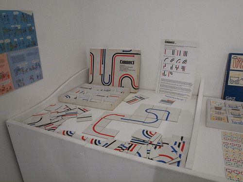
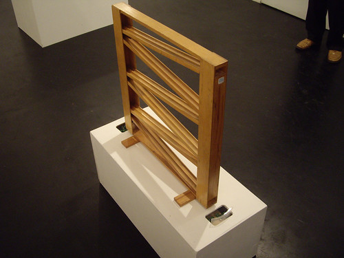
Few current exhibitions have anything quite as enjoyably interactive as Garland’s Connect (above) or marble run (below).
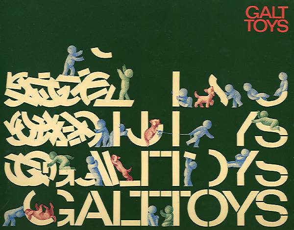
Several items explain Garland’s approach to Galt’s identity design – what might now be termed ‘branding’ – and the typography of the logo. Garland mentions this in interview with Anne Odling-Smee for Reputations in Eye 66: ‘When we were working for Galt Toys, although we used the same logo, we twisted it round and did umpteen versions of it and never let it stay the same.’
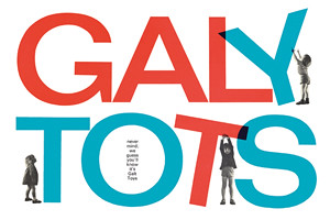
In a handy A6 brochure, Galy Tots, published by his own Pudkin Books, Garland explains further:
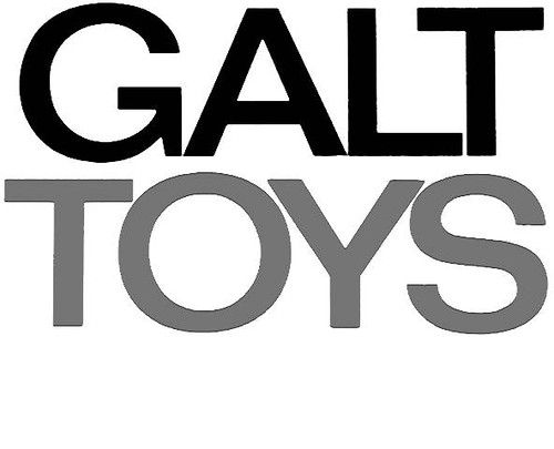
‘The style was maintained consistently for 20 years. The letterforms chosen for GALT TOYS were from a very recently issued typeface, Folio Medium Extended. The Folio type family was the creation of the Bauer Type Foundry, Frankfurt, then a close rival to the Helvetica and Univers type families.’
Garland continues: ‘[We] were determined not to let the Galt Toys logo become a sacred cow, not to be mucked about with (as was decreed with so many logos in the 50s and 60s). It would, indeed, be mucked around with, but only by us.’

Above: catalogue cover, 1961-62.
Garland: ‘There is, I have to say, more than mere whimsy in these variants. With the eager involvement of my Associates I was totally devoted to breaking down the tyranny within which logotypes were normally constrained. I felt that they were best used as the starting point for design ideas, rather than as an inviolable, enshrined entity.’
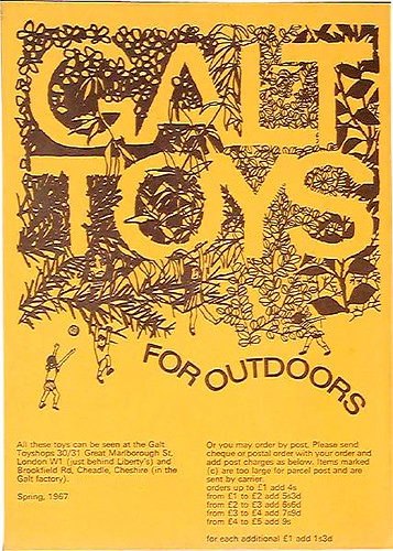
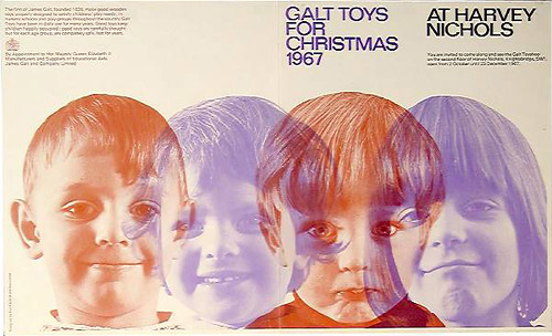
Above: publicity leaflet, 1967. Drawing by Wanda Garland.
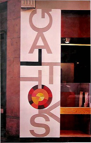
Below: mural for London toyshop.
‘Galy Tots’ continues at Kemistry Gallery until Sat 21 April 2012. Admission free.
Below: catalogue cover for 1969-70.
Read Anne Odling-Smee’s Reputations interview with Ken Garland in Eye 66.
Eye is the world’s most beautiful and collectable graphic design journal, published quarterly for professional designers, students and anyone interested in critical, informed writing about graphic design and visual culture. It’s available from all good design bookshops and online at the Eye shop, where you can buy subscriptions and single issues. Eye 82 is out now – you can browse a visual sampler at Eye before you buy on Issuu.