
Tuesday, 9:00am
29 October 2013
Tear and share
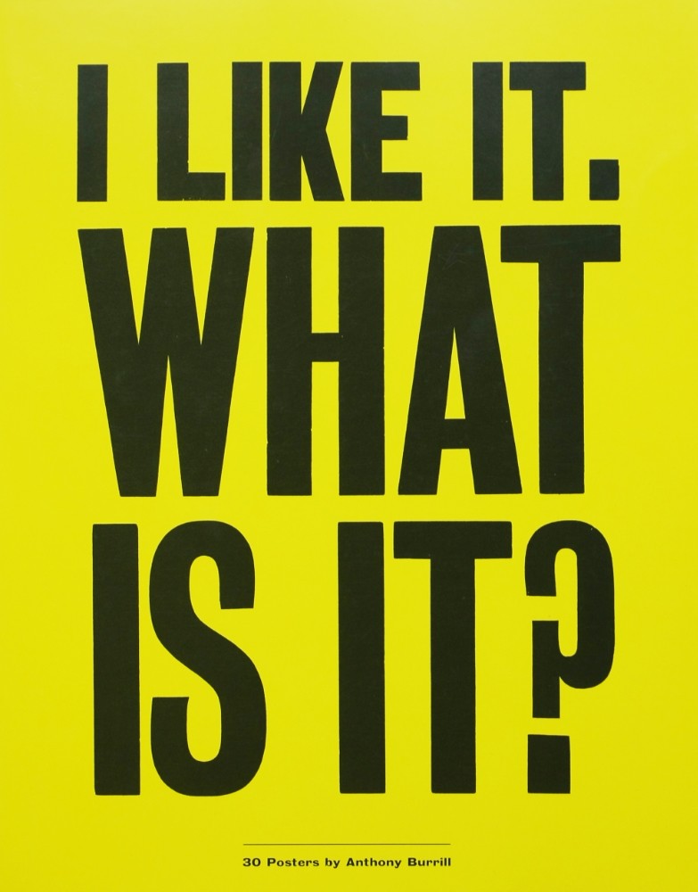
I like it. What is it?
30 Posters by Anthony Burrill<br> Laurence King, £19.95<br> Design: AB and A Practice for Everyday Life<br> Text: Patrick Burgoyne<br>From Anthony Burrill and Apfel – a book of posters you can pull out and put on your wall
If you have ever wanted to stick one of Anthony Burrill’s prints on your wall, a new book offers many of his ‘greatest hits’ in one volume, printed on heavy paper and perforated for easy removal, writes Meredith Thomas.
It’s not just the slogans that are honest and to the point – the colours and graphics add up to make each statement as bold as the last. And every poster has a story.
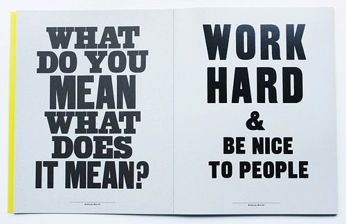
Spread from I like it. What is it, 2013. ‘Work hard and Be Nice to People’ (2004) is one of Anthony Burrill’s most recognisable posters, typeset and printed by Adams of Rye.
Top: cover. The book was designed by A Practice for Everyday Life (Apfel) and Anthony Burrill.
With simple hues of grey and popping colours of yellow and green to accompany the thick, black letterpress type on each poster, Burrill’s work is depicted as an inspiration, which can be seen in the images provided of his work in use, including the popular ‘Work Hard and Be Nice to People’ poster.
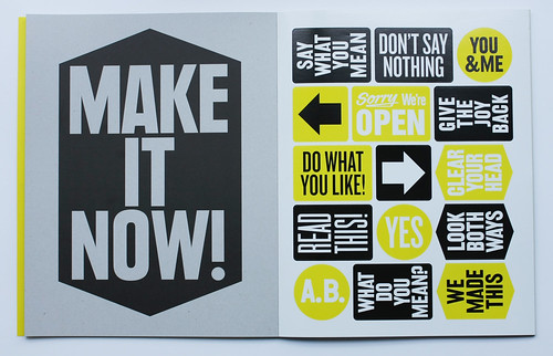
Spread featuring a page (right) of typographic stickers.
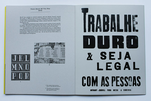
Spread showing poster (right) printed at Gráfica Fidalga (now closed) in São Paulo, 2012. This is the Portuguese-language version of ‘Work Hard and Be Nice to People’. Translated back to English, it reads: ‘Work Hard and Be Cool With The People’.
Short texts on the back of each poster add context and anecdotes. Burrill’s distinctive voice and thought-provoking attitude leave a lasting impression, all ready for an empty wall near you.
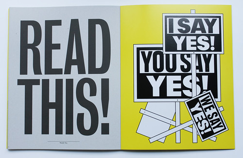
Right spread: Anthony Burrill, ‘Identity Land’, 2012, shown at the Z33 House of Contemporary Art, Belgium, featuring a series of placards carrying conflicting statements.
See also ‘Over the rainbow’, our profile of Anthony Burrill in Eye no. 75 vol. 19 Spring 2010.
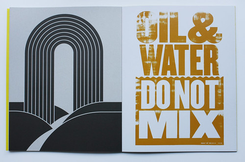
‘Oil & Water Do Not Mix’, 2010, produced in collaboration with the advertising agency Happiness Brussels in response to the Deepwater Horizon oil spill in the Gulf of Mexico off the shore of Louisiana. See ‘Troubled waters’ on the Eye blog.
Meredith Thomas, Eye intern, Autumn 2013.
Eye is the world’s most beautiful and collectable graphic design journal, published quarterly for professional designers, students and anyone interested in critical, informed writing about graphic design and visual culture. It is available from all good design bookshops and online at the Eye shop, where you can buy subscriptions and single issues.