
Monday, 12:53pm
15 August 2011
Type Tuesday
Back with a flourish #3. Of swashes and cookbooks
Typographic embellishment is the theme of this week’s Type Tuesday, as we continue to examine the swash with Christian Schwartz. In this third instalment of ‘Back with a flourish’, we turn our attention to cookbooks.
Top: Ed Benguiat, ITC Bookman, published by International Typeface Corporation, New York, 1976.
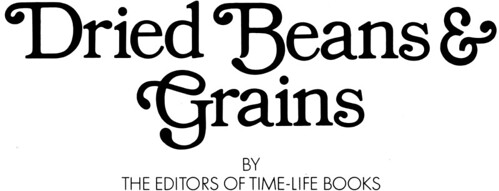
Above and below: Titlepiece and headline from The Good Cook: Dried Beans & Grains, designed by Ellen Robling. Time-Life Books, Alexandra, Virginia, 1982.
Poor Bookman Swash. It has been a typographic joke for decades now. Originated by ATF but famously expanded upon by Ed Benguiat and others at Photo-Lettering, Inc, this face, seen here in headlines from a Time & Life cookbook series from the early 1980s, is generally considered to be the nadir of the whole swash genre, evocative not of calligraphic elegance or tasteful flourishing, but of strip-mall craft supply stores and bad sitcoms.
This face has started to pop up again lately, especially on hipster T-shirts, but here its blissfully unironic use captures the best and worst traits of the face. The loops and curlicues celebrate the variety of things that can be done with letterforms, but the headlines are overwhelmed by so many individual characters vying for attention. While some of the swash characters in the top samples look a bit timid, Ed Benguiat’s ITC Bookman Swash exudes confidence with its large x-height and demonstrative loops and tails.
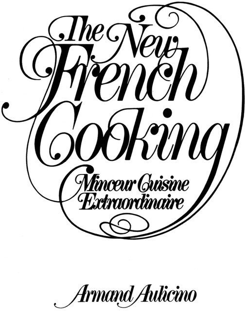
Above: Lettering Artist unknown, titlepiece for Aulicino, The New French Cooking, Grosset & Dunlap Publishers, New York, 1976.
A huge number of cookbooks published between the late 1960s and early 1980s had cover lettering in this ‘lavish lowbrow’ style, which combines ATF’s insatiable desire to add new swashes to old typefaces with George Bickham’s taste for ornamentation. Perhaps they were hoping to share in the success of Julia Child’s The French Chef Cookbook (Knopf, 1968) by mimicking – and often exaggerating – its cover lettering, or maybe it was just an attempt to look upscale.
The main part of this lettering almost certainly came from Photo-Lettering, Inc, but the larger flourishes were added by another artist who appears to have had more enthusiasm than skill. The overall effect has a so-bad-it’s-good charm, but 1976 marked the end of swashes as high style, and the year they became firmly entrenched in the uncool mainstream – cookbook covers, for example.
Type Tuesday is our weekly column on typography and type design, featuring a mixture of brand new articles and material from the extensive Eye archive. For more Type Tuesday articles, click here.
Eye is the world’s most beautiful and collectable graphic design journal, published quarterly for professional designers, students and anyone interested in critical, informed writing about graphic design and visual culture. It’s available from all good design bookshops and online at the Eye shop, where you can buy subscriptions, back issues and single copies of the latest issue. The latest issue, Eye 80, is out now.