
Tuesday, 10:10am
20 September 2011
Type Tuesday
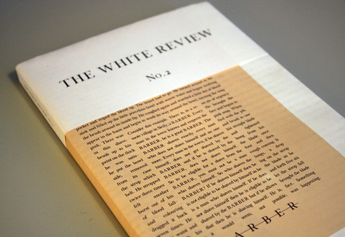
A bespoke typeface delivers ‘giddy radicalism’ for The White Review
From McSweeney’s endless experiments with form (see Eye 78) to The Drawbridge’s refined elegance (see Eye 73), literary journals can be a magnet for adventurous design practice. Rookie magazine The White Review has design at its core, right down to the bespoke typeface designed by Ray O’Meara.
An RCA alumnus, O’Meara’s design credits include Kilimanjaro magazine and he is an associate lecturer at the Chelsea School of Art and Design
‘It was part of our founding process that good design, art and literature could co-exist’ said editor Ben Eastham in conversation with Eye, ‘and that people can be ‘literate’ in a variety of ways.’
Speaking to Eye about his design, O’Meara said: ‘From a design perspective, the approach to The White Review was that it should have a sophisticated simplicity. The White Review is a new presence – there are other journals and magazines that use typefaces that might have been appropriate but I wanted ours to have a different voice. It needed to be bespoke to The White Review.
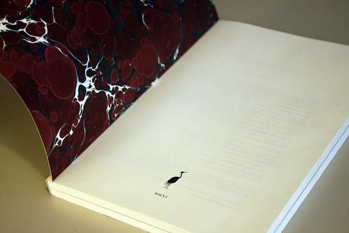
We agreed that we wanted to celebrate a new economy of print that’s not just about paper stock and marbling, it’s about the printed word. What’s exciting about The White Review is that it can be an essay in language in itself; how it is composed, presented and read. The typeface is an integral part of that story.
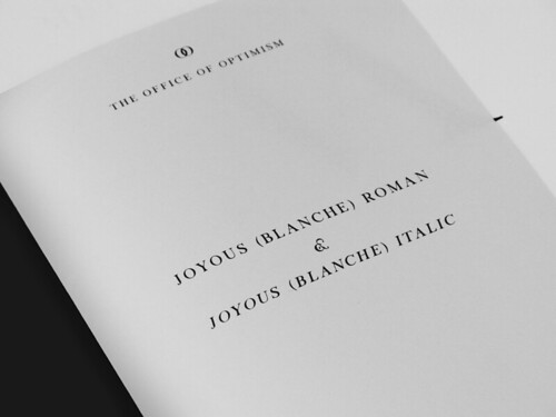
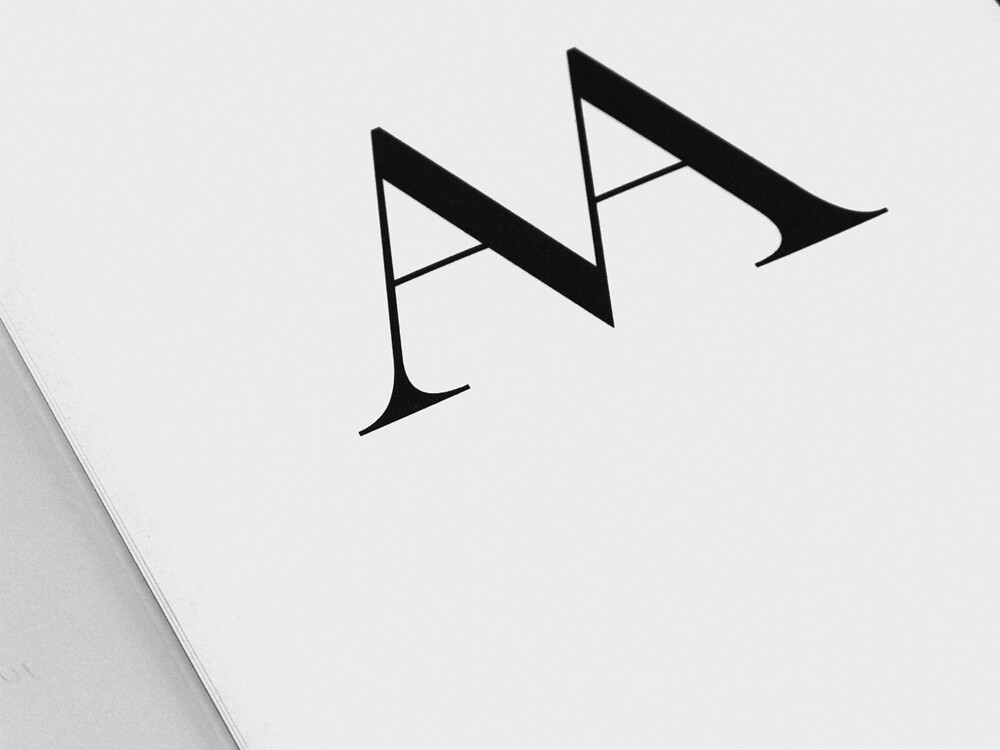
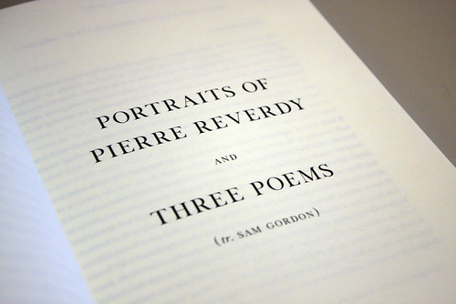
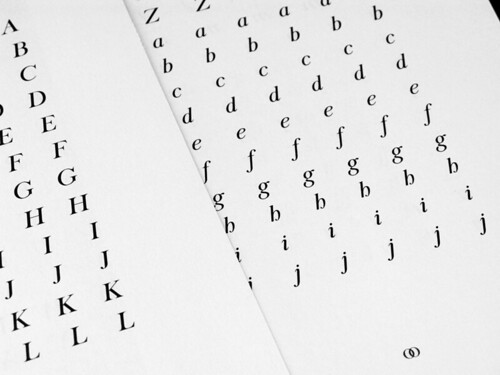
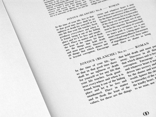
‘I drew a serif called Joyous (Blanche). It needed to be something new, but it also needed to be an evolution. Developing the late transitional/early modern style of Joyous (Blanche) took some time, but it was an instinctive fit for The White Review.
‘One of the main influences was the enlightenment and its various revolutions; the 100-odd year period that gave us transitional serifs and early moderns – something we read as classical today. It was violent, cruel, exciting, optimistic. In printing terms it was a volatile time, there was a lot of cultural and technological change – much like the present … I wanted it to have an element of that giddy radicalism,’ says O’Meara.
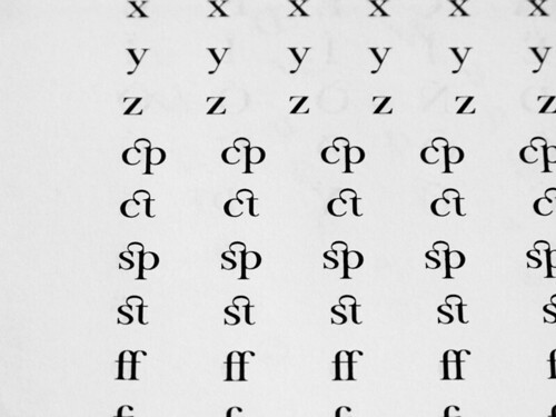
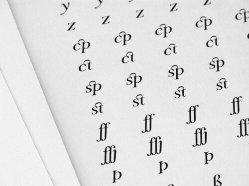
‘There is an entire set of ligatures drawn for Joyous, I’ve been somewhat hesitant to use the entire set however – primarily because of it perhaps seeming too heavy-handed as a reading voice, which, given that this is new writing, might be conflicting/excessive.
The next issue of The White Review (#3) is published October 13th, and features interviews with writers Will Self and Marina Warner, fiction by Federico Falco, Jeremy M. Davies and K. J. Orr alongside photography by Stephen Gill and Oliver Griffin and artwork by Alison Rossiter and Nick van Woert. Available to buy online direct from The White Review website.
Type Tuesday is our weekly column on typography and type design, featuring a mixture of brand new articles and material from the extensive Eye archive. For more Type Tuesday articles, click here.
Eye is the world’s most beautiful and collectable graphic design journal, published quarterly for professional designers, students and anyone interested in critical, informed writing about graphic design and visual culture. It’s available from all good design bookshops and online at the Eye shop. For a taste of the new issue, see Eye before you buy on Issuu. Eye 80, Summer 2011, is out now.