
Tuesday, 3:38pm
7 February 2012
Type Tuesday
Letters that sell: a typographic history of UK department store John Lewis
From store signing to ticketing, customer correspondence, leaflets, advertising and websites, typography plays a crucial part in shaping the identity of a department store group such as John Lewis.
In Eye 81, Jim Northover examined the corporate identity adopted by the company over the past 50 years (see ‘Trust in Modernism’). Here, we revisit his take on the retailer’s evolving typographic style.
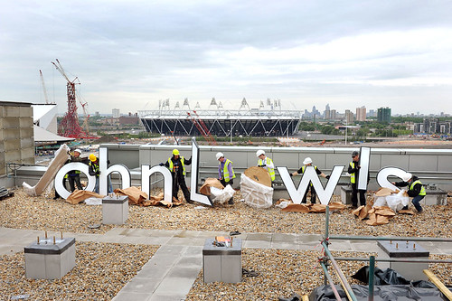
Top: Construction workers erect modified Gill Sans lettering for the new John Lewis department store at Westfield Stratford City in east London - the partnership's first custom-built store in twenty years. Photograph: Michael Walter at Troika, 2011.
As an early adopter of Modernist themes in retailing, John Lewis used Helvetica from the 1970s to the 90s. A classical note was struck in 1989 with the introduction of Elan capitals for the store names in the John Lewis Partnership (including many acquired stores such as Coles Brothers and Pratts, which were still known by their original names until the 1990s).

Above: JLP Logo designed by Hans Schleger (aka Zero), 1960s, entwines the letters of the company's acronym. An article in the in-house magazine, Partnership Gazette, described the process: ‘The problem was how to link them, to make ot just a monogram, but a symbol that would express something of the special unifying character of the Partnership’.
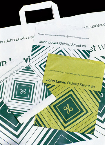
Below: Diamond shaped bags designed by Peter Hatch, 1960s.
At the time, John Lewis design co-ordinator Douglas Cooper wrote: ‘The principal typeface which was used to identify the partnership was Helvetica. When it was first brought here from Switzerland in the 1960s, it was a wonderful example of clean, Modern typography. Since then it has been used by all and sundry as the chief letter form for information graphics. We wanted to find another typeface, exclusive to us.’
In a booming, competitive period for high street retailing, the choice of Elan (Albert Boton, 1985) promised more stylish, less utilitarian department stores. However, Helvetica remained in use for everyday communications across the business.

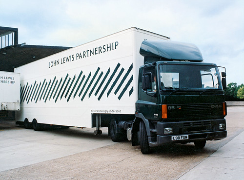
Above and below: Lloyd Northover’s 1989 identity for John Lewis linked its department stores and Waitrose supermarkets by introducing a diagonal stripe motif. The design was used at different scales throughout the business, from trucks to carrier bags, and even as a security pattern on customer account statements. Company and store names were set in Elan capitals.
It was not until this century that Gill Sans was introduced as the John Lewis type family. Interviewed in 2001 for the John Lewis in-house magazine, Cooper had acknowledged the need for further change: ‘The new typeface we will be using on everything from signage to stationery is very elegant and looks contemporary – ironic really, as Eric Gill designed it in the 1920s.’
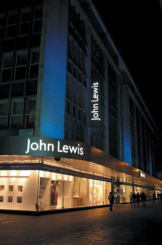
Above: External signage, 2003. Example of John Lewis identity design from the John McConnell era. Design: Pentagram.
As the John Lewis brand replaced nearly all other store names, the typeface was adapted by Pentagram to create John Lewis and Peter Jones logotypes, with chamfered initial letters that echo the diagonal pattern that forms part of the identity. In 2001 a bespoke version of Gill was introduced to create better legibility and flexibility, and in 2009 a further range of weights was designed. The light and ultralight weights initially appeared in the fashion and beauty departments and in Edition magazine. Now, as part of a consistent typographic policy, the full range of Gill adaptations is in use across all departments and communications.
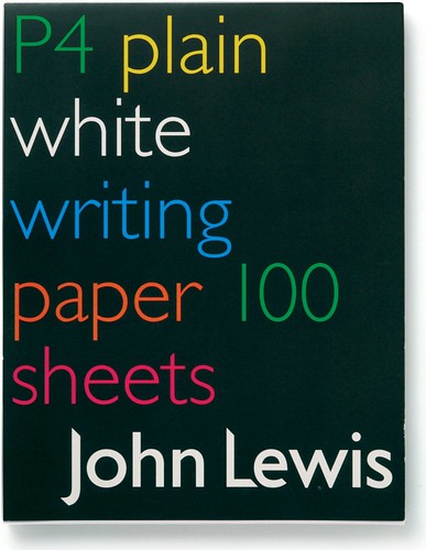
Above: Writing paper. Design: Flo Bayley, 2003-04. Example of John Lewis identity design from the John McConnell era. Design: Pentagram.
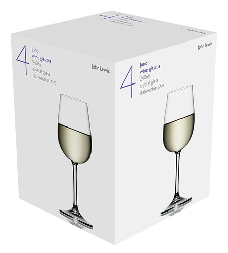
Below: Packaging (2011) for the Juno glassware range, to be launched in 2012. Design: Irving & Co. Photography: David Parfitt.
See Jim Northover’s article ‘Trust in Modernism’ and our Reputations interview with John McConnell – both published in Eye 81 (below)
Eye is the world’s most beautiful and collectable graphic design journal, published quarterly for professional designers, students and anyone interested in critical, informed writing about graphic design and visual culture. It’s available from all good design bookshops and online at the Eye shop, where you can buy subscriptions, back issues and single copies. The latest issue, Eye 81, has the theme of ‘Designers and clients’. Eye 82 will be on press soon.