
Wednesday, 9:54am
26 May 2010
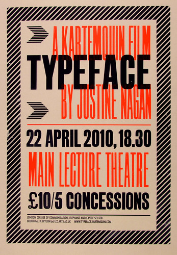
Typeface, the movie
New designers test old methods at the Hamilton Wood Type Museum
Typeface, screened last week at the London College of Communication, is billed by its makers as documenting a convergence of modern design and traditional technique, writes Sally Jeffery.
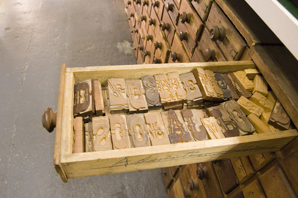
In truth the film is more a Rust Belt elegy, for the once mighty Hamilton wood type factory in Two Rivers, Wisconsin, on the western shore of Lake Michigan. It’s now a museum and workshop, struggling with vanishing skills, a dripping roof and endless boxes of uncatalogued wood type.
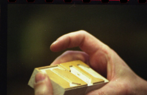
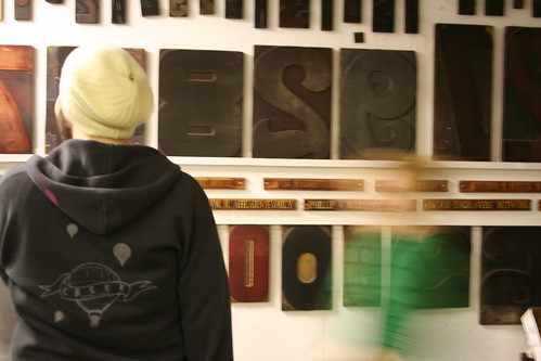
The camera wanders over the cases of type. This stuff is wood, not metal, and it gets a Josh Ritter acoustic soundtrack. A bit of fondling goes on, of letters and their printed impressions. But here’s the convergence: Norb Brylski the pantograph operator is still there too, cutting letters, and Bernice Schwahert trimming them, both in their eighties. Designers come from the Twin Cities and New York to work with them, and we see a moment when the router on the pantograph has stopped halfway along an edge, leaving a stepped line. Hold it there says the designer, that’s what I want. Norb disagrees; that’s not how it ought to be. Conjunction perhaps, more than convergence.
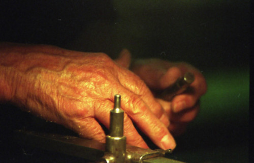
Dennis Ichiyama’s students leave their Macs and work with wood type as a hands-on way to play about with space. He also believes there is a design benefit that comes from being slowed down. He must be right; but the question of speed is interesting. In the film some young designers look at a page of modern text setting and agree that you couldn’t possibly set all that by hand, it would be way too slow. Have they forgotten how newspapers were set until 1900? Norb can cut three letters a minute.
In wood and metal type the space is as tangible as the letters. You can touch it and move it around. With enough resolve, Hamilton and others may keep on knowing how to cut new letters, and cast them, so designers and printmakers can keep on doing new things with them. Or the letterpress future may turn out to be just a decorative dent in the paper reproduced by a polymer plate.
Typeface, directed by Justine Nagan, was produced by Kartemquin Films, whose best-known work is the distinguished 1994 documentary Hoop Dreams. In the Summer 2010 issue of Eye Matthew Carter writes about the new typeface he has made for the Hamilton Wood Type Museum.
Eye 75 is a typography special issue, featuring illustrative type and lettering, calligraphy, type on the Web and Mark Thomson’s Reputations interview with Peter Biľak. You can read a selection of pages on Eye Before You Buy on Issuu. Student subscriptions are half price, bit.ly/EyeStudentOffer.
Eye magazine is available from all good design bookshops and at the online Eye shop, where you can order subscriptions, single issues and back issues.