
Wednesday, 12:12pm
30 January 2013
The other end of the spectrum
Paul Hetherington
Nick Knight
Peter Saville
Graphic design
Magazines
Music design
Photography
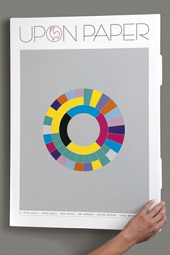
Upon Paper 02 sports a Peter Saville cover. John Ridpath talks to editorial director Paul Hetherington about this monster-format ’zine
Upon Paper is a publication made so vast in format that I had to make special travel arrangements to get it home, writes John Ridpath.
Once I did, sitting down to digest the contents was as far from the ergonomic convenience of a conventional magazine or tablet as one could imagine. But perhaps that is the point. The large 49x69cm format makes readers stop multi-tasking and clear a space in order to fully consider the imagery and articles within.
Upon Paper, 2012. Cover by Peter Saville, based on his colour-coded graphics for Power, Corruption and Lies by New Order.
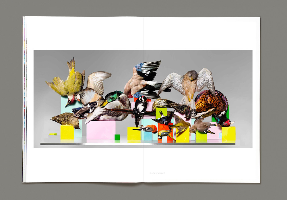
Top: spread with Nature Morte by Nick Knight.
Upon Paper was initiated by Hahnemühle, a German paper producer founded in 1584, as a celebration of paper itself – and the myriad forms of creativity that find expression upon it. The biannual / bilingual print publication forms one part of a broader project that includes online content and a physical exhibition space in Berlin. The second issue explores the theme of colour.
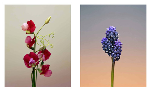
Photographers are strongly represented: Erwan Frotin sets a lurid tones with his exotic flowers over soft gradient backdrops (below), Jeff Marano compiles a set of vintage Kodak images; and Nick Knight’s Nature Morte (top) depicts a collection of stuffed birds in a colourful collision of death and beauty.
Eight pages are devoted to the distinctive colour palette of Morocco, mixing imagery with interviews with local voices desperate to share the country’s true colours.
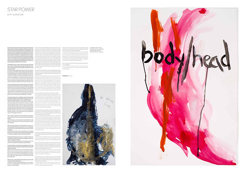
There is also a musical thread, with Sonic Youth’s Kim Gordon talking through her visual art (below), Wyndham Wallace discussing Talk Talk’s Colour of Spring, and music journalist Karl Lippegaus exploring the appeal of ‘Blue’ to jazz musicians, Joni Mitchell and the blues.
The cover was created exclusively for Upon Paper by Peter Saville, based on the colour-coded alphabet he created for the artwork of New Order’s album Power, Corruption and Lies.
I spoke to Paul Hetherington, former Creative Director at SHOWstudio and co-founder of Big Active, about the latest issue.
JR: Can you tell me more about your choice of ‘colour’ as the theme for the new issue?
PH: ‘Color’ [sic] is the curatorial theme, not necessarily the subject and I'm glad you’ve made that distinction. We were keen to find a theme that would show off the production quality of Upon Paper beyond question, to set the bar high and reach it early on. ‘Color’ is obviously a much more universal theme than our first issue (L. A.), but I think both equally portray the diverse and eclectic mix of subject matter we want to pursue.
Our editorial remit is to show what’s worth looking at, talking about, and ultimately put what’s worth printing ‘upon paper’. We try to offer the gallery experience, ‘exhibiting’ work at actual size, or at the scale at which they can be most appreciated. The pages are loose bound, no staples, so certain pages can effortlessly make the transition to a reader’s walls. We’re offering the other end of the spectrum in the age of Google thumbnails, where everything – good-and-bad – is reduced to 100 pixels high.
JR: What’s the story behind the cover?
PH: This year is the thirtieth anniversary of New Order’s ‘Blue Monday’ single, and the follow-up album Power, Corruption and Lies. We illustrated this with a series of pertinent phrases written in his colour code – they’re extracted from an interview in which he discusses in detail how this iconic work came to be.
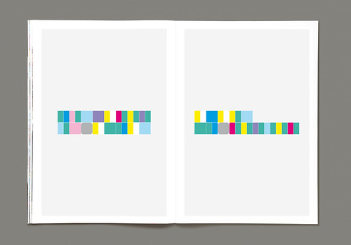
Peter told me he had always intended to revisit the colour code and to continue to put it to use, yet it’s something he never did. In the final outcome of ‘Color’, (the interview appears on the Upon Paper website), the magazine pages go totally unexplained and uncredited. Perhaps many will turn these pages never knowing their provenance or intention. As such it fulfilled Peter’s wishes for it to work in a comparably enigmatic way as the original deployment on the New Order sleeves [for Factory Records]. Thus the magazine cover, and a bit of ingenuity, is needed to decipher the phrases.
JR: Can you tell me anything about your production process?
A first issue is always a bit of a rush and a push, no matter how far in advance you begin to plan, many factors are being worked out and people are getting to know how to work with each other. Given more time to get the second issue produced, we were able to source big enough hi-res images that could really fill the pages. The picture researcher was still receiving images barely big enough to print a postcard, and so it takes a few back and forth conversations to get what we need.
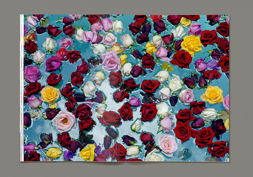
We print in Leipzig, Germany, to a standard higher than most of the art books printed there. On the production we used three types of CMYK inks to suit certain imagery (standard inks, high pigmentation and fluorescent). I think David Bailey’s image of roses on water over a double page spread in high pigment ink, is the most successful and beautiful result of this.
If you compare the small version of this we discovered on a gallery website with our spread, one metre wide they’re a universe apart. That’s what I mean about age of Google … how could you know?
For details see the Uponpaper.com website.
Eye is the world’s most beautiful and collectable graphic design journal, published quarterly for professional designers, students and anyone interested in critical, informed writing about graphic design and visual culture. It is available from all good design bookshops and online at the Eye shop, where you can buy subscriptions, back issues and single copies of the latest issue. You can see what Eye 84 looks like at Eye before You Buy on Vimeo.