
Wednesday, 4:30pm
6 December 2017
Vertical hold
Francesco Franchi
Manuel Bortoletti
Giovanni Cavalleri
Angelo Rinaldi
Marta Signori
various designers
Graphic design
Information design
Magazines
Typography
The redesign of Italian daily newspaper La Repubblica is a bold statement in a time of change. By Giulia Tugnoli
How can printed newspapers compete or coexist with the abundance of free information in the digital realm? Italian newspaper La Repubblica has some answers, writes Giulia Tugnoli.
At the redesign’s launch held at La Nuvola, the daily’s editorial director Mario Calabresi said, ‘the web bombards us with news but does not have the time and resources to respond in depth to why things happen.’ Calabresi’s strategy is that La Repubblica should make more space for analysis and commentary, hence the extensive redesign launched on 22 November 2017.
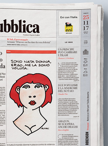
From page of La Repubblica, 25 November 2017. Detail showing a new element, a vertical column dedicated to powerful critiques and ideas (‘Le Idee’), plus information about the paper’s supplements. This issue, published on the international day for the elimination of violence against women, includes an illustration that reads, ‘I was born a woman, hence I asked for it.’
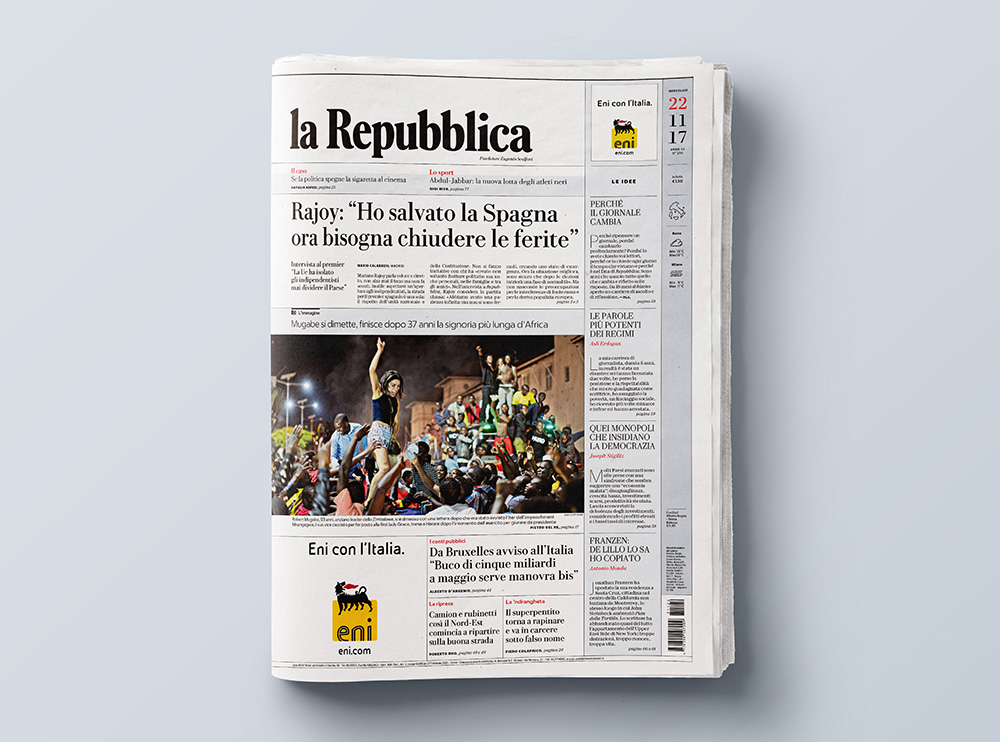
Top: Front page of La Repubblica, 22 November 2017.
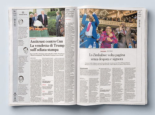
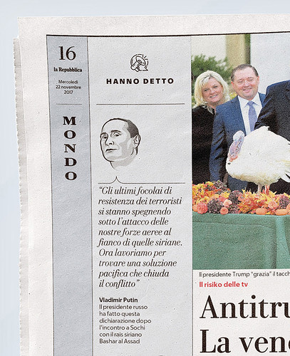
Opening spread for the ‘World’ section showing the application of the gray vertical zone. In this case, it functions as a space for citations and references. La Repubblica, 22 November 2017.
The new design is a collaboration between art director Angelo Rinaldi and managing editor Francesco Franchi, the award-winning former art director of IL magazine (see Eye 93). The changes reach into every part of the newspaper and its sections, through thoughtful content, new navigation elements, a bespoke typeface and reinvented specialist sections.
News spread column detail featuring icons and illustrated portraits by Marta Signori. La Repubblica, 22 November 2017.
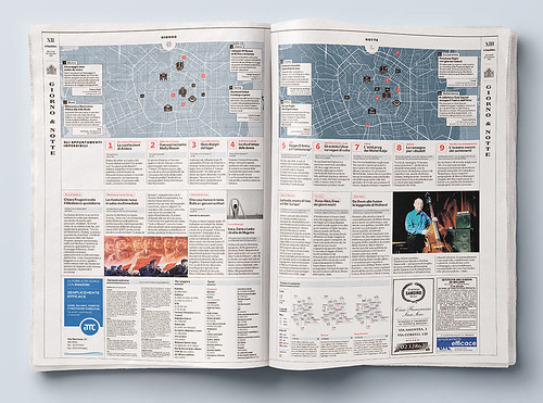
Spread from Repubblica’s local section dedicated to day and night happenings in Milan, 22 November 2017.
On the front page there is a new design element, a narrow column head dedicated to brief, powerful ‘ideas’ and critique (‘Le Idee’). This device recurs throughout the newspaper’s opening sections. Vertically set section heads (‘Mondo’, ‘Giorno & Notes’) echo this, with a touch of hotel street signs – though this is not to everyone’s taste. (The ‘Crazy for Repubblica’ blog reposted a comment calling the vertical heads ‘lousy replicas of old bar signs’.)
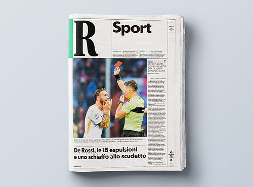
Sports content displayed in the RSport supplement, which has undergone the same transformation as the rest of the newspaper.
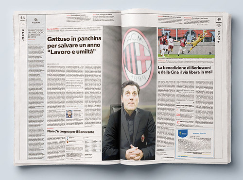
The RClub, RHealth and RSport sections have also undergone an elegant metamorphosis. It will be interesting to see what La Repubblica’s design team do with RFood in the coming weeks.
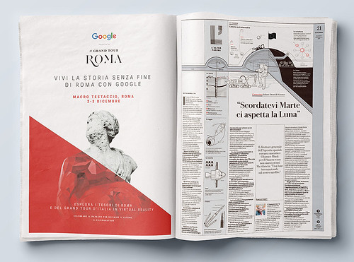
Information graphics, in the 26 November paper, for an article by Matteo Marini outlining the prospect of a human colony on the Moon in the next decade.
RHealth supplement showing information graphics about antibiotics and cures for Hepatitis C.
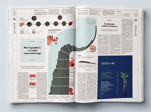
La Repubblica’s redesign makes better use of white space, with fewer images per page, while boldly setting illustrative infographics across double page spreads. The graphics, austere and functional, are very much in the tradition of IL magazine’s approach to information under Franchi’s art direction.
Bespoke type family, designed by Commercial Type, inspired by the newspaper’s original Bodoni typeface. Named after the founder of the paper, Eugenio Scalfari.
Design team credits: Manuel Bortoletti and Giovanni Cavalleri, led by art director Angelo Rinaldi and managing editor Francesco Franchi. Portraits and icons drawn by Marta Signori.
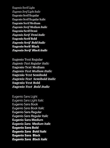
New typefaces by Commercial Type are a key element of La Repubblica’s redesign. The newspaper’s body text is Eugenio, a Bodoni-esque Modern reminiscent of the newspaper’s original typeface. Commercial Type’s Paul Barnes and Christian Schwartz have designed three type families: Eugenio Serif, Eugenio Text and a crisp Eugenio Sans. Other details include a redrawing of La Repubblica’s logotype, which had not changed since the newspaper was founded in 1976.
The design follows Mario Calabresi’s concern is that a printed newspaper must differentiate itself from the web by offering readers material for reflection, analysis and perspective, rather instant ‘snack’ information. ‘A newspaper today makes sense if it exists to explain contexts,’ declares Calabresi, ‘if it digs into the root of problems, if it explains the consequences of news and possible solutions.’
Giulia Tugnoli, designer, London
Eye is the world’s most beautiful and collectable graphic design journal, published quarterly for professional designers, students and anyone interested in critical, informed writing about graphic design and visual culture. It is available from all good design bookshops and online at the Eye shop, where you can buy subscriptions and single issues.