
Monday, 4:00am
28 January 2013
What type taught me about music
Rick Finlay recalls his time at Reading, a university education that was not about vocation, but ‘raw knowledge and research, and their applicability to whatever life throws at you’
As an undergraduate on the Typography course at Reading University around 1980 I found enough fellow tunesmiths to put together a five-piece band made up only of students on the course, writes Rick Finlay. We were proud of our rock-pop constructions, but also fastidious about the packaging of our demo cassette.
After graduating in 1982, my life took the other fork in the road and, although my early career as a drummer and percussionist was subsidised by freelance book design for a year or so, my portfolio was soon gathering dust under the bed.
And yet my passion for my four years at Reading persisted, and there was little need for hindsight to recognise that the inspiring institution of the department shaped my adult self and continues to influence my work to this day.
When I stumbled across the obituary of Paul Stiff last year, I found myself reflecting on how it could be that the Department of Typography & Graphic Communication (we would brook no abbreviation) played such a significant part in how I lead my life as a musician.
It felt like a golden time: the course had originated as Michael Twyman’s baby some years earlier, but by 1978 the ethos and modus operandi was in full flow. The brightly coloured internal architecture of the prefab buildings shouted ‘modern’ to my eighteen-year-old north London eyes, and Swiss typography was still a recent enough concept to be a rallying cry to those of us in love with design as a pure and political rebuttal to the lightweight postwar ephemeral design of our parents’ generation.
What shaped me more than anything, though, was this oddball family of obsessives I found at Reading who could argue into the night about letterspacing and what we loved to call ‘nitty-gritty’ typography. I’d read about my jazz heroes practising for hours every day, and there was a romantic appeal to learning that my favourite drummer lived in a bedsit with no more than a bed and a ride cymbal for furniture. Now I found real-life characters whose love for their subject led to similarly beguiling single-mindedness, confirming for me that you could become an adult and still play with trains.
I remember a privileged (for an undergraduate) invitation to a meeting of these minds, where the classification of fonts in the new digital world became the subject of an abstract and ideological study, trying to adapt the tools of statistical cluster analysis to the multidimensional field of graphic elements.
The parallels between musical and graphic communication run deep and wide. The language analogy is a powerful metaphor in both fields, and when we learned about synectics at Reading (thanks to a design client who evangelised the methodology) it chimed with an internal conviction that everything connected, and there was nothing that couldn’t inform my journey as a musician as much as a designer.
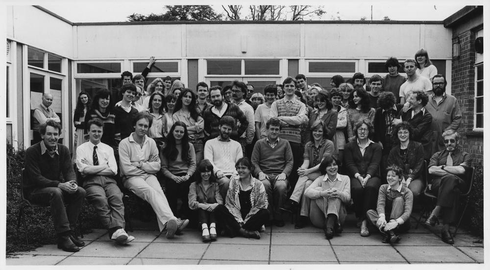
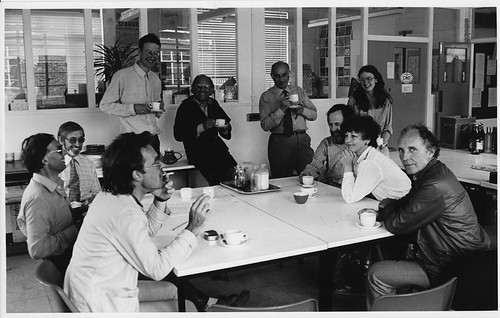
Department of Typography & Graphic Communication, University of Reading, early 1980s. Photographs from the collection of Rick Finlay.
I left Reading at the moment the desktop publishing revolution swept away hot metal, hand-rendered roughs and copyfitting tables. Another inspiring tutor on the course, Richard Southall, somehow managed to bring an early Apple Lisa into the building for a week or two, and for us it was like some kind of time machine.
The democratisation of the means of design and production the Lisa portended weighed heavily on the senior brains of the department. The whole postwar conviction that typographic design could be a force for social and political change was threatened by the ease with which the powerful arsenal of fonts and printing could fall into the wrong hands. It seemed that all we were learning about could be unstitched.
And it’s true that there was a proliferation of awful design in the early years.
But we never imagined that a consequence of this would be an awareness and appreciation of, and interest in, typography which would lead to the minor cinematic success of Gary Hustwit’s film Helvetica (reviewed in Eye 64), or the mass-audience popularity of Simon Garfield’s book Just My Type (reviewed in Eye 78).
An exactly parallel process was developing in music at the same time: home recording and computerised music production were becoming available, and as I entered the music business I recoiled at the horrors of thousands of dabblers in music churning out soulless and meaningless music at near-professional quality. And yet a similar coming of age has happened: almost all musicians, from the hobbyist to the big-name celebrity, use the kind of tools that were once only available in top-notch recording studios to develop their ideas at home.
I still practise my now-creaking typographic skills in designing album covers, websites and promotional materials for my band, and teaching materials for my drum students. But it is in the management of business and musical relationships that I draw on the rich and diverse knowledge imparted at Reading.
Whether communicating through my percussion instruments on a gig, negotiating with European promoters, or debating in the boardroom of the Musicians’ Union, I reference skills first acquired 30 years ago. This was a proper university education, not about vocation but about raw knowledge and research, and their applicability to whatever life throws at you.
I could mention Ernest Hoch opening the doors of systems analysis to me. Or postgraduate student Robin Kinross (see ‘Reputations’, Eye 80) producing Potter’s What Is a Designer on his Hyphen Press imprint – the publishing equivalent of the punk independent record label. Or Michael Twyman’s alchemical conversion of ephemeral typography to gold.
But perhaps the abiding memory is of Paul Stiff’s lectures, on anything and everything, unfolding like the best Miles Davis solo, turning the lecture room into a jazz club and the audience into devoted fans.
Rick Finlay is a drummer and a member of Just East.
Read Paul Stiff’s ‘The way ahead’ in Eye 78. Also, ‘Strategies for telling truths’ from Eye 25 and ‘Stop sitting around and start reading’, Eye 11.
Eye is the world’s most beautiful and collectable graphic design journal, published quarterly for professional designers, students and anyone interested in critical, informed writing about graphic design and visual culture. It is available from all good design bookshops and online at the Eye shop, where you can buy subscriptions, back issues and single copies of the latest issue. You can see what Eye 84 looks like at Eye before You Buy on Vimeo.