
Summer 2007
Ready for its close-up
various designers
Max Miedinger
Eduard Hoffmann
Stefan Sagmeister
Massimo Vignelli
Matthew Carter
Tobias Frere-Jones
Jonathan Hoefler
Gary Hustwit
Erik Spiekermann
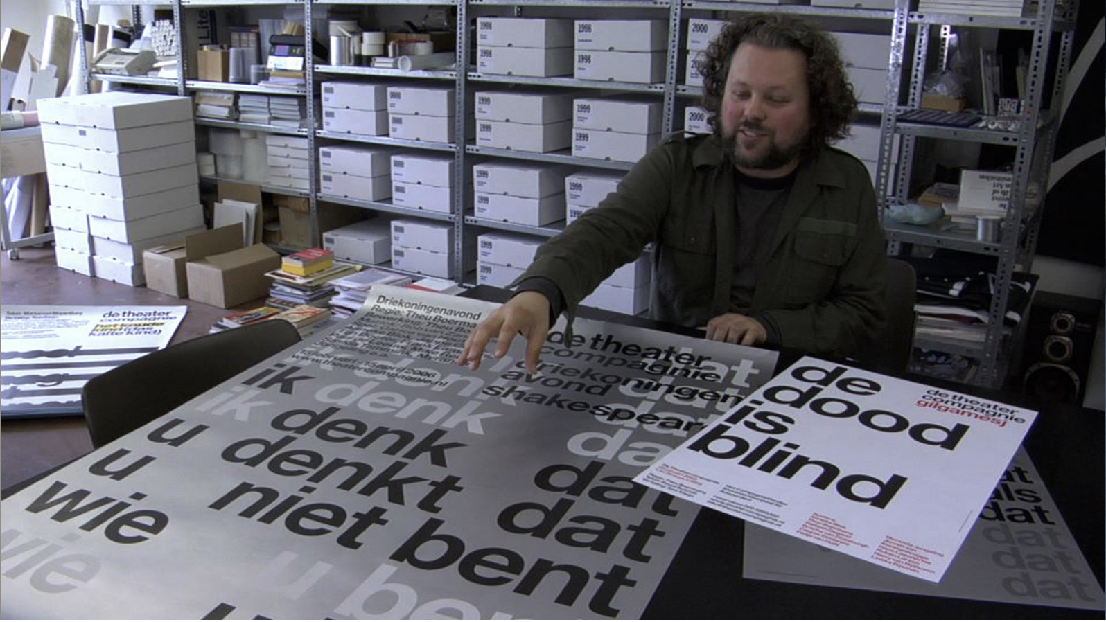
Experimental Jetset
After 50 years as a famous face, Helvetica gets to star in its own feature film
Helvetica is a feature-length documentary film, celebrating the life and times of a famous typeface in its fiftieth year. It’s a biopic. A charming opening sequence takes the audience back to a font’s humble, mechanical beginnings: a meticulous older man with a steady hand picks out metal letters, inks them up and prints the film’s title on a press.
First-time director Gary Hustwit does a light, enthusiastic job here, offering a little historical context, flavouring the story with multiple excerpts of Helvetica’s best-known performances on city infrastructure, billboards and familiar corporate print media, like a scene from Patrick Keiller’s 1994 London, only with more Letraset. This travelogue-and-testimonial format gives the whole piece the feel of a blog, though: it is high on name-dropping and visual nuggets, but lacks critical appreciation.
Certainly, it succeeds in explaining how type works, what designers do all day, what graphic design is for. A BBC treatment of the subject matter might have captured more of that, as a lens through which a wider public could look upon design practice, but that would be a different film. Instead, this is Hustwit’s passion, played out on screen with a Eurorail pass, a digital camera and a pleasant electronica soundtrack. And for that, it is still entertaining and is attracting a significant minority audience of pixel-pushers who, in identifying with their community of practice, get nostalgic for inky fingers and rolled-up sleeves.
Clips from Europe and the United States are spliced with testimonial interviews, like an episode of This Is Your Life with a cast of design luminaries, adoring fans and bitching naysayers holding forth on Helvetica.
Insightful and opinionated, these talking heads build what there is of a debate, tracing Helvetica from its small beginnings in a Swiss type foundry, through its commercial success as a Linotype property, to its enduring place on New York sanitation trucks and American Airlines tailfins.
The British type designer Matthew Carter is humbled: ‘It’s very hard for a designer to look at these characters and say, how would I improve them? […] They just seem to be exactly right.’ Its other advocates, including Wim Crouwel, Otmar Hoefer of the Linotype Library, Danny van den Dungen of Experimental Jetset (top), exalt Helvetica as a beacon of twentieth-century progress, an artefact of Modernist mass production.
The dissenters, by contrast, take a scatological view. Erik Spiekermann is no fan: ‘Most people use Helvetica because it’s ubiquitous. It’s like going to McDonald’s instead of thinking about food. Because it’s there. It’s on every street corner. So let’s eat crap.’
For Stefan Sagmeister, too, its ubiquity is less a mark of quality than of designers’ laziness: ‘If I see a brochure now with lots of white space, six lines of Helvetica and a little abstract logo on the bottom, that says to me: “Do not read me because I will bore the shit out of you.” ’
What unfolds is a tension between the mythic neutrality of the letterforms as design objects, and designers’ insistence that type is a building block to support the power and integrity of language. Should a typeface stay schtum, like an actor keeping a straight face, until it has something to say? Or is it so much a product of its social and economic context that its character is hard-wired?
In response, the film’s tiebreaker is Massimo Vignelli, graphic design grandee (and the designer of that durable American Airlines identity). He insists that typography – how designers interpret language and what they do with type to do that – is more important than the character of the characters alone. He only ever bothers with six typefaces, maybe eight at most, and yes, Helvetica is among them. How you handle the tools – design as a process – governs the outcome and is therefore what matters, he argues. In the Q&A after the New York premiere at the New School in April, an audience member, who had perhaps missed Vignelli’s point, was desperate to know the master’s top picks. Would it make her a better designer? Would she go home and make her own movie poster? Probably not. Is a sequel about a serif face in the pipeline? Hustwit has no plans to make one.
Rachel Abrams, writer, New York and London
Eye is the world’s most beautiful and collectable graphic design journal, published for professional designers, students and anyone interested in critical, informed writing about graphic design and visual culture. It is available from all good design bookshops and online at the Eye shop, where you can buy subscriptions and single issues.