Summer 2011
10,000 one offs
Field’s 10,000 ‘illustrations’ for SEA’s GF Smith paper swatch give a new dimension to variable data printing
It is almost commonplace that new technology companies inhabit studios in buildings whose names commemorate the old-technology activities they have superseded: delicatessens in ‘the smokehouse’; digital music studios in ‘the old piano factory’ and so on. Field, the digital design agency founded by Marcus Wendt and Vera-Maria Glahn is based in Dalston’s Print House, a hotbed of new media creativity in East London.
In just two years they have acquired an impressive roster of influential collaborators, notably Matt Pyke of Universal Everything (see Reviews, pp.110-12), and a substantial client list, working on projects such as a huge 150-screen media wall for Deutsche Bank in Hong Kong and ‘soundreactive visuals’ for the Red Bull Music Academy 3D Soundclash at the Albert Hall in February 2010.
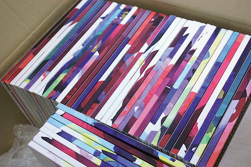
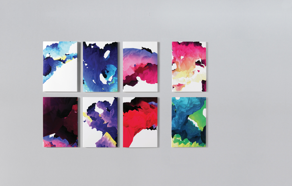
However one recent collaboration brought print back to the Print House. Bryan Edmondson of SEA Design commissioned Field to produce 10,000 ‘digital illustrations’ for paper merchant GF Smith’s new promotion – a bundle of digitally printed paper samples for designers and other clients on their mailing list. Edmondson decided to make use of the digital print facility at Pureprint, which allows a different file to be printed with each pass of the press, and pushed it to the limit.
For Edmondson, the process began when he encountered the generative work of Karsten Schmidt (see Eye 74) and Stefan Sagmeister (his celebrated ‘cobweb’ graphics), when they were fellow speakers at a conference in New Zealand. ‘I thought, “Bloody hell, that’s fascinating – it’s all about numbers.”’
Then one of Edmondson’scolleagues came across Field’s digital light installations, and Edmondson paid a visit to the new agency, soon afterwards arranging a three-way meeting with the printers (who also produce Eye).
Edmondson was concerned from the start that they should make something that looked ‘really beautiful, but all different’. Personalised brochures and magazines can be regarded as rather tacky – what Edmondson calls ‘the dirty end of the digital print process’ – and he wanted to push the visual potential of the new technology as far as he could.
Pureprint’s technical director, Aaron Archer, is enthusiastic about the market for ‘variable database communication’, which has expanded rapidly over the past six months. Such campaigns are usually broadcast across several platforms, including email and HTML, with a print component for ‘credibility’. Print-based projects with large image files such as the SEA / Field / GF Smith collaboration are more comparable to the highly personalised student prospectuses Pureprint produce for the University of the Creative Arts.
SEA asked Field to do something based on the macro-structure of paper, so Wendt and Glahn began by drawing curves to create a virtual 3D ‘sculpture’, like a wireframe, and then deployed an algorithm that would ‘wrap’ the structure with a scrunched-up, paper-like surface. ‘We didn’t want it to be bright and shiny,’ says Glahn, ‘we wanted an “uncoated” surface.’

To generate the final images for the print process, Wendt and Glahn chose 10,000 different views of the structure. However, they didn’t automate the selection of images. ‘I’m convinced that the designer’s eye is the most important thing,’ says Glahn. ‘It was like moving the camera for each image.’
Glahn relished the ‘craft aspect’ of the job: ‘What we like doing is design and process, not just the end result.’ The result was 10,000 different RGB files, each with a tag that indicated whether the block of type in the top left corner should be black or ‘white out’ of the colour.
There are precedents for this kind of multiple-edition work – in ‘split-duct’ printing, in Universal Everything’s identity for Lovebytes (see Eye 65) and in the generative experiments of Brian Eno or Jem Finer – but this project had a commercial purpose. GF Smith’s John Haslam regards the project as a way to educate the design community: ‘Digital printing is shrouded in mystery,’ he says. He bemoans a general lack of interest and understanding of print and paper: ‘Everything is in the digital domain – students are not taught about the nature of paper and the power of print.’ Printers, he says, are also educating potential clients about new processes: ‘That’s where these beautiful images come in.’
Superficially, there are similarities to the work SEA has done for GF Smith in the past, using John Ross’s photos of ink diffusing colourfully in water – another process that has to be ‘steered’ rather than controlled (see Eye 72).
Edmondson is pleased that this work goes directly to his peers: art directors, designers and clients on GF Smith’s mailing lists. ‘I don’t think a majority of designers understand the potential of this approach,’ he says.
Glahn has a similar view: ‘We wanted a chance to apply these ideas to something where a lot of people see them,’ she says. ‘If it were an independent art piece, you wouldn’t make something that 10,000 people can hold in their hands. And if you have a simple idea, you can take it through a lot of variations … it speaks directly to people on a more emotional level.’
First published in Eye no. 80 vol. 20.