Autumn 2002
A designer and a one-man band

Cranbrook’s song and dance man goes back to college with a bang
Even for those who follow his activities with interest, the news that Elliott Peter Earls was to be a designer-in-residence at Cranbrook Academy of Art – a post formerly held by the McCoys and the Makelas – came as a something of a surprise. If ever a designer seemed like a certified oddball, pursuing a trajectory far removed from the obligations of institutional life, it is Earls.
He is one of those unclassifiable, mutant blooms thrown up by the fractured landscape of 1990s graphic design. My first encounter with his output came in 1993, when I was working on a survey of new design. A package of material from Cranbrook (near Detroit, Michigan) included several posters by Earls, who was in his final year. In one, an Astro Boy doll bursts through a sheet of glass, accompanied by the copyline, ‘The side of my head hurts from thinking in the rain’ – an announcement both engagingly direct in its physicality and intriguingly obscure in its state of mind.
The posters, he now reveals, represented something of a crisis. Earls was in the process of reinventing himself and, after that, things just got weirder. In 1995, operating as ‘The Apollo Program’, he released a CD-ROM, Throwing Apples at the Sun, which invaded the desktop and plunged viewers into a Supercard labyrinth of pop-up windows, sound effects, spoken-word pieces and Quicktime movies, as one layer led to the next. It was some kind of landmark in a medium that had mostly failed to deliver on its early promise, and reviewers were impressed. Around this time, Earls launched a triptych of deranged-looking typefaces – Dysphasia, Dysplasia and Dyslexia – that confirmed his gifts as a practitioner of outlandishly dysfunctional design. One could only wonder at the peculiar mind-space inhabited by their creator, apparently holed up in White Plains, somewhere outside of New York.
Emigre promoted these projects and Rudy VanderLans, clearly a big fan of Earls, has continued to feature his work, though a follow-up CD-ROM, Eye Sling Shot Lions, was independently distributed. This summer, in its latest guise as a CD / magazine, Emigre released Earls’s first film, Catfish, on DVD, revealing yet another side to a figure for whom ‘designer’ seems an increasingly threadbare job description. Since 1998, Earls has given 40 or so live performances in which he delivers spoken texts, sings, acts, strikes attitudes, plays guitar, activates a number of self-made electronic contraptions, and uses computers to trigger a flow of random graphic imagery on big screens behind him. He has performed at Here, the Independent Art Center in New York; the Walker Art Center, Minneapolis; Fabrica in Treviso; Typo 2000 in Berlin; and the Maison des Arts et de la Culture in Créteil, France. ‘If nothing pleases you about Catfish,’ notes VanderLans preemptively, ‘at least imagine the possibilities opened up by Earls’s use and misuse of the different media he employs.’
Top: Still from the DVD Catfish, 2002, written, directed and shot by Elliott Peter Earls.
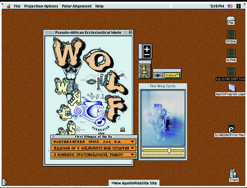
Below: Screen shot from Eye Sling Shot Lions, Earl’s interactive multimedia CD-ROM, 1997.
Bottom: Frame from the DVD Catfish, 2002 (Emigre no. 62). After suffering an electric shock during an electronics experiment, Earls is visited by his neighbour, who sells fire safety products.

The light bulb over the head
Earls, now 36, is a natural performer, intense and charismatic, with sculpted features and a wide mouth – imagine ‘Wicked Game’ singer Chris Isaak’s slightly crazy brother. Watching him move around the stage with such authority, it’s hard to believe he was in his thirties before it occurred to him to perform. He’s tall, wiry and angular, a fast-talking, powerfully physical presence. His spacious studio at Cranbrook feels like a cross between a workshop and a film set, its floor littered with tripods, cables, gadgets, and the audio rig he uses in performance. His banjo hangs on the wall.
At Jesuit high school in Cincinnati, Ohio, Earls seems to have been one of the jocks. He was a committed athlete and soccer player with no interest in academic pursuits. It was his mother who suggested he turn his skills at drawing and painting into a career in graphic design. Assembling a portfolio with the help of an early mentor, he won a place at Rochester Institute of Technology. After graduating in 1988, he landed a job at de Harak and Poulin Associates in New York. Eleven months later, they fired him. ‘I really didn’t fit in there,’ he says. ‘It was a museum.’ Mortified by this setback, Earls fled to Greenwich, Connecticut, with his wife Darlene. At this stage he knew nothing about designers such as April Greiman and Emigre; he knew only about corporate design. Working at David Cundy Inc. in New Canaan, he finally saw an issue of VanderLans’s increasingly influential type-zine. ‘Bling! The light bulb went off over my head and I thought this was the most amazing thing I had ever seen.’
Earls decided to go to graduate school. Visiting Cranbrook for his interview, he fell in love with its bohemian, commune-like atmosphere. ‘I believe in the mythology of the place and I think that was important. I believed in the McCoys. There was a process that I wanted to subject myself to. One of the things that was stressed by the McCoys and the visiting artists – Lorraine Wild and Ed Fella came while I was here – was that you have to take responsibility for the quality of your own education as well as your life.’
At Cranbrook, Earls started to question everything about himself, even his tastes in food. For those following in the footsteps of theory-hungry 1980s students such as Jeffery Keedy and Andrew Blauvelt, these were difficult times. ‘I found I was rejecting a lot of the founding, underlying theoretical principles,’ says Earls. ‘I don’t believe – as unacademic as this is going to sound – in the anti-teleological impulse. I don’t believe in any of that shit. I believe there’s an underlying order to the universe.’ Earls’s inquiry into values led him in some unlikely directions. He read Ayn Rand, Robert M. Pirsig’s Zen and the Art of Motorcycle Maintenance and Jack Kerouac, subject of one of his Cranbrook posters. (There’s a copy of On the Road on the shelf – it belongs to Darlene, who shares the studio.) Earls identified with Kerouac’s call for a direct poetry of no abstractions, a joyful, zen celebration of ‘the true blue song of man’.
Earls’s next attempt to function as a regular designer, at Elektra Records in New York, lasted only a few months. Asked to work on the Eagles’ greatest hits for international release, he produced a cover design that was so ‘country’ in mood, it was clearly ironic. ‘I simply could not bring myself to give them what they wanted,’ he admits. Elektra returned the favour by showing him the door. These failures and the sense of futility were painful, but they helped Earls to focus; on the day he was fired, he sketched out a plan on his laptop for a multidimensional way of working and he has pursued this in parallel with projects for clients such as Nonesuch Records, Little Brown, Scribner and the Cartoon Network (UK) ever since. His early grunge typefaces – best represented by the Dysphasia family – gave way to cleaner-edged, eccentrically cartoonish fonts such as Venus Diode, Jig Saw Dropshadow and Typhoid Mary, which feature heavily in his personal work. Under the influence of Ed Fella, drawing assumed increasing importance. ‘You put the mark-making instrument to the page and you make beautiful or ugly or disgusting marks and you let them be true to themselves,’ says Earls. His drawings, sometimes created with lo-fi scraperboard, have a repellent vigour. Their ungainly style, the very antithesis of fashionable digital illustration’s purged and perfectionist linework, owes more to outsider art’s brutal figuration and the unleashed id oozing from the darker kind of adult comic book. Earls surrounds his Picassoid, decapitated heads with graffiti-like annotations and unstable, aerobatic typography. In a sequence of images presented, as ever, in Emigre, he offers portraits of four figures – Martin Luther King, Malcolm X, Max Ernst and Kurt Schwitters – whose ideas have ‘left their mark on my soul’. His drawings, he says, are ‘misinterpretations’ of the way Ernst drew.
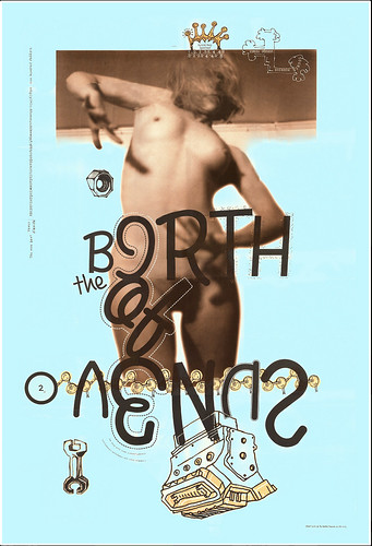
Below: The Birth of Venus, (poster 24x36 ins, 1998), ‘a portrait of my beautiful wife’.
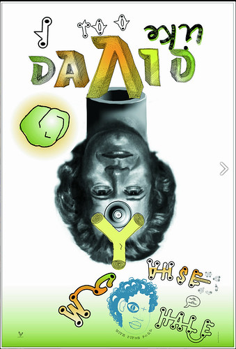
I Too Like David Chase White Whale With Pitch Fork and Pick Axe and Sling Shot, (poster, 24x36 ins, 1997), inspired by Herman Melville’s Moby Dick.
AIGA Fresh Dialog (poster, 18x24 ins, 1998), announcing lecture series in New York City.
In an Emigre essay, Earls lays out his intention to become a ‘prosumptive’ designer – a term borrowed from Alvin Toffler’s The Third Wave – positioned somewhere between traditional models of production and consumption. For Earls, this seems to translate into a goal of total self-sufficiency, a desire to become a 21st-century Renaissance man able to leap between disciplines with a single bound and somehow (this part is unclear) escape the dilemma of a pluralistic environment in which everything is possible and nothing taboo. Of course, the desire not to be constrained by disciplinary boundaries has been a cultural ideal in recent years, to the point of cliché, though few have what it takes to become a convincing multidisciplinary artist. Whatever one thinks of his aesthetic, Earls possesses an unusual array of talents and an enviable facility to acquire new skills. He taught himself guitar as a student at Cranbrook, composed songs, picked up practical electronics, wrote a screenplay, and can do almost anything he wants with a computer. In Catfish, he delivers an impressively obnoxious performance as a buck-toothed, hillbilly typeface salesman – as a performer and actor, he sometimes seems to tap into a deep well of inner rage.
Earls’s work has undeniable power and he has succeeded in finding audiences outside the insular club of design. If he presented himself purely as an artist or musician, one probably would not even feel the need to ask: what does it all mean? Or, if one were to ask this, it would come some way behind the immersive experience of the work itself. In recent years, many design projects have aspired to be absorbed without thinking, but design’s long-standing, disciplinary commitment to ‘communication’ means the spectre of meaning can never be entirely repressed. Nevertheless, Earls’s work resists interpretation. ‘The program’s construction reinforces the theme of intellectual dyslexia,’ notes Kenneth FitzGerald, discussing Throwing Apples. ‘Fragments fail to coalesce to definite meaning, nor do they attempt to.’ If his creations were less persuasive on an experiential level, one might dismiss them by saying that he is merely ‘expressing himself’. However, Earls continues to view what he does as being firmly based on design principles, even though artists, filmmakers, musicians and writers use similar compositional principles without calling them ‘design’.
Follow your bliss
His own reflections on meaning are distinctly inward-looking. While he was a student at Cranbrook, he saw tapes of Joseph Campbell and Bill Moyers’ PBS television series The Power of Myth. One programme dealt with Hindu concepts of perfect consciousness, perfect being and perfect bliss. ‘Man’s purpose in life is to attain those things,’ says Earls. ‘Perfect bliss is the easiest one to understand. You follow your bliss. So in my work the point is self-actualisation, to figure out exactly who I am … These [works] are the visual records of the attempt to follow that sense of being at home with the work. In Buddhism, they refer to it as the white moment, where time and space collapse.’
Earlier, Earls had spoken of the quest for something transcendent in Kerouac’s view of poetry; here he invokes the idea of the sublime. He wants to create something ‘deeply human’ that would elicit emotion from the viewer. ‘I guess part of this is trying to figure out what those structures are, to try to illuminate the beauty, the horror, the terror and the poetry of life.’ These ideas are familiar enough in art and poetry, ancient and new, but it is unusual to hear a designer express them.
Like others in search of the contemporary sublime, Earls uses multifocal complexity to provoke a vertiginous sense of displacement. He wants to make the strange familiar and the familiar strange. He cites Dick Hebdige’s essay about Talking Heads’ Road to Nowhere video, where Hebdige discusses the tendency in pop videos to substitute referential density for narrative coherence. Throwing Apples was Earls’s Road to Nowhere and he confesses to once replacing David Byrne’s name with his own in the text. By the end of Talking Heads’ clip, four alternative image-tracks are running in separate picture-in-picture boxes over the main image. More recently, Earls has come round to the view that the degree of referential density in the Eye Sling Shot Lions show is sometimes overwhelming. Looking out into the audience in the middle of a non-linear poetry rap that verged on nonsense, he would see blank stares. ‘Anytime there was any kind of narrative strain at all, all of a sudden the audience would be with me.’ Earls is operating in a genre of experimental music / performance that includes the likes of the Residents and Laurie Anderson. My guess is that if he were to shed the ‘design’ tag, find a manager and develop his grasp of narrative and character, he would have a show that, while still challenging, could achieve much bigger audiences.
After only a year as 2D designer in residence at Cranbrook, it is too early to say what impact Earls will have on his students. By taking on the responsibility, he seems to be seeking to challenge himself: it would be easier to work alone. It’s almost inevitable, though, that his concerns will underscore a self-absorbed view of the designer as artist for which some have criticised Cranbrook. ‘The first and most important step is to be true to one’s self,’ Earls writes in the prospectus. ‘To allow one’s work to be “true,” to be “honest,” to be “real” even in deceit.’ (But why those inverted commas? Are these ideals not really attainable?) ‘Students must realize the importance of risk within work,’ he adds. ‘They must realize that approval seeking is a vicious cycle that never leads to truly powerful work.’ As an educational credo, this will only take a designer so far, but in his own case, it has definitely been the making of him. Graphic design may yet prove to be the least of it.
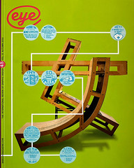
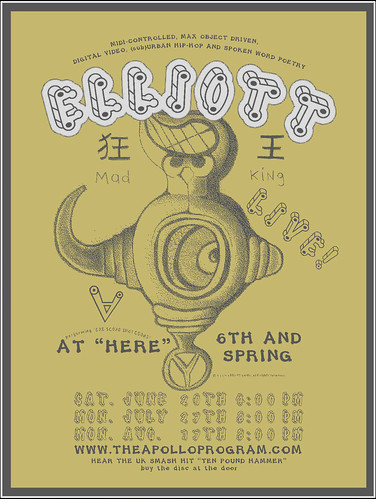
Performance poster, 18x24 ins, 1998. The first in a series advertising Earl's gigs: This silk-screened poster was flyposted on walls all over SoHo. ‘Within two days, all 500 posters had been torn down or pasted over.’
Rick Poynor, writer, Eye founder, London
First published in Eye no. 45 vol. 12 2002
Eye is the world’s most beautiful and collectable graphic design journal, published quarterly for professional designers, students and anyone interested in critical, informed writing about graphic design and visual culture. It is available from all good design bookshops and online at the Eye shop, where you can buy subscriptions and single issues.