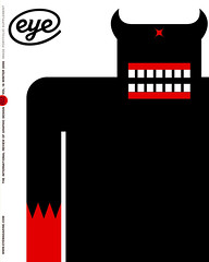
Winter 2006
Back with a flourish
Paul Barnes
Marian Bantjes
Ed Benguiat
Christian Schwartz
Giambattista Bodoni
Sumner Stone
Sibylle Hagmann
various designers
A taste for ornamentation and 1970s kitsch has led to a revival in the swash, the ‘tea cosy’ of typography
The twentieth century was not a good time for swashes, often described as the ‘curly bits added on to make type look fancy’. During the previous four centuries swashes were often an integral part of refined, elegant typography, but by the 1990s they had become a symbol of bad taste, relegated to the status of floral wallpaper. Perhaps this was because of their ubiquity in the 1970s, or because few of the people who used them with such zeal had the kind of restraint common in the preceding centuries.
Swashes are like salad dressing: great as a condiment, but you wouldn’t want to drink a whole glass. For a type designer, swashes provide an opportunity for the kind of unfettered self-expression that is usually found only in lettering and calligraphy. Well crafted swash characters tease out characteristics that already exist in a typeface and proudly put them on display. When poorly crafted or poorly used, swash characters become a clumsy parody, inadvertently making a mockery of the letters around them.
Recently though, interest in swash characters has been rekindled by a growing acceptance from type designers and graphic designers of the OpenType font format, which provides the ability to include hundreds of alternate characters in a single font. This interest is compounded by a resurgence of taste for ornamentation in general and specifically for 1970s and 80s graphic style, ironic or not.
Type designer and lettering artist Ed Benguiat drew many of the swashes to emerge from Photo-Lettering, Inc and International Typeface Corporation (ITC) in New York in the 1970s, including ITC Bookman and Benguiat Caslon. House Industries has been collaborating with Benguiat since 2003, and will soon bring Photo-Lettering back to life for the 21st century, swashes and all. (Note: I am involved, in a team that also includes Ken Barber and Erik van Blokland.)
And if we are lucky, maybe graphic designers will use a little more restraint this time.
Marian Bantjes, lettering for The New York Times magazine, 2005. Sibylle Hagmann, Odile Deco Initials, published by Contour through Village, Houston, 2005.
Top: Paul Barnes, unpublished lettering for private valentine, 1998.


Fearless contemporaries
Now that the revival of the International Style is done and graphic designers are once again enamoured of ornament for its own sake (see Eye no. 58 vol. 15), fear of swashes has naturally subsided. This has led to work that references the 1970s (jokingly or not), and more interesting pieces of work such as Paul Barnes’s lettering for a valentine which updates delicate eighteenth- and nineteenth-century forms with unabashed use of digital effects. Marian Bantjes in Canada and Si Scott in London are also working in this genre, adding swashes to bitmaps and sans serifs. Sibylle Hagmann’s Odile adds a contemporary twist to titling caps from the 1930s and 40s.
Robert Granjon, Gros-romain italic ‘A’ (1547–), used in Vergilius, Enide, printed in Lyons by J. de Tournes, 1560. This sample from The Italics of Robert Granjon, Hendrik D. L. Vervliet, Typography Papers no. 3, 1998.
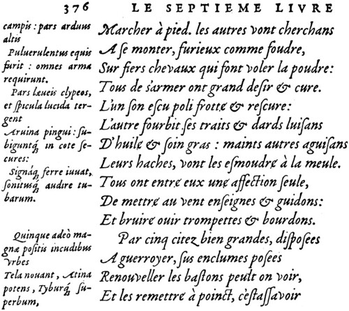
The calligraphic tendency
This sample shows the subtle way that Robert Granjon’s swashed characters can blend into a block of text, emphasising certain words and giving a very active texture. While the basic form of the italic shows punch-cutting at its most sculptural, the swashes have a strong calligraphic influence. The looping ‘M’, for example, flows from the hand very naturally but is not a practical form to cut into steel.
George Bickham, from The Universal Penman, London, 1743.
An impressive level of control
George Bickham’s seminal set of engravings, published as The Universal Penman, demonstrates the blurry line between swashes and ornamental flourishes. Although these forms are just about impossible to replicate in type, they are undeniably related to the typographic style of the late eighteenth century. This is design that dances on the edge of being ‘too much’, yet Bickham’s level of control is extremely impressive. This level of visual balance is very difficult to achieve using such organic forms.
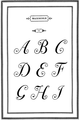
Giambattista Bodoni, Majuscole no. 17 (ca. 1788), shown in his Manuale Tipografico, Volume I, Parma, 1818.
Below: Janice Fishman, Holly Goldsmith, Jim Parkinson and Sumner Stone, ITC Bodoni 72 Italic Swash, published by International Typeface Corporation, 1994.
No terminal goes unflourished
As calligraphy’s influence was overtaken by engraving, swash caps got really weird. While this set of caps is not as extravagantly decorated as Bickham’s work, no terminal goes unflourished here, showing Bodoni at his most exuberant. These were revived as an addition to the 72-point version of ITC Bodoni Italic, and while they do not seem to be quite the right fit with the lowercase, they do look great as drop caps.
Vincent Figgins, thirteen lines pica Fatface Italic and eight lines pica Fatface Italic No. 2 (ca. 1815), shown in Specimen of Printing Types by Vincent Figgins, Letter-founder, London, 1815.

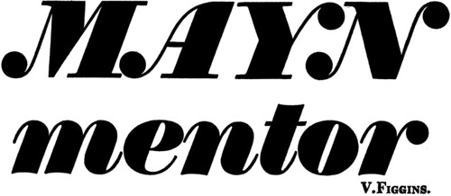
Bigger, louder, heavier
As display type got bigger, louder, and heavier in the nineteenth century, Figgins and many of his contemporaries added a limited set of swash characters to their Modern italics – generally just ‘A’, ‘J’, ‘K’, ‘M’, ‘N’, ‘T’, ‘V’, ‘W’ and ‘Y’. These give the type character without drawing an undue amount of attention to it. The ball terminals connect the forms to the lowercase (almost like the biforms popularised in the 1960s, such as Bradbury Thompson’s Alphabet 26, but not as literal), and make the caps look fresh and contemporary, even today.
Morris Fuller Benton, Cloister Italic; Specimen Book & Catalogue 1923, American Type Founders, Jersey City, NJ, 1923.
Below: Morris Fuller Benton, ATF Baskerville Italic; Specimen Book & Catalogue 1923, American Type Founders, Jersey City, NJ, 1923.
ATF cloister italic
ATF baskerville italic
Typographic transvestism
In the 1920s and 1930s, American Type Founders rediscovered Renaissance-era swashes while reviving classic typefaces such as Garamond and reworking them for American tastes. They went overboard, just like Photo-Lettering, Inc would 40 years later. Some of these sets of swashes, such as ATF Garamond, were tastefully done. Others, like the ones they added to ATF Baskerville, were ludicrous. Perhaps this was a response to demand from the American market, or it may have been a way to sell additions to popular typefaces to unsuspecting printers. In any case, many of the ATF swash caps are suspiciously similar to each other. In a bizarre case of typographic transvestism, swash caps for Cloister, based on Venetian Oldstyles from the fifteenth century, and Baskerville, based on British Transitional faces from the eighteenth century, are almost identical in underlying structure, which appear to have been borrowed from ATF Caslon No. 410.
R. Hunter Middleton, Tempo Medium Italic (1930-42), shown in Ludlow Typefaces, Chicago, ca. 1943.
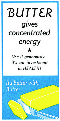
Unconvincing and overheated
This overheated style reached its most humorous point in the early 1940s. After Futura’s popularity exploded in the US, the major foundries raced to produce clones in varying degrees of faithfulness. Ludlow’s Tempo was fairly accurate in its romans, but the italics worked hard – maybe too hard – to differentiate themselves from their source and the other clones.
The tails on the lowercase are very clever in the way they differentiate italic from roman in text (in fact, I ‘borrowed’ them when I designed Neutraface in 2002) but the swash caps are unconvincing, drawing undue attention to themselves in the fake ad for butter in the specimen book. Around 1967, Phil Martin’s Helvetica Flair would push this idea several steps further.
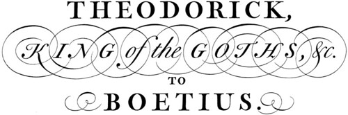
Lettering Artist unknown, titlepiece for Aulicino, The New French Cooking, Grosset & Dunlap Publishers, New York, 1976.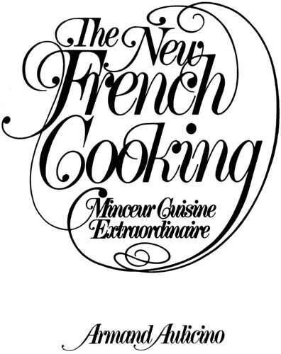
Lavish lowbrow
A huge number of cookbooks published between the late 1960s and early 1980s had cover lettering in this ‘lavish lowbrow’ style, which combines ATF’s insatiable desire to add new swashes to old typefaces with George Bickham’s taste for ornamentation. Perhaps they were hoping to share in the success of Julia Child’s The French Chef Cookbook (Knopf, 1968) by mimicking – and often exaggerating – its cover lettering, or maybe it was just an attempt to look upscale. The main part of this lettering almost certainly came from Photo-Lettering, Inc, but the larger flourishes were added by another artist who appears to have had more enthusiasm than skill. The overall effect has a so-bad-it’s-good charm, but 1976 marked the end of swashes as high style, and the year they became firmly entrenched in the uncool mainstream – cookbook covers, for example.
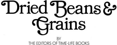
Titlepiece and headlines from The Good Cook: Dried Beans & Grains, designed by Ellen Robling. Time-Life Books, Alexandra, Virginia, 1982.
Below: Ed Benguiat, itc Bookman, published by International Typeface Corporation, New York, 1976.

Blissfully unironic
Poor Bookman Swash. It has been a typographic joke for decades now. Originated by ATF but famously expanded upon by Ed Benguiat and others at Photo-Lettering, Inc, this face, seen here in headlines from a Time & Life cookbook series from the early 1980s, is generally considered to be the nadir of the whole swash genre, evocative not of calligraphic elegance or tasteful flourishing, but of strip-mall craft supply stores and bad sitcoms. This face has started to pop up again lately, especially on hipster T-shirts, but here its blissfully unironic use captures the best and worst traits of the face. The loops and curlicues celebrate the variety of things that can be done with letterforms, but the headlines are overwhelmed by so many individual characters vying for attention. While some of the swash characters in the top samples look a bit timid, Ed Benguiat’s ITC Bookman Swash exudes confidence with its large x-height and demonstrative loops and tails.
Ed Benguiat, Benguiat Caslon Swash, (ca. 1974);
Top: Digital reconstruction of lettering by Photo-Lettering.
Below: lettering by Christian Schwartz for music video Go (2005) by Common, directed by Kanye West, Matthew Tragesser / Convert and MK12.
The common touch
While Bookman Swash epitomises unsophisticated typography, Benguiat Caslon still manages to give off an impression of cool urbanity – probably because of its association with movies such as Foxy Brown (1974) – despite being from the same time period. When House Industries invited me to be part of their project to bring Photo-Lettering, Inc back to life, this face was at the top of my list.
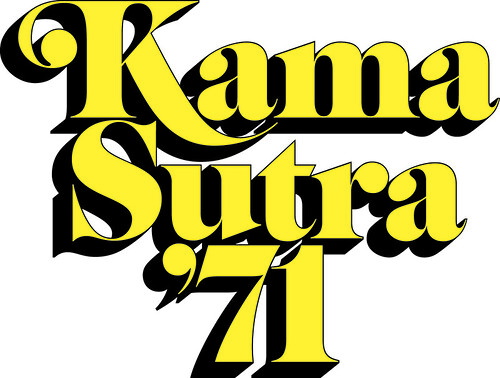
Our new digital version came in handy when broadcast designer Matthew Tragesser hired me to turn hip-hop artist Common’s lyrics into type treatments evocative of 1970s-influenced magazine design for a music video. one of the co-directors sent over the scanned cover of a book called Kama Sutra ’71 for inspiration, which used this face
Farnham display italic

Farnham display italic (all caps)
Luxury text italic
The challenge of all caps
My first attempt at swash caps was released in 2004 as part of the Farnham family. A reinterpretation and expansion of punch-cutter Johann Fleischman’s eighteenth-century swashes, they worked well as initial caps, but when magazine designers used them in all caps they looked ridiculous. When drawing Luxury Text a couple of years later, I aimed to figure out a way to make swash all caps look reasonably good. Antique maps gave a good starting point (incidentally, on closer inspection it seems that many of the swashes grew out of the need to hide engraving mistakes), and so did nineteenth-century Moderns, with sharp forms substituted for thier ball terminals. A complex series of algorithms automatically balances swash substitution and attempts to tone down flamboyance, making it easier for its users to look as if they have sophisticated tastes.
Christian Schwartz, type designer, New York
First published in Eye no. 62 vol. 16 2006
Eye is the world’s most beautiful and collectable graphic design journal, published quarterly for professional designers, students and anyone interested in critical, informed writing about graphic design and visual culture. It is available from all good design bookshops and online at the Eye shop, where you can buy subscriptions and back issues. You can also browse visual samples of recent issues at Eye before You Buy.