Winter 1993
Both ends burning
Fuel is a magazine, a design team, and a four letter word. Their style is tough, but ambiguous, too
Fuel is a four-letter word. It is also the name of a magazine and now a design company. They are a rare and arresting example of a design team trying to have it both ways: unfettered self-expression and serving the client. In an ideal world, say Fuel, they would spend 50 per cent of their time creating the magazine and 50 per cent doing commercial work. A year and a half out of post-graduate studies, the ratio is more like 20:80 in favour of business.
Fuel’s three members – Peter Miles, Damon Murray and Stephen Sorrell – banded together in 1990 during their first term at the Royal College of Art. They refused to do the set projects, choosing instead to work collectively on their magazine. The college provided funding for the first issue; after that they were on their own.
Published in spring 1991, Fuel no. 1 – four-letter title: “Girl” – provoked cries of “sexist!” within the college, mostly, they now claim, from other male students rather than women. At the very least it is an ambiguous affair. There is nothing very explicit, or particularly outrageous, about the juxtaposition of pegboard-lettered keywords (“omen”, “peep”, “want”, “nude”) with found type and media imagery, and the overall mood is more one of post-adolescent sexual uncertainty than outright misogyny. The raw visual treatment, on the other hand, had real freshness and force after a decade of sugary style in British graphic design. “Decoration can be confusing,” says Sorrell. “There’s no need to flower things up. We are interested in the undesigned look.”
Subsequent issues, appearing roughly twice a year, have continued in much the same vein, with two breaks in the magazine format: issue 3, “USSR”, was a poster set with accompanying 8mm film (undistributed); issue 5 was a T-shirt. For the most part, though, they have played to their strengths: tough, four-letter subject matter (“Hype”, “Cash”); scalpel-sharp visual editing and assembly on the page; ambiguous and unresolved effect. In a spread from “Crash” – probably their best issue to date and certainly their best-funded – a story about Buenos Aires doctors selling the body parts of murdered mental patients is illustrated with a prosthetic torso and leg. The latest issue, Fuel’s most wilfully provocative, at least in intention, is called “Dead”. “We chose [the theme] because it was so unlikely and ugly,” says Sorrell. “We are questioning our own attitudes,” adds Miles. “The ideas were slow in coming. It needed delicate handling. It’s always uncomfortable and that suits our graphic sensibility as well.”
It is possible they held back too much on this occasion, possible, too, that they and their team of regular writers didn’t have anything very pertinent or pressing to say. Certainly the clean white pages are strangely antiseptic compared with earlier issues. The sixth issue sees a refinement – perhaps too great a refinement – of the simple text/image oppositions used to such satirical purpose in “Cash”. Text is set in square, centred patches with no adornment, and the typography, as they acknowledge, is very English. “We use quite old types,” says Sorrell, “serifs like Caslon, Bembo, Perpetua. That’s not to say that we wouldn’t use a modern typeface, but our taste is more traditional. We all did quite a lot of letterpress at college which gives you a background in tradition.”
Their hope now is to find a wider audience. “It’s frustrating that it sells only in arts-based bookshops,” says Sorrell. “Hype” was an edition of just 50 produced by letterpress and photocopier, while “Cash” ran to 1000 copies. “Dead” has a print run of 700 copies and will be available in Paris, Amsterdam and New York, as well as in the UK.
As for Fuel’s commercial projects, it is still early days: catalogue work for Diesel, a denim company – they set fire to the clothes; a series of foyer posters for Virgin; a design exhibition catalogue; and some independent record sleeves. All interesting, but one or two of the Virgin posters apart, nothing as yet with the no-holds-barred conviction of Fuel. Give them time.
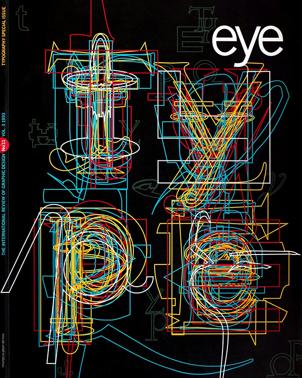
First published in Eye no. 11 vol. 3, 1993
Eye is the world’s most beautiful and collectable graphic design journal, published for professional designers, students and anyone interested in critical, informed writing about graphic design and visual culture. It is available from all good design bookshops and online at the Eye shop, where you can buy subscriptions and single issues.

