
Spring 2014
Burger, fries, no logo
With ‘nothing to show and nothing to say’, Ben Stott’s ‘anti-branding’ helped turn the Byron restaurant chain into a multi-million pound brand.
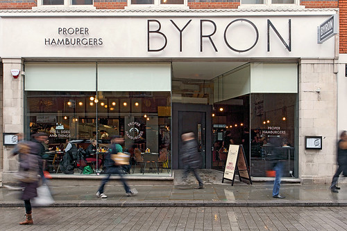
For the past few years the British hamburger chain Byron, which launched in 2007, has had an approach to identity design that flies in the face of branding fundamentalism, and reflects the more current notion of ‘dynamic identity’.
Yet ‘dynamic’ is not quite correct to describe an identity, steered by designer Ben Stott, for which there’s no logo – and no easily describable ‘house style’. Stott has taken a playful approach to every aspect of a chain in which the most consistent elements appear to be the hamburgers themselves, and the word ‘Byron’.
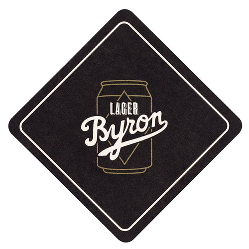
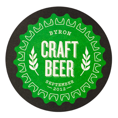
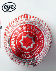
Beer mat used to promote Byron’s own light golden lager and pale ale, brewed with Camden Town Brewery (see ‘Labelled with love’, Eye 87).
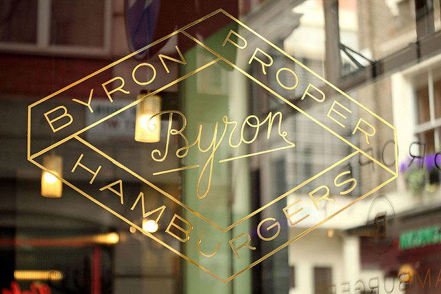
Top: Design and art direction by Ben Stott, Byron Beak Street, London, 2013. Stott says: ‘The letters are based on Turnpike, redrawn to be thinner and wider.’
Such ‘anti-branding’ appears to have worked well for a chain that in six years has grown from a handful of London burger joints to 35 in the UK. Originally backed by Gondola Holdings (owned by private equity firm Cinven), Byron was bought by Hutton Collins Partners in October 2013 in a deal worth £100 million.
The 36th branch is opening at the O2 entertainment complex in London, and there are also Byron restaurants in Cambridge, Liverpool, Manchester, Oxford and in the Bluewater shopping mall (see Eye 34) in Kent.
Under Stott’s art direction, Byron signs can be anything from carefully applied signwriting to deliberately applied ‘bad type’; from distressed stencils to gleaming neon. The interiors and menus feature the exuberant outpourings of contemporary illustrators such as Jean Jullien, Paul Davis, Mr Bingo, Joel Holland and Andrew Rae. Stott is also happy to repurpose clip art and his own snapshots. Furthermore, there’s no custom typeface: type styles vary from typewritten through hand-lettering to vintage typefaces chosen with a sharp, contemporary eye for detail.
Cowcross Street, London, 2013. For the sign, Stott used a ‘deliberately oversized, skinny sans serif, inspired by some East German shop signs’.
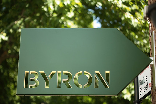
Hoxton Square, London, 2011. This sign has since been replaced.
Stott began working with Byron MD Tom Byng soon after making an amicable split from NB (as in Nota Bene) Studio, the company he founded with Nick Finney and Alan Dye more than a decade earlier after stints with Pentagram and Landor. NB’s notable successes included identity design for Tate Members and Insead, the international business school.
He says that when he was approached about designing for the burger chain (through Byron’s ‘head of brand’ Cristina Fedi, formerly at Channel Four), his first thought was: ‘I can’t possibly do it, I haven’t even got a letterhead.’ At the first meeting he found Byng ‘intimidating … but in a good way’, and admired the latter’s obsessive interest in the details of his restaurants, demonstrated by his pride in the ferocious force of the hand dryers in the loos. Shortly after that meeting, Stott had devised a few basic principles that guided his subsequent approach. First, no photographs of the food. ‘You really can’t take a great picture of a hamburger,’ he says. ‘Tom winced every time I showed him one of Byron’s own photographs.’
Second, he decided that Byron’s copywriters should never claim that the food is ‘good’, ‘fresh’ or ‘authentic’. He argues that you don’t need to tell people because they’ll know. Third, the chain’s architects, Michaelis Boyd Associates, were interested in developing an individual style for each restaurant, which opened a path for a more radical graphic approach. Stott: ‘With nothing to say and nothing to show, my approach was to treat each restaurant as if it was the only one.’
Beer mat used to promote Byron’s own light golden lager and pale ale, brewed with Camden Town Brewery (see ‘Labelled with love’), as well as Byron’s craft beer list.
His confidence in tackling the commission in this way was bolstered by his belief that the job would only last four or six months before he moved on to other commitments. Stott’s straightforward restaurant signs, along with the quirky illustrations he commissioned for menus and other ancillary material, soon became the way that Londoners recognised the chain.
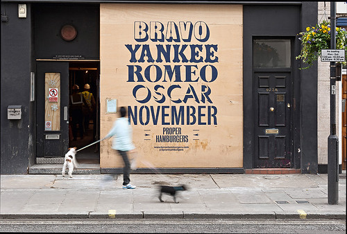
As the chain expanded, the ‘no logo’ look became a badge of honour, a tease incorporated into the boards that went up while builders were still refitting the premises. For the hoardings outside the Westbourne Grove branch, Stott suggested they use ‘Bravo Yankee Romeo Oscar November’, the phonetic [Nato] alphabet words to spell ‘Byron’.
Sometimes the approach is less crafted: for one site, the architects told Stott they were looking for ‘1970s cab office’; another branch looks like an old electrical showroom, with graphics to match. Stott collects ‘images of crap signs’, and doesn’t mind playing with pastiche, making the uncool look oddly cool. The Waterloo branch is sited in three interconnecting small shop sites in The Cut. So it has three different signs: the hip anti-brand explains itself at a glance.
Westbourne Grove, London, 2012. Photo by Jon Osborne.
Waterloo, London, April 2012. Ben Stott says: ‘The site was three shopfronts with a traditional 1950s and 60s café feel – the opportunity to make three different fascias was too good to miss!’ Two of the three sites are shown here. Photo by Glenn Dearing.
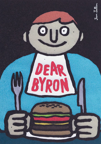
Inside the restaurants, the cheerful, studied eclecticism continues, in tandem with the magpie instincts of stylist Clare Nash. A typical Byron feedback form is a postcard bearing a Jean Jullien illustration. In one, an outstretched fist clutches a squeezy red bottle and writes ‘Dear Byron’ in ketchup. The verso politely asks: ‘Anything you’d like to add?’ The address cards (in a rare outbreak of consistency) are playing cards with each branch’s details on the backs. The takeaway bags have a touch of 1970s retro, with monochrome clip art illustrations (adapted by Ryan Bartaby in Stott’s studio) showing a push-button wall phone and other resonant images. Colour-in kids’ menus show menageries of anthropomorphised animals, vegetables and balloons by illustrators such as Jullien and Andrew Rae. When the Hoxton branch serves a craft beer such as The Kernel (see ‘Labelled with love’, page 96), the label meshes nicely with the hipster milieu. Byron’s own labels use a script face by Stott, Bartaby and Rose Reeves.
Byron is highly fashionable right now, but Stott doesn’t see a problem with that: ‘We’re not trying to say my designs will be here for ten or fifteen years.’ Stott wound down his commitment to the chain in 2013, passing the anti-branding baton to Charlie Smith and former employee Reeves. He admits that after several years he realised that he had ‘painted himself into a corner’ by having to be so different with each place. There are more challenges on the horizon. However I suspect that many other restaurant chains, and brands in general, will be examining Byron’s success – and Ben Stott’s artfully eclectic methods – with great interest.
Feedback card with illustrations by Jean Jullien, 2012.
John L. Walters, Eye editor, London
First published in Eye no. 87 vol. 22 2014
Eye is the world’s most beautiful and collectable graphic design journal, published quarterly for professional designers, students and anyone interested in critical, informed writing about graphic design and visual culture. It is available from all good design bookshops and online at the Eye shop, where you can buy subscriptions, back issues and single copies of the latest issue. You can see what Eye 87 looks like at Eye before You Buy on Vimeo.