Autumn 2009
Character studies
Michael Johnson’s project to make a ‘phonetic typeface’ that English speakers can understand
Michael Johnson has long been fascinated by Japan. But when he went there in the 1980s as a young freelance, he found there was little opportunity to engage with the local visual culture; he spent a while in Tokyo as an exotic resource, turning out gaijin [foreigner] design on demand for a big advertising agency. ‘I’d ask them what the brief was and they’d say “Milton Glaser”,’ he laughs. ‘I lasted about six months before I went almost crazy.’
Johnson didn’t return for fifteen years. ‘I waited until I was sure I could offer something,’ he says.When he did go back to Japan, in 2003, to give a seminar at the British Embassy in Tokyo, it was as principal of his own design practice, Johnson Banks, and with a substantial body of work to his name. This visit, soon followed by an exhibition of his work in Japan, gave rise to a series of projects that integrate the two cultures.
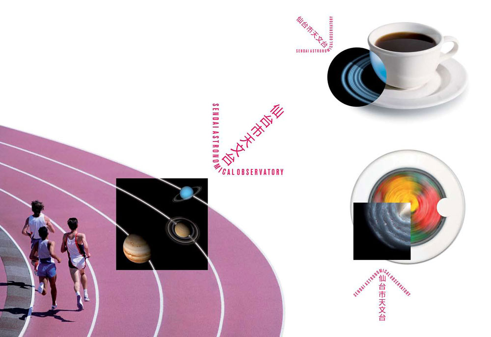
The practice’s first substantial project in Japan was to design an identity programme for the Sendai Astronomical Observatory (2005). ‘Sendai wanted the identity not to have the feeling of a Japanese graphic designer about it,’ explains Johnson. ‘They wanted a gaijin to look at it.’ He notes with some amusement that all the other Japanese observatories employ logos with solar systems: ‘They all look exactly the same!’
The Sendai logo combines western and Japanese characters in a single, arrow-like logo. The identity makes play with double images that make visual rhymes between photos of everyday things and the (literally) other-worldly content of the observatory’s museum. Circular and elliptical forms – a racetrack seen from above, a teacup and saucer, or a girl hula-hooping – are elided with orbital systems and planets. This is a variation on a typical Johnson Banks process, whether it’s juxtaposing familiar images (comedians, artworks) in their 1998 poster campaign for the British Council; or the Think London identity (2004) in which the city’s abstracted skyline is outlined as a reflection of its cultural icons.
The integration of western and Japanese characters is becoming a theme for Johnson Banks. Their identity for UK-Japan 2008, a year-long celebration of the opening of trade links between the two countries, for example, combines the letters ‘U’ and ‘K’ with the kanji character for Nihon, the ‘land of the rising sun’ [aka Japan].
Kanji, based on the pictograms of written Chinese, uses a single character to represent a word, such as ‘moon’ or a sound. But kanji is only one of three Japanese writing systems, along with katakana, the phonetic alphabet most frequently used to translate foreign words into Japanese, and hiragana (also phonetic), the more curved script used for words for which there are no kanji. It is not unusual to find all three in one sentence.
‘On business trips to Japan I would always try and work out how to say things that I saw … I would look at the characters on my Japanese business card and try to say it – and Japanese people would correct me. This was a repeated, slightly Groundhog Day aspect to my trips there.’
Romatakana and Phonetikana
It was this experience of struggling gamely with the language that prompted Johnson to start work on a speculative project, a ‘typeface’ that would combine both sets of characters and would also aid understanding – acting as a phonetic aide-memoire for anyone learning the language. ‘This is me getting off the plane and having this really odd idea,’ says Johnson. Though this Anglo-Japanese typeface has gone through several evolutionary stages, it remains a personal project, to be developed over time with the assistance of Japanese-American designer Miho Aishima at Johnson Banks.
‘Uniqlo’ rendered in Michael Johnson’s Phonetikana typeface. Design: Michael Johnson, Miho Aishima, Johnson Banks.
Top: identity for Sendai Astronomical Observatory. Design: Michael Johnson, Julia Woollams, Johnson Banks, 2005. The text in the arrow, reads Sen dai City Ten mun dai (Japanese for space observatory), in the six kanji characters.
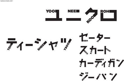
Johnson called the first version Romatakana. Each character embeds a Latin letter in the thick part of the stylised katakana glyph. ‘It looks beautiful, but doesn’t tell you how to say it,’ says Johnson. Phonetikana, the second attempt, shows the English reader how to pronounce each Japanese character, with phonetic syllables such as ‘hoh’, ‘shee’ and ‘koo’ – the idea being that ‘you don’t even have to learn the shape’. Using this, you can see that the four characters in (for example) the Japanese version of the Uniqlo fashion logo read ‘yoo’, ‘nee’, ‘koo’, ‘roh’; and read the katakana for Pecha Kucha (‘peh’ ‘chee’ ‘ya’ ‘koo’ ‘chee’ ‘ya’).
A new Johnson Banks commission, a marque for 2009’s Japan Matsuri [festival] in London, has given Johnson yet another opportunity to work with both languages. ‘We took a risk and asked them if they could reverse the order of words in the name,’ says Johnson. Changing the title to ‘Matsuri Japan’ made it possible to construct the kanji character for ‘festival’ from the letters ‘A’ and ‘J’.
Mashed-up language
Meanwhile, Johnson continues his speculative work to make a phonetic typeface. The project appeals to his interest in mashed-up languages, which you find all over the world: Africa, Malaysia, and especially Japan. ‘You see a lot of work there in ‘Jinglish’, where you mess up Japanese and English. Uniqlo is a fantastic example – unique clothing. You see that all the time – it’s like the mashed-up street language in Blade Runner, the language of the future, if you like.’
Is there perhaps a Utopian, Modernist element to this quest for understanding? ‘You mean a 21st-century Esperanto?’ he says with a laugh. ‘Maybe!’
‘But some of this is just driven by embarrassment. I struggle to say their language and I want to be able to say my own name, for example, in the right phonetic way.’
First published in Eye no. 73 vol. 19 2009
Eye is the world’s most beautiful and collectable graphic design journal, published quarterly for professional designers, students and anyone interested in critical, informed writing about graphic design and visual culture. It is available from all good design bookshops and online at the Eye shop, where you can buy subscriptions and single issues.