
Winter 2014
Crowd-sourced wisdom?
As Hershey and Airbnb have discovered, the internet has spawned a vast, powerful audience of opinionated design critics. If resistance is futile, how can designers adapt?
Screengrab, paste, select, edit, upload, rate. Design images are no longer safe, and neither are the people who create them. Today’s working designers not only have to please their clients, now it looks as though the whole internet has a few changes to suggest.
Communication technology is exposing graphic design to a vicious yet creative new form of criticism. People have always had strong opinions about design, but now anyone with a smartphone can edit, re-appropriate and redistribute professional graphic design in minutes. Mockeries, grievances and suggestions once discussed in pubs or studios are now visualised and published online and there is nothing professionals can do about it.
In August, the American chocolate giant Hershey ran into difficulties when it launched a new, simplified vector iteration of its logo. The classic, drop-shadowed type was replaced by bold flat lettering, and the accompanying photo-illustration of an emblematic ‘Kisses’ chocolate drop by a stylised graphic. It is all you might expect from a 2014 design facelift: gone are the shadows and realism, in come the clean lines and abstract shapes. It looks neat. But it also resembles a hugely popular message icon that smartphone users will recognise as ‘Pile of Poo’ – the grinning dollop of excrement that comes bundled with the smiley faces, cars, guns, skulls and animals that make up the other ‘emojis’.
In August 2014, Hershey’s logotype redesign and slick, simplified new rendition of its emblematic chocolate ‘Kisses’ confection led to unwelcome comparisons to another popular glyph, the ‘Pile of Poo’ emoji, familiar to smartphone users around the world.
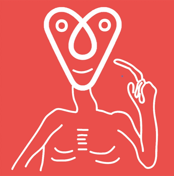
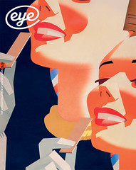
Top: Airbnb’s Bélo logo is ingeniously and mischievously redrawn by online image editors.
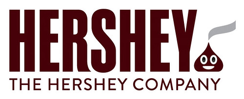

The resemblance was not only suggested but also realised, with the Pile of Poo character quickly replacing the Kisses graphic, ridiculing the rebrand and associating it with the last thing anyone would want to eat. The image sped across the Web, and soon the hunt was on for other companies whose logos resembled similarly unsavoury objects. The Spanish bank Santander fared particularly badly.
Though this somewhat juvenile response is typical of the online community, it feels as if the appetite for mischief is growing, particularly since the furore that greeted Airbnb’s rebrand earlier this year. The reaction to the online sublet agency’s looping, curvy new arrow logo – created by the London-based Design Studio and christened the ‘Bélo’ – illustrated how opinionated the online community is about design and, crucially, how skilled many users are at re-appropriating it. It quickly emerged that the good people of the internet felt that the Bélo looked more like a bodily opening than a domestic one, as within hours of its release dozens of new versions appeared on message boards and blogs. As with Hershey, most were either scatological or pornographic, and many were both.
In this age of apps and icons, rebrands are becoming increasingly high profile. Many company logos become icons that people have to interact with physically, tapping them on screens, launching applications, linking to websites. Modern logos have to be not just visually appealing, but tactile as well. Once your identity appears across the internet, Photoshopped into frankly obscene scenarios, it can give unpleasant associations to the service you are providing.
Airbnb’s reaction to its rebrand typifies an emerging attitude towards new logos. It embraced the rampant customising and now actively encourages it – this appears to have been part of the plan all along. Although its ‘Create Airbnb’ website steers clear of the more explicit interpretations shared online, it allows users to edit the shape, size, colour, line and style of the Bélo and attach emoticons, little animals and other simple images to it. Airbnb wants these personalised designs posted, printed, stuck on windows, uploaded and generally disseminated as widely as possible.
New York City Football Club invited prospective fans to design a crest for the new team and submit it online: many of those received were critical of the capitalist ambitions of the club’s owners, Sheikh Mansour and Manchester City.
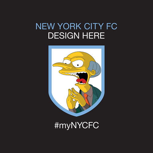
Other companies are turning to their customers for design tips, with varying degrees of success. US Major League Soccer’s twentieth new team, New York City FC, who will play their first competitive season in 2015, turned to the internet to crowd-source designs for a team crest. They posted an image of a blank shield on Twitter, with the hashtag #myNYCFC, and encouraged their followers to submit their own designs. Predictably, most submissions were just daft (a smiley face; a tiny, off-centre football; even Hershey’s modified Kisses put in an appearance), while others highlighted the financial ambitions of NYCFC’s founders. Changing these logos online, like scribbling a moustache on a poster, became an outlet for dissent as well as support.
Elsewhere in the sports world, and in a curious instance of self-fulfilling prophecy, a re-interpretation of the logo for the 2014 FIFA World Cup in Brazil ended up becoming an emblem of the home team’s disastrous collapse towards the end of the tournament. The official logo represented the coveted World Cup trophy as an arrangement of thick cartoon hands – it was intended to stand for the desire to touch the trophy, to get your hands on it, as well as the coming together of peoples from around the globe. As soon as the design was revealed, the helpful online community was quick to point out its resemblance to Captain Jean-Luc Picard’s famous ‘facepalm’ screenshot, an image meme from Star Trek: The Next Generation distributed around the net and used to indicate despair, regret or exasperation. After Brazil’s 7-1 drubbing by the Germans, the facepalm interpretation of the logo suddenly took on a new resonance. Photos of devastated Brazilians began to look like the logo for the tournament itself: the logo crystallised their emotions.
What has changed is not simply that people who previously would not have had strong opinions on logo design are now taking an interest. The way that the internet displays and orders images is altering our appreciation of them. Imgur.com (pronounced ‘im-a-jer’) is a picture-hosting website, founded in 2009, to which more than 1.5m images are uploaded daily. Each post is subjected to ‘upvotes’ or ‘downvotes’ by other users: the most popular rise to the top of the grid, where they are seen and judged by even more people. Its disparate community collectively decides which pictures are the most original, the funniest, saddest, or most inventive.
And it is on sites such as Imgur that variations of established symbols originate and spread. They allow accumulations of images to build up and inform one another. Just as the rude realisations of the Hershey and Airbnb logos were collected into one Tumblr blog, on Imgur inventive re-interpretations are posted to the comments section underneath each image. Viewing an image online – a logo, a photograph, or a cartoon – is a shared experience. These websites funnel content across the Web so quickly that images arrive with a string of variations, opinions, comical alterations, captions and withering criticisms already attached.
Online communities such as Imgur are the polling stations in Adobe Photoshop’s new democracy. Designers simply have to adapt to a world in which their work is not only rated and ranked but – once published – beyond their control.
FIFA’s logo for the 2014 World Cup was compared to Captain Jean-Luc Picard’s ‘facepalm’ meme, an image used online to signify exasperation.
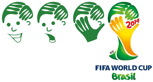
FIFA’s logo for the 2014 World Cup was compared to Captain Jean-Luc Picard’s ‘facepalm’ meme, an image used online to signify exasperation. For Brazilian football fans, it is a gesture now regrettably synonymous with their team’s performance in the tournament.

Tom Harrad, writer, London
First published in Eye no. 89 vol. 23 2014
Eye is the world’s most beautiful and collectable graphic design journal, published quarterly for professional designers, students and anyone interested in critical, informed writing about graphic design and visual culture. It is available from all good design bookshops and online at the Eye shop, where you can buy subscriptions, back issues and single copies of the latest issue. You can see what Eye 89 looks like at Eye before You Buy on Vimeo.