Spring 2007
Dark tools of desire

various designers
Roman Cieślewicz
Quay Brothers
René Magritte
Abram Games
Max Ernst
Herbert Bayer
Lester Beall
Hans Schleger
Alvin Lustig
Bronislaw Zelek
Karel Teissig
Brian Schorn
Surrealism’s relationship with graphic design is still strangely unfulfilled. By Rick Poynor
Surrealism is often described as the most influential of all twentieth-century art movements. Its poetic sensibility and way of perceiving reality is so pervasive that we take it for granted now. From the bursts of nonsense and deranged flights of fancy in contemporary humour to David Lynch’s disturbing journeys into the secret backwaters of desire, Surrealism has exposed the liberating power of the unconscious mind. Yet, despite its place at the dark heart of visual culture, Surrealism’s implications for the commercial art of graphic design have never received much attention in academic histories and informal surveys. Dada and Futurism, by contrast, were such fertile sources of new approaches to typography that they remain essential points of comparison and, indeed, benchmarks for all subsequent attempts to manipulate letterforms for expressive effect; and this applies even to designs that share no philosophical or ideological aims with the Dadaists and Futurists.
One reason for Surrealism’s relatively unexamined role in the history of graphic design is that it had no decisive impact on typographic methods and aesthetics. While graphic designers are still working today with typographic conventions that can be traced back to Modernism, Surrealism is not part of this narrative. This raises the question of whether there was ever such a thing as surrealistic typography – we will return to this later.
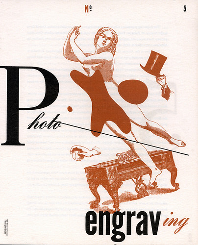
Cover of Photo Engraving no. 5 designed by Lester Beall, 1939.
Top: Poster designed by Hans Schleger (Zero) for Shell-Mex’s ‘These Men Use Shell’ series, 1938. The subject here is journalists.
In A History of Graphic Design, Philip Meggs briefly discusses Surrealism in a section about modern art’s influence on graphic design, without relating the movement to specific moments and developments in design. ‘Unfortunately, the ideas and images of surrealism have been exploited and trivialised frequently in the mass media,’ he concludes, without much enthusiasm. Writing in an entry about Surrealism in his recent book Stylepedia, Steven Heller is similarly lukewarm about its applications in visual communication. ‘As commercial art, Surrealism was a benign tool not a revolutionary language,’ claims Heller. Nevertheless, he believes that as a ‘popular style’ this neutralised concept still has its uses: ‘Surrealism’s dreamy appeal continues to entice, and remains a viable means to convey complex themes in poetic, often abstract, ways.’
Be this as it may, scholarly and curatorial interest in Surrealism continues at full tilt. In recent years, London has seen major exhibitions at Tate Modern (‘Surrealism: Desire Unbound’, 2001) and at the Hayward Gallery (‘Undercover Surrealism’, 2006). In March 2007, ‘Surreal Things: Surrealism and Design’, the first substantial exhibition to examine Surrealism’s influence on design, opens at the Victoria and Albert Museum. This sounded promising, but curator Ghislaine Wood’s focus in both the exhibition and its accompanying book is primarily on Surrealism in relation to the object: furniture, fashion and the interior take centre stage. Although the show features magazine covers and advertising related mainly to these topics, it does not set out to consider the relationship between Surrealist concepts, aims and methods and the development and practice of graphic design.
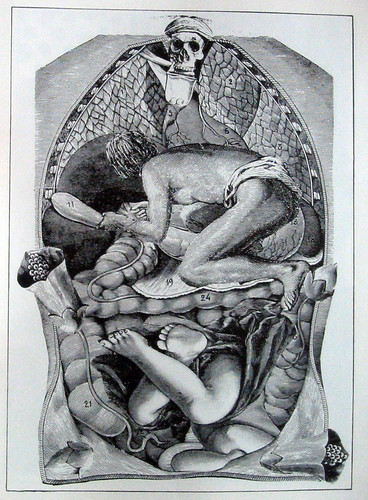
Hydrometric Demonstration of how to Kill by Temperature, 1920, a proto-Surrealist collage by Max Ernst using found material.

Page from Une Semaine de Bonté (A Week of Kindness) by Max Ernst, 1934, showing one of 182 collages. In place of the seven deadly sins, Ernst offers seven deadly elements, in this case ‘blackness’.
Total liberation of the mind
Whatever it was to become later, Surrealism presented itself from the outset as a revolutionary project. A tract distributed in 1925 by the Surrealists’ Parisian headquarters, Le Bureau central de Recherches Surréalistes, describes the movement as ‘a means of total liberation of the mind’ and insists that its signatories – among them Antonin Artaud, Max Ernst and the group’s leader, André Breton – are ‘specialists in revolt’ who will stop at nothing to achieve their aims. ‘Surrealism is based on the belief in the superior reality of certain forms of previously neglected associations, in the omnipotence of dream, and in the disinterested play of pure thought,’ writes Breton in the first Surrealist Manifesto (1924).
Surrealism’s origins lay in poetry rather than painting, and its first task was to unchain language by putting the emphasis on automatic writing, the exploration of the unconscious and the revelations of dream imagery. Since all the logical connections embodied by linear syntax were under assault, it might seem odd that Surrealism’s founders did not attempt to unpick the conventions of structured typography and orthography used to give language the appearance of rationality and order, in a similar fashion to Dada.
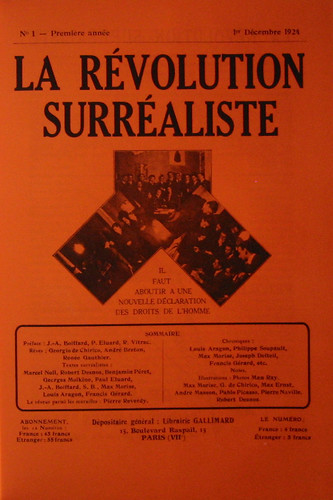
La Révolution Surréaliste, 1924.
Documents no. 1, 1929.
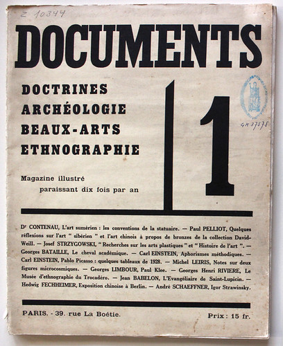
Instead, for their official documents the Surrealists employed, albeit ironically, the staid typographic conventions of the day. The layout of the journal La Révolution Surréaliste (1924-29) was modelled on the science journal Nature; its two-column grid, if not its content, is a picture of sobriety. Documents (1929-30), a journal co-edited by Georges Bataille, who broke away early from the Surrealist group, was similarly restrained in its outward typographic form. In 1924, the Bureau of Surrealist Research issued a series of sixteen papillons (butterflies), postcard-sized flyers bearing enigmatic slogans such as ‘Parents! racontez vos rêves à vos enfants’ (Parents! recount your dreams to your children) and ‘Si vous aimez l’amour vous aimerez Surréalisme’ (If you love love, you will love Surrealism), which they posted around Paris. While these language experiments from the Surrealist laboratory were provocative in conception, they employed an ordinary printers’ vernacular, mixing type styles and sizes for emphasis, with no concern for consistency, or for the niceties of Modernist avant-garde design.
As art critic Krzysztof Fijalkowski points out in Surreal Things, Surrealism’s version of Modernism was always more preoccupied with objects and images that were recently outmoded – with what Walter Benjamin called the ‘ruins of the bourgeoisie’ – than with celebrating the alluring new products of capitalism. Surrealism’s demands, notes Fijalkowski, were ‘not for new things but for new eyes with which to re-envision and understand afresh both the world one had just lived through and its ideological legacies’.
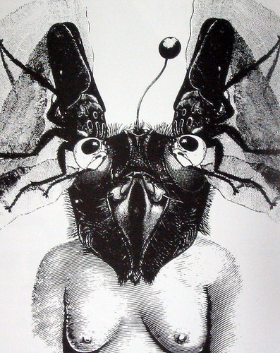
Max Ernst, the most brilliant investigator of these possibilities in graphic terms, made repeated use in his collages of found images from old trade catalogues, text books and engraved illustrations – shoes, hats, animals, billiard tables, scientific equipment, medical supports. In a rare piece of graphic design, a cover for the Surrealist magazine VVV, published in New York in 1942, Ernst montaged diagrams of fish, insect wing and bird wing movements to generate an almost abstract play of wave forms across the enlarged titlepiece. His blackly comic subversion of Victorian engravings in bizarre collage novels such as Une Semaine de Bonté (1934) coded this kind of imagery as permanently surreal, whenever it has subsequently been seen displaced from its original context. Ernst’s prodigiously inventive juxtapositions revealed a new graphic universe and they have had an immeasurable, if not always acknowledged, influence on the language of graphic design.
Advertising’s dreamlike other-worlds
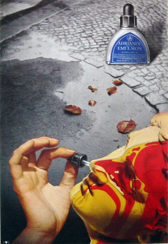
By the mid-1930s, Surrealism had become so fashionable that its take-up by commercial artists was inevitable. The preferred form of image, derived from de Chirico (a Surrealist by adoption), Dalí and Magritte, was illusionistic. Herbert Bayer had become familiar with Magritte’s work while living in Berlin, when one of his own paintings was featured in a Belgian magazine. In Bayer’s ad for Adrianol nose drops, designed in 1935, a hand inserts the dropper into the nose of a classical head based on Praxiteles’ Hermes – by way of de Chirico, who favoured similar statuary – on to which Bayer has superimposed a medical diagram, as though we can see inside the head. The product, shown without copy lines, becomes a surrealistic totem. Bayer made other images that have been linked to Surrealism, such as his photographic self-portrait of 1932, where he appears to remove a section from his naked arm. There are only a few images of this kind in his oeuvre, though, and it has been argued that his concerns lay with conscious matters of perception, interpretation and pictorial organisation, rather than with the expression of subconscious impulses.
Poster design by Abram Games from the ‘Your Britain. Fight for it Now’ series, 1942.
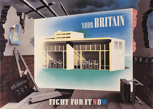
Other surrealistic commercial art from this period tends to have the same feeling of expediency, without commitment to Surrealism’s radical intentions. Abram Games was among the 23,000 visitors who visited the ‘International Surrealist Exhibition’ at the New Burlington Galleries in London in 1936, where 360 collages, paintings and sculptures by Ernst, Dalí, Hans Arp, Man Ray and many others were shown. Games’s visual debt to Surrealism can be seen in propaganda posters such as the ‘Your Britain, Fight for it Now’ series (1942). Walls emblazoned with images of new architecture shine like visions of hope against shattered buildings that loom out of dark zones of despair purged of identifying features by war. The same fusion of realism and fantasy to materialise dreamlike other-worlds familiar from innumerable Surrealist paintings distinguishes posters created in the 1930s by Hans Schleger and by the team of Tom Eckersley and Eric Lombers for the ‘You Can be Sure of Shell’ promotional series. Eckersley and Lombers’ ‘Scientists Prefer Shell’ also features a stylised laboratory table with a flask apparently floating in deep space that recalls the frottage textures in Ernst’s paintings.
Only occasionally in these years were there indications of what Surrealism might look like if applied to the graphic space of the typographic, printed page rather than to pictorial spaces visualised by paintbrush and airbrush. American designer Lester Beall’s cover for the fifth issue of Photo Engraving magazine (1939) is in every sense a graphic construction, synthesising typographic and compositional influences from Dada and Constructivism as well as Surrealist tropes. (See Eye no. 24 vol. 6) Representational collage elements, such as the hand holding a hat and the keyboard instrument, come from Max Ernst, while the abstract ‘biomorphic’ shapes were familiar from the works of Arp, Joan Miró and the non-representational landscapes of Yves Tanguy. In 1939, Dalí became the talk of New York with window displays for Bonwit Teller that offended the department store’s customers, and Surrealism’s influence was given an added boost in the US by the arrival during the war years of so many émigré Surrealists and their affiliates, including Breton, Arp, Miró, Duchamp, Magritte, and Hans Bellmer.
In the 1940s, Alvin Lustig was the most convincing American graphic interpreter of Surrealist imagery in a series of remarkably free book covers for the publisher New Directions. (See Eye no. 10 vol. 3.) On Baudelaire’s Flowers of Evil, one of the most mysterious, three biomorphic beings radiate spindly tendrils of menace.
Surrealism in Eastern Europe
In the decades after the Second World War, some of the most potent and persuasive examples of Surrealism’s influence on graphic design came from Eastern Europe – from Czechoslovakia and Poland. In 1934, the photographer and collagist Jindrich Styrsky and the painter Toyen co-founded a Surrealist group in Prague, and they kept closely in touch with the Parisian Surrealists, creating rich soil for later developments in graphic art and design. In both Poland and Czechoslovakia, the street poster was the medium in which this new sensibility flourished. Where American and British commercial Surrealism can seem much too neatly manicured, given the movement’s flagrantly anti-bourgeois origins, these Eastern European images were barbed and unsettling interpretations of the films and plays they announced – by turns enchanted, capricious, enigmatic, fantastical, bizarre and sometimes monstrous. The constraints on free speech under which the designers were compelled to work in Communist countries necessitated the development of a feverishly expressive symbolism. Many of the finest posters convey a feeling that the repressed – in both the psychological and political senses – is not merely returning to the surface but gushing uncontrollably into view.
Asked about his influences, the Polish designer Roman Cieślewicz tended to cite El Lissitzky, Rodchenko and the Dadaist John Heartfield rather than any of the Surrealists, though he admired Bayer’s surreal photomontages. Yet his work is charged with an electrifying power that inevitably brings to mind Ernst’s more threatening collages. In a poster for the film Katastrofa (1961), Cieślewicz fashions a giant, misshapen head out of engravings of an eye and an old map, and fills its mouth with black teeth like torn metal. In 1952, the Czech Surrealist poet Jindrich Heisler had collaged together a polymorphous alphabet out of hands, arms, heads, measuring devices and hammers, and twelve years later Cieślewicz made his own hybrid letterforms, using faces, snakes, lizards and an armadillo that, once again, recall Ernst. David Carson later used the letters to construct a Ray Gun masthead.
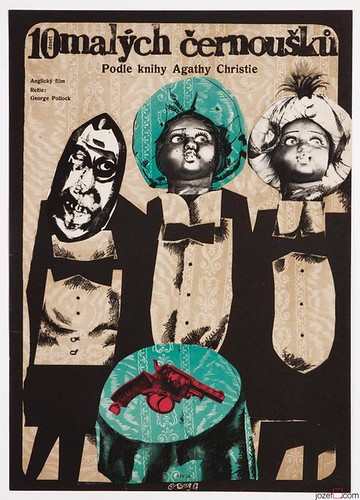
A similar taste for jagged, expressionistic forms cut together with antique engravings and peculiar photographic details appears in the work of Karel Teissig, who pioneered the use of surreal collage effects in the Czech poster. In a marketplace that allowed designers a degree of interpretative latitude that is rare today, these visual techniques could be applied to the least obvious subjects. In Teissig’s poster for the film of Agatha Christie’s Ten Little Indians (1968), two of the Indians have doll heads – the doll is one of Surrealism’s enduring icons – while the third figure’s face is a grotesque, leering mask.
Czech film poster for Ten Little Indians, based on Agatha Christie’s novel, designed by Karel Teisseg, 1968.
Dolls, with empty craniums where their hair used to be, haunt the films of the Quay Brothers, one of the most fascinating cases of the way the spirit of Surrealism continues to operate undercover in contemporary image-making. In the late 1960s, on arrival at the Philadelphia College of Art to study illustration, the twins saw an exhibition of Polish posters that would change their lives. They often speak of their admiration for poster artists such as Cieślewicz, Jan Lenica and Franciszek Starowieyski. A poster by Bronislaw Zelek, showing an anatomical section of a jaw and throat, appears on a wall at the start of their film Street of Crocodiles (1986). In the 1970s and early 1980s, before settling into film-making, the Quays designed posters, book covers and record sleeves that seem to embody a genuinely Surrealist pursuit of the marvellous in both their dreamlike images and extravagantly ornamental calligraphy. The films continue this quest, constructing mysterious puppet-world scenarios and confabulating ‘meanings’ that make satisfying emotional sense while eluding rational transcription. Nevertheless, the Quays prefer to distance themselves from Surrealism.
‘Of course we are familiar with Surrealism, we know its history and its place,’ they told an interviewer in 1996, ‘but the term can too often be used in a cavalier way, without acknowledgement of its real meaning. Like, “Oh, that’s cool, that’s surreal.” When it’s used cautiously and intelligently it can be a very descriptive term, but we’re weary of its over-use.’
This over-use of ‘surreal’ as a synonym for ‘weird’ or ‘strange’ might seem to be an insuperable problem. Illusionistic illustrations plundered from Magritte lost their power to bemuse or delight decades ago, though some illustrators still churn them out. No creative person wants to be identified with a term that has been trivialised and rendered meaningless. Yet this doesn’t mean that work in sympathy with the original Surrealists’ ideas and aims is not possible, as the Quays’ body of work confirms. As the Surrealists themselves often pointed out, they were in part simply laying bare and proclaiming a sensibility and a way of being that had many precursors in literature and art: in black humour, in nonsense poetry, in the Gothic novel, in anatomical engravings, in the strange architectural visions of Piranesi and the disquieting Symbolist dream-pictures of Gustave Moreau and Odilon Redon.
Universes without rules of logic
It may be that to find traces of a purer and more vital strain of Surrealism within graphic design we have to return to a period that is not currently fashionable: the early to mid-1990s. Although the experimental digital design of that time has been understood mainly as a response to new technological possibilities, and to postmodern market conditions, some of the more notable work from those years has a Surrealist quality of spontaneous interior expression.
Advertisement for Adrianol Emulsion nose drops designed by Herbert Bayer, 1935.
If this sounds far-fetched, consider the work of Ed Fella, which is based on a form of ‘pure psychic automatism’ – as Breton defined Surrealism – that remains one of the cornerstones of Surrealist practice. In Fella’s case, call it automatic designing. This can be seen most clearly in the obsessive doodling in his many notebooks (see Eye no. 23 vol. 6), but the posters he has produced since the late 1980s, usually now for his own lectures, display the same urge to facilitate unpremeditated discovery and the chance encounter of unlikely typographic forms.
Fella cites Ernst as a key figure: ‘Juxtaposition is everything!’ he says in Influences (Die Gestalten Verlag, 2006), a ‘lexicon’ based on the possibilities of random selection and fruitful juxtaposition. Fella’s interest in vernacular typography, shared by many other designers, and seen in his book of roadside Polaroids, Letters on America, can be interpreted as a search for outmoded, Benjaminian ‘obscure objects of desire’.
In the work of Fella’s colleague, Brian Schorn, the connection with Surrealism becomes even more explicit. Schorn studied for two years at medical school where he worked as a microbiology assistant and dissected a human cadaver. His interest in Surrealism and in figures such as Ernst and the poetic box-maker Joseph Cornell began when he switched to photographic studies. Schorn had acquired MFAs in photography and creative writing before I encountered him at Cranbrook Academy of Art in the early 1990s, studying for a third MFA in graphic design. By that time he was thoroughly steeped in Surrealist literature and art: Lautréamont (author of the Surrealist precursor classic Les Chants de Maldoror), Breton, Artaud, Bataille, the Romanian painter Victor Brauner and the contemporary American photographer Joel-Peter Witkin are just a few of the influences Schorn cites. He kept dream journals and experimented with automatic writing.
‘I wrote a tremendous amount of poetry using this technique and I believe that I actually accomplished a kind of total, open door to my unconscious landscape,’ Schorn recalls. ‘It was completely natural and flowing.’ He began to apply similar Surrealist techniques to graphic imagery. ‘Soon, the entire form and content of my designs were informed by Surrealist techniques and ideas, most notably collage, automatism, dreams, fascination with the body, primal urges and non-sequiturs. Everything happened in a purely unconscious state where anything was possible. The work, in a way, spontaneously combusted before my eyes. It was fuelled by a desire to reach content not available to grid-oriented designs or thinking. The works were individual universes without rules of logic.’
While Schorn’s pieces might have seemed superficially similar to other examples of 1990s graphic rule-breaking, his designs for campus events and local clients such as Surreal magazine (published briefly in Detroit) were fluent examples of authentically surrealistic graphic form. The anatomical details and organic formations derived from Schorn’s intimate study of the body’s interior – an education in seeing that few graphic designers can ever have shared – achieve a depth of psychological reality found in the most compelling Surrealist creations: they are dream deposits and residues of a desire beyond words. Schorn’s poetry, published in Emigre with typographic collages based on the letter ‘A’, and in a book, Strabismus (1995), is equally committed to Surrealist aims and imperatives. If the Surrealists had made graphic design a central concern in the 1920s and 1930s, and had brought the same degree of iconoclasm to typography and graphic form that they brought to collage and painting, then Schorn’s and Fella’s output gives a good idea of what it might have looked like. ‘My interest in Surrealism was completely attached to all aspects of my self: mind, body and spirit,’ says Schorn. ‘I lived it and what I produced at that time was a product of it.’
Roman Cieślewicz, Tiuja, the village madwoman, 1962. Illustration based on the writings of Bruno Schultz, the author of Street of Crocodiles.
Schorn’s experience suggests that ideas drawn from Surrealism – whether we use the term or not – are potentially limitless in their possibilities for a truly unfettered graphic design, just as they are limitless in other areas of culture. His experience also shows why there are few designers whose work can be closely related to Surrealism as a movement. Surrealism demands a degree of inwardness that is not compatible with the realities of most client work. Fella pursues his brand of uncompromising automatism from a position of semi-retirement. Schorn tried working as a corporate designer in Chicago after Cranbrook, but gave it up in less than a year. After that he taught graphic design for six years, only to discover that there was little time to engage in personal explorations as intensive as those he had conducted during his years studying photography, writing and design. Today, after acquiring a fourth MFA in electronic music, he works as a musician and performance artist and teaches interdisciplinary art. The strange products of his brief stay in design offer a tantalisingly sharp glimpse of another possible design world, for anyone who seeks it.
‘Surreal Things: Surrealism and Design’ is at the V&A, London SW7, from 29 March to 22 July 2007.
Street of Crocodiles can be found on a double DVD, The Quay Brothers: The Short Films 1979-2003 (BFI).
Poster-sized wedding invitation by Ed Fella, 1994.
First published in Eye no. 63 vol. 16, 2007
Eye is the world’s most beautiful and collectable graphic design journal, published for professional designers, students and anyone interested in critical, informed writing about graphic design and visual culture. It is available from all good design bookshops and online at the Eye shop, where you can buy subscriptions and single issues.