
Winter 2014
Pay close attention
Adam Michaels and Prem Krishnamurthy of Project Projects bring deep cultural engagement to every aspect of their practice, both in their client work and in their personal ventures
In the ten years it has been in action, Project Projects has become a paradigm for a form of graphic design practice based on deep cultural engagement. The ingeniously named studio, founded by Prem Krishnamurthy and Adam Michaels, is based in New York and, as they acknowledge, this is probably one of the few centres where this mode of culturally focused practice is possible at this scale. London offers comparable opportunities and some highly regarded studios work regularly, if not always exclusively, in the cultural sector, but it is hard to name a team that matches Project Projects’ level of ambition and achievement.
[…]
Krishnamurthy and Michaels had unusually clear goals from the start. They wanted to find a way to combine their own projects with commissions for clients. The quality of their work for publishers, museums and arts organisations – Canadian Centre for Architecture, Guggenheim Museum, MoMA, the New York City Department of Parks & Recreation, SALT (Istanbul) and Whitney Museum of American Art – was quickly recognised and they were finalists for the National Design Awards in 2009 and 2011. Even so, it was six years before Michaels was in a position to launch his Inventory Books series, in association with Princeton Architectural Press. Krishnamurthy’s long-cherished personal project, the P! gallery – the initial is self-explanatory – on Broome Street in Chinatown, opened more recently in September 2012.
‘We make our livings at the studio,’ says Michaels, ‘and if we do a good job of it a little bit of money comes out of that and instead of buying things for ourselves, the money is circulated back into this other kind of production.’ The aim is to achieve a degree of internal balance and the two sides of their work fertilise each other. They don’t elevate the self-initiated projects, a term Krishnamurthy says they don’t favour, above work for clients, which they find equally interesting.
Like many designers now in their mid-thirties, Krishnamurthy and Michaels began their careers in what might be called the ‘post-1990s’ moment. They received their introduction to graphic design – Michaels at MCAD in Minneapolis; Krishnamurthy at Yale – at a time when experimental typography and complex, highly subjective design styles still held sway in the US. While this approach, exemplified by work from Cranbrook and CalArts, represented the vanguard for some, designers of the millennial generation had no desire to duplicate the preoccupations of their predecessors. An era of reduction, default design and conceptualism would soon follow. ‘It seemed very clear that the way to go was to be openly communicative with as many people as possible and not be hermetic, basically,’ says Michaels.
Krishnamurthy and Michaels met at a New York studio named O.R.G., freelancing for the designer David Reinfurt, who would shortly become one half of Dexter Sinister. Until then, the city’s design scene was turning out not to be as stimulating as they had hoped. They bonded, Michaels recalls, talking about Karel Martens, decided they had little to lose, and found themselves a tiny space in the Financial District next door to a Marxist collective called 16 Beaver Group. The Project Projects studio name and Manhattan address gave them immediate credibility. These days they have an unflashy office with ten or twelve people located on the Bowery.
They were interested in photography, art, architecture and urbanism and were always set on working in the cultural sector. They identified 100 people in New York and around the world that they thought were doing interesting work and tried to meet them. With Project Projects, there are no lucrative hidden corporate projects underpinning the studio, and on the rare occasions they have attempted this kind of work, it hasn’t gone well. ‘It’s just not what we seem to be capable of,’ says Michaels. In conversation, neither of them sounds particularly like a designer. Krishnamurthy and Michaels are both committed readers and their allegiance is to writing as much as it is to design. They are fully formed and convincing representatives of the kind of hybrid operator – designer / editor / publisher; designer / curator / gallerist – that has been an enduring aspiration within graphic design culture in the past two decades: much speculated about, not so easy to achieve.
‘We often felt as a studio that there is a certain paucity with graphic design discourse,’ says Krishnamurthy, making a comparison with art. ‘There are lots of wholly superficial things about the art context, but there is also serious critical writing. Things are read in a way that is compelling. It feels like a discourse. It feels like ideas influence each other. That’s attractive – that people actually pay attention to certain things.’
In 2010, the founders were joined by a third principal, Rob Giampietro, designer and writer. Giampietro brought new strength to the studio’s website capability and I had intended to include him here. After winning the Rome Prize for design from the American Academy in Rome, he is now spending six months in the city and has withdrawn from an active role at Project Projects. His future position is undecided and, in his absence, Krishnamurthy and Michaels plan to restructure and renew the studio’s focus on identity, publishing and exhibition work, as well as collaborations with cultural clients, while also pursuing their personal projects with equal commitment.
Adam Michaels
The co-founders make a strikingly well matched and complementary partnership. ‘We’re very different in temperament,’ says Michaels. ‘He’s more extroverted. I’m more introverted.’ But such terms are relative and this is America. Michaels talks fast and fluently, with gentle conviction. He has a boyish charm and he smoothly changes tone in mid-flow to add an extra layer of wryness, irony or self-deprecation to what he is saying.
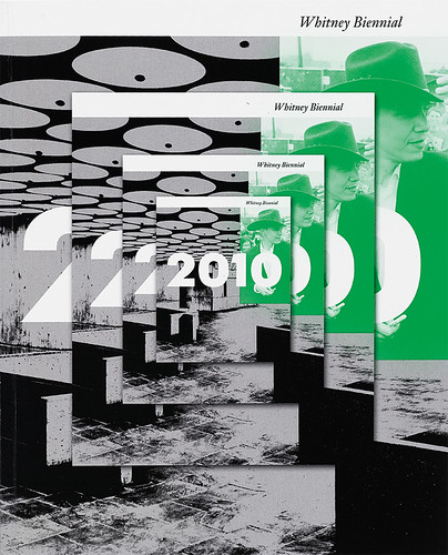
Michaels’ primary focus at Project Projects is on books. ‘I’ve done a bit of exhibition design, a bit of identity design, but really books are the thing that I’ve always been interested in.’ This is not, he emphasises, about making the book into a fetish and the many titles designed by the studio bear this out – from the vertigo-inducing ‘paper-and-ink time machine’ they created for the Whitney Biennial in 2010 to the hardcore punk cacophony of a monochrome visual study of the letter ‘x’. The volumes are as visual as they need to be, but they are not conceived and styled as tactile luxury objects in a last-ditch design attempt to keep the book alive. Nor is this commitment to books a backward-looking position. Michaels is interested in contemporary technology and ways of communicating. Nevertheless, he says, ‘I still see books as being the best place for complex thought to be represented.’
Michaels emerges as deeply political in his motivations: far more so than many prominent designers of the previous generation, whose work he rejected. In the early 1990s, as a teenager in Chicago, he was part of the hardcore punk scene and he played guitar in various bands, including one called The Unemployed. His first step in graphic design was making J-cards for editions of 50 cassettes using his father’s copy of Microsoft Publisher. ‘My cultural origins are from this very inward-looking, very suspicious-of-the-outside kind of scene,’ he says. ‘When I started to work as a designer, a lot of those impulses were part of how I might generally process things. But one lesson I took away from it was that subculture becomes much more interesting when it engages with society in a broader sense. If you have some pretty good ideas within your subculture, then you might want to broadcast them beyond and try to change the broader culture’s thinking.’
The need to communicate with lucidity because the ideas matter is expressed more formally in a Project Projects manifesto written in 2011 and titled What is Design? ‘We advocate for design that translates specialized and complex knowledge into a form that is comprehensible to anyone who might be interested. Rather than vagueness, obfuscation, and visual rhetoric, this requires clarity and precision.’
Michaels admires graphic experimentation – as shown by The Electric Information Age Book, which he created with the Harvard academic Jeffrey T. Schnapp – but he is most committed to the idea of using these experimental devices to transmit political ideas. He distinguishes between protest graphics, which are too ‘shouty’ for his temperament, and the studio’s weaving of political impulses into day-to-day design work (and also in the choice of clients). Saturated with art as Project Project’s ethos and work may be, Michaels regards it as ‘retrograde for designers to be taking on artistic modes’ in their own practice.
His initial experience, like Krishnamurthy’s, lay in text and photography, rather than in expressionistic visual form. He concedes that Project Projects’ earliest designs were ‘kind of boring’. His typography is more sophisticated today, though still restrained. ‘We were always attracted to avant-gardes where it was the ideas that were the really daring part of it, rather than wildly expressive graphic form,’ he says.
Michaels’ idea for the Inventory Books series of paperbacks – ‘a platform for the synthesis of textual and visual research on transformations in urban spaces and culture’ – dates back to his time as student when, as a class assignment, he redesigned Learning from Las Vegas as a paperback. The first two volumes, Street Value: Shopping, Planning, and Politics at Fulton Mall and Above the Pavement – The Farm! Architecture & Agriculture at P.F.1 – appeared in 2010. His collection of 1960s experimental paperbacks devised by Jerome Agel, Marshall McLuhan and Quentin Fiore (see Eye no. 8 vol. 2), mentioned in Above the Pavement, then provided the subject of his 2012 collaboration with Schnapp, who was attracted from the outset by the chance to produce a book that wasn’t just an academic text. ‘He understood very much that it would be far more interesting to do something that had some sense of the spirit of the material,’ says Michaels. This visually adventurous book found an audience among McLuhanites. Teacher friends who have introduced it to their classes tell Michaels that students embrace these still extraordinary mass-market book designs.
The next volume in the Inventory Books series won’t appear until 2015 or later and Michaels’ new company, Inventory Press, will publish future titles independently of Princeton Architectural Press. In the meantime, he has just launched four new books: Catalogue by Amie Siegel, John Fahey: Paintings, Public Collectors by Marc Fischer and Figures in Air by Micah Silver. ‘The new imprint’s coverage will span art, architecture, design and experimental music,’ he says, ‘with a focus on underground and under-reported topics.’ There will also be books about the social and political aspects of material culture; he aims to release three to four titles each spring and autumn.
Prem Krishnamurthy
In a body of work as extensive as Project Projects’, singling out any project as especially significant could seem arbitrary. Both Adams and Krishnamurthy agree, though, that Matrix/Berkeley: A Changing Exhibition of Contemporary Art for the Berkeley Art Museum in 2009 was something of a milestone. The book, which documents 30 years of artist commissions – the Matrix series – took three years to produce. The pair, co-curators with art critic Elizabeth Thomas, spent time in Berkeley sifting through files about all the shows, and the densely illustrated 560-page volume is a tour de force of documentary narration. At one stage in its production, there was a seven-month interval waiting for all the material they had requested to be scanned. Krishnamurthy says that for him the project was a ‘curatorial education’. It was here, for instance, that he first encountered Brian O’Doherty, former doctor, TV presenter, art critic, artist and novelist, now in his mid-eighties, who was the subject of a show at Krishnamurthy’s P! gallery in spring 2014.
My first conversation with Krishnamurthy, in 2013, took place in the gallery after it had been going for a year. He has a big-chested voice, full of enthusiasm and relish, and is an animated speaker; as he says himself, he’s a people person. He struck me then as a natural gallerist and a persuasive advocate for his many interests. He showed me pictures by the American engineer turned radical photographer Chauncey Hare, exhibited alongside Karel Martens in the first P! show, and followed up by sending pdfs of useful background texts out of a desire to share his love of the work.
‘In some ways it’s developed even beyond what I’d expected,’ Krishnamurthy says the next time we sit down to talk, after P! has been open for seventeen months. ‘When I started I was still trying to figure out what its model was, whether it was a non-profit model or a for-profit model.’ He believes that the gallery’s role lies somewhere between these two poles. ‘Selling work seemed important for a lot of reasons, not only economic but ideological. But at the same time, the gallery wants to have an ambitious and experimental exhibition programme.’ Krisnamurthy’s O’Doherty show was then about to open. The unclassifiable conceptualist’s work and thinking was one reason why he wanted to start his own space. P! is neither an ‘art’ nor a ‘design’ gallery and Krishnamurthy, who studied both fine art and graphic design, makes no hierarchical or qualitative distinction between the two. As a curator, he wants the freedom to intermix disciplines at will, including architecture, music and film. He likes the fact that work such as Karel Martens’ prompts visiting curators thinking about acquiring pieces for their museum collections to wonder: ‘Is it design or is it art or is it a print?’
‘Rather than seeing the discourses as totally separate,’ says Krishnamurthy, ‘I’m interested in the fact that there are historical moments of overlap.’ He argues that graphic design, a relatively young discipline, has been going through a twenty- or thirty-year ‘blip’ (though it’s probably even longer), a departure from earlier more elastic norms, during which art and design have been pulled apart as professional categories. In another decade, he suggests, these distinctions will matter less and it will be usual to look at a great piece of graphic design with ‘the same level of scrutiny and ascribe to it the same level of intentionality, nuance and layering of meaning’ that one brings to a great work of art.
Keeping the definitions flexible is one way of encouraging a mixture of audiences to come into P! and it appears to be working. In an exhibition titled ‘A Rough Guide to Hell’, the French-Hungarian artists’ cooperative Société Réaliste scrambled the logos of 156 companies to make a Frankenstein font that was distributed for free online for the duration of the show.
As Krishnamurthy describes it, visiting graphic design curators admired the ‘crazy typeface’ and art critics wanted to know, ‘What is this thing?’ as though they were seeing the alphabet’s malleability with new eyes. Architects and artists appreciated the collaborative aspects of the installation. Even the Wall Street Journal was minded to write up the show.
Krishnamurthy is infiltrating the art scene ‘parasitically’ (his word) to broach cultural questions that more rigidly aligned and conventionally structured galleries would never think of asking. From the moment you walk off the street into P!, a parallelogram with a bright green ceiling, divided by an internal window used for projections, the space is a radically different proposition from the polite, predictable and generic white cube.
Unless there is a good reason, Krishnamurthy no longer mentions to gallery visitors that he is a designer, to preempt typecasting, and this is a wise move. Nevertheless, as with Michaels, design skills and thinking are fundamental to much of what he does. ‘Everything I know as a graphic designer translates pretty much one-to-one into running a space,’ he says. ‘I know how to make things. I have made so many exhibitions as a designer that I know how an exhibition comes together.’ The only thing he still needs to perfect, he admits, is how to sell someone’s unique artistic object as opposed to a professional design service. Now he has hit his stride with P! this seems unlikely to be an issue for long.
Whitney Biennial, the 2010 catalogue.
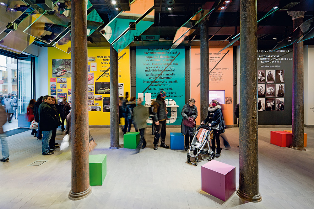
Top: Installation from the ongoing curatorial programme initiated by Project Projects for SALT, a cultural institution in Istanbul, since 2011. The letters S-A-L-T are not represented as a formal logo mark. They are embedded within Kraliçe, a custom typeface created by type designer Timo Gaessner for Project Projects.
Rick Poynor, writer, Eye founder, London
Read the full version in Eye no. 89 vol. 23 2014
Eye is the world’s most beautiful and collectable graphic design journal, published quarterly for professional designers, students and anyone interested in critical, informed writing about graphic design and visual culture. It is available from all good design bookshops and online at the Eye shop, where you can buy subscriptions, back issues and single copies of the latest issue. You can see what Eye 89 looks like at Eye before You Buy on Vimeo.