
Summer 2014
Powered flight
For fifteen years, Pegasus, an international biannual corporate magazine designed by Derek Birdsall, led a charmed life.
Some graphic design stories are all around us: road signs, catchy logos, well known book covers, typefaces with familiar names. Other design projects have little or no profile in the wider world. Pegasus is an example of the latter, yet it is an outstanding piece of editorial design, a perfect-bound 248mm square magazine cherished by its readers for a decade and a half.
From 1970 to 1985, the 29 issues of Pegasus, plus several specials and ‘best-ofs’, were testament to the consistently assured art direction of Derek Birdsall, along with editor Gregory Vitiello and an inspired group of regular contributors, including Michael Foreman, Harri Peccinotti, Ron Sandford, Irma Kurtz and art editor Alan Kitching.
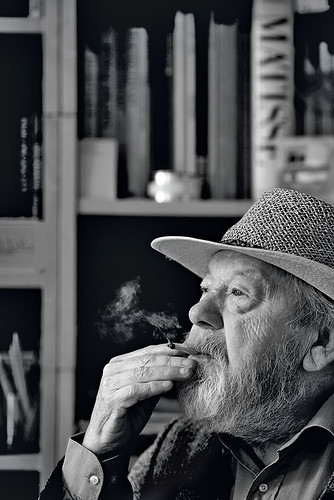
Birdsall portrait by Phil Sayer, April 2014.
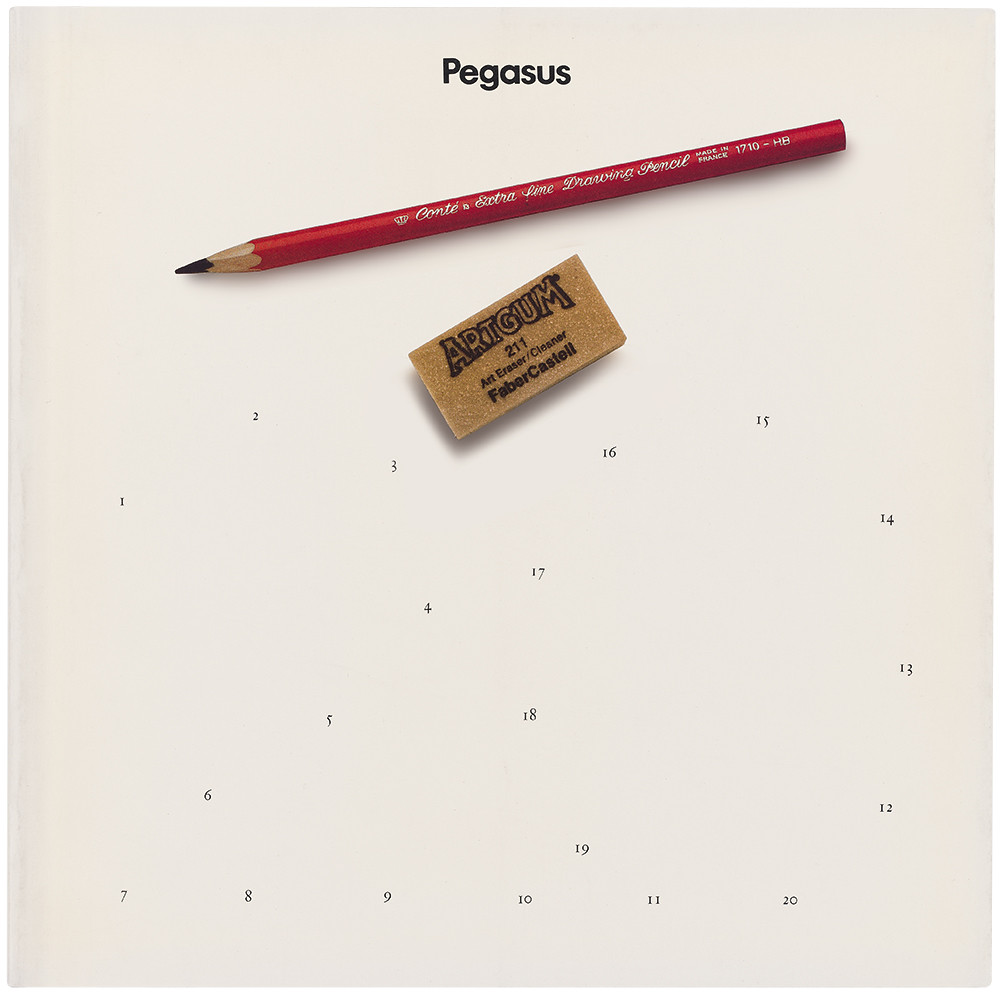
Top: Cover, Pegasus no. 20, 1981, ‘Creativity’. ‘With the help of your own pencil (and possibly an eraser) we present you with the opportunity to create your own cover.’
Funded by Mobil, Pegasus was aimed at the oil giant’s senior managers and an international élite of politicians, public intellectuals and captains of industry. At the very least, Mobil was hoping to create a positive association. Birdsall says that the magazine was mailed to ‘the prime minister of each country and the minister in charge of oil and gas!’ He recalls getting approving letters from high-profile readers, including movie star Anthony Quinn. Birdsall says: ‘It was designed to be exclusive. And for the top brass within the company. It was a very elegant bribe.’
Philanthropy often follows a guilty conscience – look at the dynamite-powered Nobel Prize – and Pegasus’s birth coincided with the early stirrings of ‘corporate responsibility’, when the environmental and social impact of big oil corporations would come under increased public scrutiny. Pegasus was also a child of the late 1960s, when the hippie dream developed into more substantial, long-lasting changes in culture, politics and the law.
The change in the air is signalled in Pegasus’s first few issues. In the ‘Youth’ issue (no. 2) Birdsall ran a spread of Sam Haskins’ fisheye photos from the Isle of Wight pop festival. On the previous page is a scan of a letter to The Times about the festival that states: ‘… let it not go unrecorded that for the first time in history some quarter of a million people of whom possibly more than half were young men, were encamped for several days for purposes other than the eventual slaughter of their fellow creatures.’
Spread from Pegasus no. 2, 1971 ‘Youth’ showing the audience at the 1970 Isle of Wight Festival by South African photographer Sam Haskins.

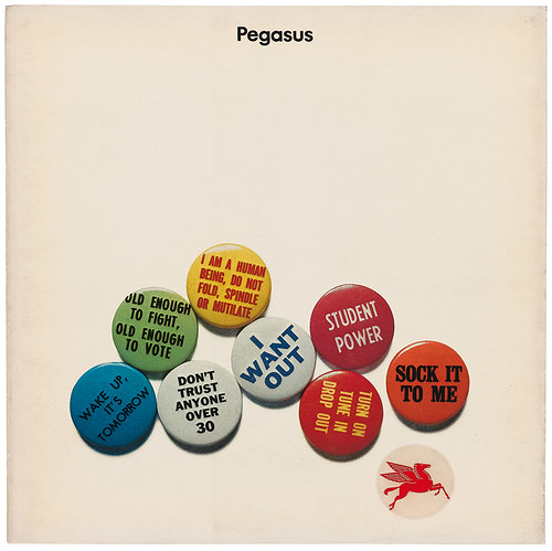
No. 2, 1971, ‘Youth’, with button badges that reference the Vietnam war, the generation gap and 1960s culture. Mobil’s ‘Pegasus’ logo is printed within an embossed circle.
The initiative to launch Pegasus came from within Mobil, whose executive Walter K. Wilson met Birdsall in London. They quickly struck up a good relationship. ‘I did one very good thing at the start,’ said Birdsall. ‘I organised a dinner with Michael Foreman, Harri Peccinotti, Irma Kurtz, a couple more writers and my accountant. And I said to Walter: “This is your team”.’
The themes of the first few issues, including ‘Mobility’ and ‘Design’, show Birdsall’s imaginative marshalling of diverse image sources. He commissioned Peccinotti to shoot orchids, Foreman to illustrate ecology and sex, and André François to nail design, via a cartoon in which a lone designer procrastinates by rearranging pens.
But Pegasus really took flight with the arrival in 1973 of editor Vitiello, a writer and former Fulbright scholar who had worked in public television for six years. Vitiello remained at the helm until the final issue, Pegasus no. 29, ‘Performance’, in 1985. Birdsall and Vitiello value their collaboration highly: nearly 30 years later, they recall the experience as one of the best of their careers. ‘I learned what a good editor was,’ says Birdsall. ‘We worked very closely on this and I haven’t had a closer relationship since.’
‘The longer Derek and I worked together,’ says Vitiello, ‘The more integrated the issues became. The structure improved, as editorial pieces flowed into visual ones.’
Vitiello inherited the fifth issue, which had the nebulous theme of ‘Change’. ‘Ed Waggoner, the head of international relations at Mobil, was scathing,’ says Vitiello, ‘so I asked him to identify the articles that offended him and replaced them with new ones.’ The big challenge was then to sell issue no. 6, ‘Human communication’, from scratch.
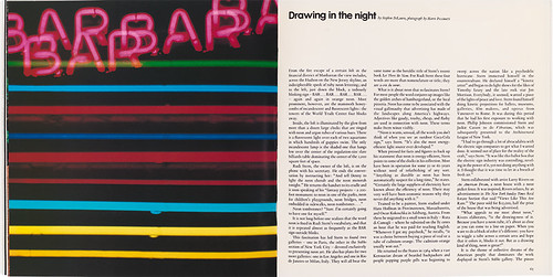
A photograph by Harri Peccinotti accompanies Stephen DiLauro’s article about neon art gallerist Rudi Stern for no. 22, 1982, the ‘Innovation’ issue.
‘Derek and I developed a story slate … but an ad hoc editorial board challenged every one of our ideas. Fortunately, I was well prepared. I described each proposed article and how it fitted structurally.’ The issue includes interviews with Marshall McLuhan, Studs Terkel and Marcel Marceau, but Vitiello says that what really ‘sold it’ to Mobil was their ideas for communication at a daily level, with resonant articles about British pubs, French cafés, Japanese baths and Italian passeggiate.
Birdsall and Vitiello also had the support of the international Mobil employees who sent or personally handed out issues of Pegasus to VIPs in their countries. ‘When they praised the magazine,’ says Vitiello, ‘my bosses backed off.’
The magazine settled into a confident cycle with high standards of writing, image-making, editing, design, repro and print, which was carried out at Rowley Atterbury’s Westerham Press – which printed the type-only pages letterpress – for the first fifteen issues. The remaining fourteen were printed litho by Balding & Mansell. ‘I don’t think any company was producing anything like this,’ says Vitiello, ‘so tangential to the business and intended to be so thought-provoking.’
Birdsall: ‘All of the corporations did films, wonderful art films that hardly related to their business. So we said that this was cheaper than film, and you could get it to all the top people in an envelope. That’s the great thing about books and magazines. You know if they’re going into the right hands … television is sprayed across everywhere.’
For Vitiello, the challenge was to find themes, such as ‘Human behavior’ (Pegasus no. 7), that he and Birdsall could address in many different ways. The six-month schedule gave the virtual team enough time to communicate across continents and time zones. Communication via telex, fax, phone calls and letters was punctuated by physical meetings in London and New York – what Vitiello recalls as ‘our long boozy, idea-gathering sessions’. The choice of themes allowed them to focus on special interests, and to indulge the obsessions and passions of their contributors.
Each issue was obliged to include a ‘business article’ about the oil industry, such as the article about the Beryl A oil platform in no. 22, which uses a huge, virtuoso line drawing by Ron Sandford, originally commissioned for a Mobil ad campaign, to accompany its poetic prose. (See inside back cover.) Only 24 of the magazine’s 72 pages were in colour: black-and-white text and image predominated.
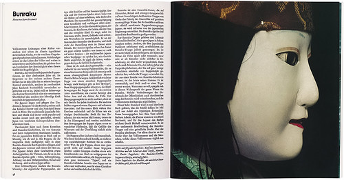
Head of a Japanese puppet carved by Minosuke Oe from a feature about Bunraku, a form of traditional Japanese puppet theatre, in Pegasus no. 14, 1979, ‘Über das Vollkommene’ / ‘About Perfection’. Photographs: Harri Peccinotti.
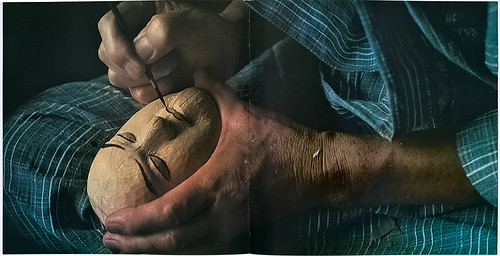
Oe paints a wooden puppet head from Pegasus no. 14, 1979. Layout by Sue Montalto Lee, Alan Kitching’s predecessor as Pegasus art editor.
Yet the structure allowed for articles by big-name writers, photo essays, long reads and short, caption-like articles, all set calmly by Birdsall in two typefaces: a serif text face, Van Dijck, and a sans serif for headlines – the new Mobil house typeface.
‘One of my favourite magazines at the time was The New Yorker,’ says Birdsall, ‘hence that three-column format. I’ve never been one for craziness. I like the quiet life. And typography is such an aid to a quiet life, isn’t it? I mean you can’t go far wrong. In 1969-70, everything was in sans serif, especially the corporate stuff, but I had fallen in love with Van Dijck. And Ivan Chermayeff had just designed the new sans typeface as part of Mobil’s big redesign [see Eye 81], so that’s how it happened.’
In the remainder of each issue there was plenty of room for exuberance, extravagance and experiment. Illustrator Michael Foreman looks back on Pegasus with affection: ‘I always say that Derek Birdsall gave me a ticket to the world.’ His Pegasus commissions gave him the chance to travel on the Orient Express to China, to visit Egypt and Russia, and to track reindeer in Norway. Birdsall made the most of Foreman’s panoramic narratives, which often included handwritten text, by planning them as gatefolds and fold-outs.
Birdsall’s use of photography in Pegasus varies widely, from the cool ‘coffee table’ appeal of photo essays to the dramatic pacing of reportage, portraits and big close-ups. ‘He had a great gift for lateral thinking, coming up with ideas that fitted the theme in unexpected ways,’ says Vitiello. For the ‘Human behavior’ issue, no. 7, Birdsall commissioned Peccinotti to shoot ‘The War Game’, a four-page feature on ‘military fashion’ styled by Caroline Baker, then fashion editor of Nova, that put garments from army surplus shop Laurence Corner alongside Yves Saint Laurent. Such photo shoots clashed nicely with more serious text, which in this issue included interviews with Margaret Mead, René Dubos and B. F. Skinner.
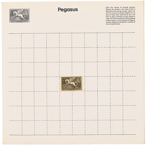
No.1, 1970, features an Uruguayan air-mail postage stamp, whose emblem is also a flying horse, tipped in to the centre of the cover.
‘Derek surprised me when he took a weak, boring picture and blew it up large,’ says Vitiello. ‘He explained that his rule was to use good pictures large and bad pictures even larger. As a result, the “bad pictures” often benefited by their graininess.’
For no. 10, ‘America’ (1975), the forthcoming 1976 bicentennial celebrations prompted Mobil to increase the Pegasus budget, allowing the magazine extra pages, images and stories. Vitiello commissioned articles such as ‘William Faulkner’s Mississippi’ and ‘Nathanael West’s Hollywood’, giving the issue a literary dimension. ‘America in camera’ – one photo per page – includes classic pictures of the USA by Minor White, Walker Evans and Robert Frank.
Vitiello particularly valued Alfred Eisenstaedt’s contributions: Pegasus commissioned him to take pictures of New York for no. 16, ‘Institutions’, and raided his archive for issue 17, ‘Le style’. Birdsall delighted in witty juxtapositions that recall Stefan Lorant’s Lilliput magazine – placing Eisenstaedt’s skating waiter next to a stylish Fred Astaire.
Pegasus allowed Harri Peccinotti (also known for his Pirelli calendar shoots and Nova magazine) to show the sheer range of his photography, with striking visual essays about crafts in Malaysia, performing arts in Indonesia, family businesses, home-made bicycles, Parisian street performers and Japanese puppets.
Illustrator Ron Sandford was a regular presence. ‘Alan, Derek and Greg were satisfying to work with,’ says Sandford. ‘Most of my drawings were “fill-ins”, the requirement of which became apparent when they had sorted out the magazine. We did much work in the pub in a relaxed and enjoyable way.’
‘I think they got it really well at Mobil,’ says Birdsall. ‘They got that this was a stylish magazine. I remember one manager said, “Thank you for making me look good.” There was a lovely ambiguity in that!’
Corporate culture began to shift in the 1980s: Vitiello wasn’t surprised when Mobil shut down the magazine in 1986. ‘The bold ideas of the 1960s and 1970s were supplanted by more business-oriented projects,’ he says. ‘This change was reflected in the people Mobil hired – you didn’t see long-haired intellectuals any more. The most we might have hoped for was another five years.’
Yet for those lucky to have access to copies, Pegasus remains a tribute to what can be achieved, in both form and content, within the constraints of corporate publishing.
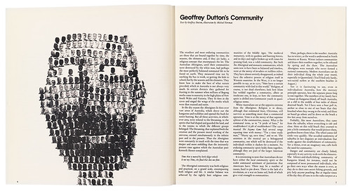
Michael Foreman’s potato print artwork illustrates an article by Geoffrey Dutton in Pegasus no. 21, 1981, ‘Community’.
John L. Walters, Eye editor, London
First published in Eye no. 88 vol. 22 2014
Eye is the world’s most beautiful and collectable graphic design journal, published quarterly for professional designers, students and anyone interested in critical, informed writing about graphic design and visual culture. It is available from all good design bookshops and online at the Eye shop, where you can buy subscriptions and single issues. You can see what Eye 88 looks like at Eye before you buy on Vimeo.