
Summer 2012
Reputations: Massimo Vignelli
‘I was always seeking to affect the lives of millions of people – not through politics or entertainment but through design. I strive to raise the bar a few inches, taking the commonplace and improving it.’
Massimo Vignelli, who turned 81 in January 2012, has been practising design in New York for nearly 50 years, during which time he has made a big impact on all forms of design, from graphic design, to furniture, to clothing. All the while he has steadfastly maintained his Modernist approach to all design problems. ‘We brought discipline to design,’ he claims. ‘We are systematic, logical and objective – not trendy. Trends kill the soul of design. Modernism took out all the junk, and postmodernism put it all back in.’
Born in Milan, Italy, in 1931, he left school at sixteen to work as an architectural draftsman, then studied architecture in Milan and Venice between 1950 and 1953. Inspired by Swiss Modernists such as Max Huber and Antonio Boggeri, however, he was drawn to graphic design.
From 1953 he was employed as a designer at Venini Glass in Venice, while freelancing on editorial projects such as festival catalogues, newspapers, books and packaging.
In 1957, he married Lella Valle; shortly afterwards, they went to the US, he on a Towle Silversmiths fellowship, she on an architecture fellowship at MIT. The following year they moved to Chicago, where Massimo taught at the Institute of Design, Illinois Institute of Technology, and worked as a designer at Container Corporation of America. The Vignellis returned to Milan in 1960, where they opened an office for design and architecture, with Massimo teaching graphic design in Milan and Venice.
In the mid-1960s, they returned to the US, and Massimo became a founding member of Unimark International Corporation. Through identity projects for the likes of American Airlines, Ford Motor Company, Gillette, J. C. Penney, Knoll Associates and the New York Transit Authority, Unimark grew to become the largest design firm in the world. However, by 1977, it had overextended itself and the partners went their separate ways. Massimo had already opened his own office, Vignelli Associates, in New York in 1971; this became Vignelli Designs in 1978.
Many of Vignelli’s projects are regarded as classic examples of modern design, including the corporate identity for American Airlines (1967); the graphics for the United States National Park Service (1977); the subway map for the MTA New York City Transit Authority (1970); and the interior design of Saint Peter’s Church in New York (1977), where the studio’s ‘total design concept’ ranged from the organ to the furniture to the silver communion accessories, and more.
The Vignelli aesthetic has been articulated in books such as Design: Vignelli (1990), produced concurrently with an exhibition that toured Europe between 1989 and 1993 (see Eye no. 2); Design Is One (2004); Vignelli: From A to Z (2007); and The Vignelli Canon (first available online and published in print by Lars Müller in 2010). Design Is One: The Vignellis, a feature-length documentary by Kathy Brew and Roberto Guerra (who made a programme about the couple in the 1990s), is to be released in late 2012.
Massimo Vignelli has taught design at many major international colleges and universities, including Harvard, and held leadership positions at the Alliance Graphique Internationale (AGI), the American Institute of Graphic Arts (AIGA) and the Architectural League. He has received numerous design and architecture awards, as well as several honorary doctorates.
The Vignellis have designed books, corporate identities, product design, furniture, environmental graphic design, interior design, type design, graphic design, packaging, their own garments, and transportation graphics. ‘If we need something and we can’t find it, then we design it.’ He characterises their process as ‘design is one’ – which means that if you can design one thing, you can design everything. The methodology is the same no matter what the content.
Examples of their work can be seen in the permanent collections of many museums, including the US Museum of Modern Art, the Musée des Arts Décoratifs in Montréal and the International Design Museum (die Neue Sammlung) in Munich; but the biggest collection is at the Vignelli Center for Design Studies at Rochester Institute of Technology in New York, to which they donated their own archive in 2010. Massimo’s awards include Gran Premio Triennale de Milano, 1964; Compasso d’Oro from the Associazione per il Disegno Industriale in 1964 and 1998; New York Art Directors Club Hall of Fame in 1982; AIGA Gold Medal in 1983; and Honorary Royal Designer for Industry in 1996. Here he speaks to R. Roger Remington, director of the Vignelli Center for Design Studies, Rochester Institute of Technology.
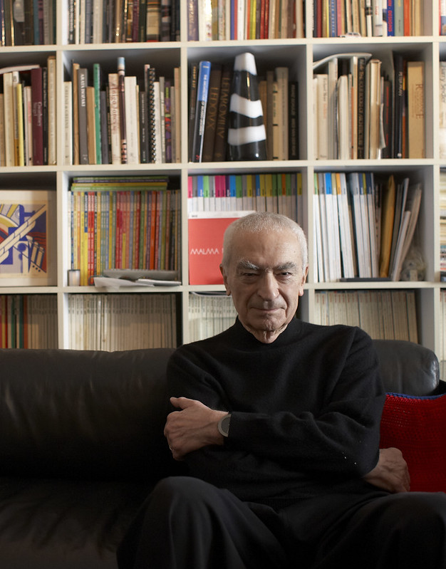
Cover of New York subway diagram designed in 1970. Top: Portrait of Massimo Vignelli by Maria Spann
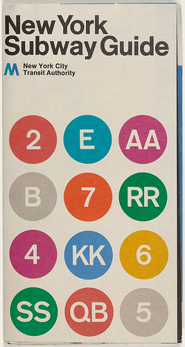
R. Roger Remington: Your New York subway diagram (1970, in use until 1979) has had a revival – how did this happen?
Massimo Vignelli: In 2008 we were asked to design a new version, in a limited edition print for a Men’s Vogue benefit. The New York transit authority then approached us to apply it in ‘The Weekender’ section of its website. The diagram [provides] subway users with an interactive way of getting important information about, for example, what lines are working and which ones are out of service.
There are also discussions under way about adopting the new diagram as the central visual element in consumer products such as T-shirts, plates, cups, and other New York souvenir items. So the diagram is evolving into a central identity element for the transit authority.
RRR: What’s on your mind this morning?
MV: The centre is the most powerful position. Intuitively, I have been aware of this for a long time. When I look back at my earliest graphic design piece, this book cover has its title running across the centre of the format. Then when I compare this to a recent book I designed on the architecture of my friend Richard Meier, his name also runs right across the centre of the book cover.
This view works in other critical areas as well; for instance, one could say that the most effective design is positioned in the centre between progressiveness and conservatism. Our Vignelli standard colour is positioned in the middle between red and orange. There is a timelessness to this notion of balance, and timelessness has always been an important priority for me.
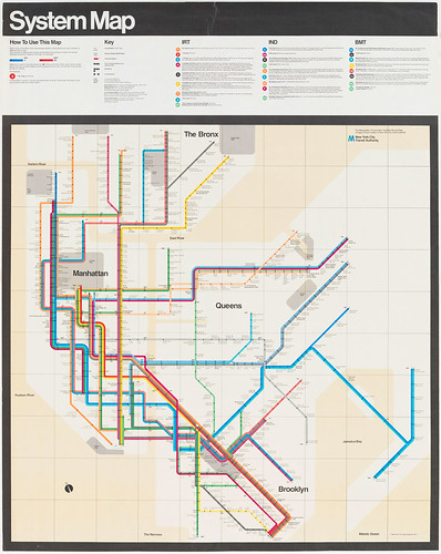
New York subway map, 1970 (1978 edition). Following the Beck London Underground diagram, Vignelli produced a diagram of subway lines.
The map is widely admired for its beauty and utility, though New Yorkers disliked its indifference to above-ground geography.
RRR: What do you think of the use of “information design” as a label for graphic design?
MV: We have been using this term a lot. We even use it to define ourselves, because of the confusion about being a graphic designer or a graphic artist. We’ve been using the term information architecture, because it definitely places the accent on the structural side rather than the pictorial side of visual communication. We call ourselves graphic designers and some people understand. That’s hopeful but the terminology of information design is a mouthful of hopefulness!
We want to make it clear that we are not commercial artists, illustrators or advertising designers. We are information architects who structure information. Like architecture, what we do is not only structural but it is also appearance and visual form.
“Information design” has been appropriated by those who specialise in making diagrams. However, much more is involved than just doing diagrams or books about health, hospitals and sports. What we do
is really structural in presenting information in a way that’s more understandable than any other form.
Graphic designers today are changing because of the computer. They all work with a digital technology so they are really switching more and more towards information architecture. If you still want to call it graphic design, that is fine with me.
RRR: You speak of creating a “visual language” with elements that are the same and elements that are different. Can you explain this?
Poster and graphic programme for Milan’s Piccolo Teatro, 1964 and 1965 – illustrating the powerful philosophical connection between Zurich and Milan in the 1960s.
Vignelli’s effortless ordering of information – using closely set Helvetica in two sizes and strong horizontal rules – has been echoed in print, blog themes and app design right up to the present day.
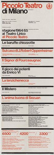
MV: I remember when I was doing the Piccolo Teatro di Milano posters in 1964 that I had the perception of having a language, a master language that was original and not borrowed. I wasn’t so interested in having my own, but the thing that was exciting to me was that I was not following some other process or language. Of course, there was influence from the Swiss, but the entire structure of those posters – which were just information on architecture rather than promotional pieces – was really a different language. I used a black line, with the type adjacent, and then the bigger type. Then there were two sizes of type as an economy of means.
For quite a long time at the beginning of our careers, one of the aims was to establish our own vocabulary of forms, elements – in effect, a catalogue of elements that we could use, so we need not start from scratch all the time. This is a very different attitude. There are people who just love to do the opposite and can’t stand our simple idea.
In graphic design there was a certain vocabulary of elements and typefaces. Should it require something classical, in the sense of something refined, [then] we would use Garamond. For something more informational we would use Helvetica. Our goal was to simplify things. We were purposefully eliminating, simplifying, disregarding a lot of alternatives, and limiting our choices to the point of then creating our own vocabulary.
The basis is that visual language has a structure but it has a vocabulary of variables, you know; and the vocabulary could be more or less extended according to the demands of the project, whether it is two-dimensional or three-dimensional. This was all generated from a certain logic related to the material, the function, or the materials.
This is not a formula but an attitude. And not even an attitude, it’s a vocabulary and a language. I think that the closest analogy here is that it is a visual language – and not a dialect, either, because it’s a pattern from culture rather than a subculture.
And so this became our common language. I did not invent it. People did use it before me, but not to this extent. My contribution is the systematic approach. I’m happy we brought the awareness of a system into design more than it was before. I think, too, the amount of work that was done by Unimark showed the benefits of this language to many clients and others.
Quantity is very important in these things. One can do beautiful, significant things on a small scale and in limited quantity. If, however, you have a large client like American Airlines, Knoll, J. C. Penney or the New York transit authority, you make things that are seen by millions of people and that is what I want.
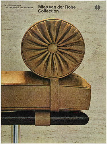
Cover for Knoll International product brochure. The typographical layout exemplifies a rational, systems-based approach to design.
RRR: How do you define quality?
MV: Quality, like Modernism, is an attitude, which means that one does not go below a certain standard. Quality is a way of living, a life attitude and a constant fight to eliminate any hint of vulgarity from one’s mind. This is a constant job of enormous proportions because the bombardment that we continuously have, the amount of seduction that we receive from life, makes this fight against crudeness a very heavy job. It’s like the devil. I suppose the priest would call [vulgarity] the devil, and call quality the state of holiness.
Quality is when you know that you have reached a high level in your work, when it really sings, when it touches you, when it responds. Quality is a level of intellectual elegance that is unmatched in other forms. When you see that there is no more vulgarity in it, you’ve got the sense of quality. So quality is something that you can achieve by continuously refining your mind through exposure to things which are the best manifestation of people that came before you, or are around you. This is what you obtain by nourishing yourself away from anything which has vulgarity in it. Quality is when you solve all of the problems that you have to solve in a way that is beyond the expected. So it is the sum of many things, and the answer to many searches. Quality is a by-product of passion, curiosity, intensity and professionalism.
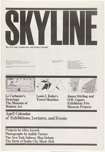
Cover from Skyline, the monthly newspaper / review of the Institute for Architecture and Urban Studies (IAUS), New York, 1982.
RRR: Have you any advice for young designers today?
MV: I say all the time, particularly to young designers who seem to be always affected by things they have seen: when you have a design to do, don’t look outside. Learn to look inside the problem, because you will find the solution is right there waiting for you to get it out. Your style comes by refining your way of looking inside, not by importing it.
A lot of young people ask me how to get a job. I say, socially you will get many jobs. You go to a dinner; you sit next to a person and you start to talk about what you do and then you get interested in what they do, and then sooner or later you find out about their communications. Then I tell them if it’s good or that it is not good. Most of the time it’s not good, but it really happens, not because I want to get the job. I just want to help them out.
I say all the time to young designers it’s much better for you to starve than to get a bad client, because from a bad client you get a worse client. From a good client you’ll get a better client. This is fundamental. From day one we refused to work for bad clients or we then dropped them.
RRR: What inspires you, and feeds your soul?
MV: Music has always been a big inspiration for me. A great thing about being in New York is that anything you need, you have it. If you want anything, you go out and get it –whether it is music or exhibitions or museums. When we are in Italy, there is nothing like this besides the natural beauty, which one soon gets used to.
The two engines that propel my life so far are curiosity and passion. And of these, curiosity becomes a responsibility of the design professional. I’m so curious about new things that I haven’t done before that I can’t wait to have the experience. So this curiosity is really what drives me continuously from one project to the other and especially the new challenge. The passion of solving problems, coming up with solutions, investigating new challenges, and moving from one thing to the other – these things energise me. I love to see new things come alive.
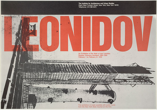
Poster for exhibition of the visionary Soviet architect Ivan Leonidov, IAUS, New York, 1978. As always, strong lines, simple typography, and a basic palette of black, white and red.
RRR: In the past five years, your clients have become more international in scope, including a firm in Turkey...
MV: This work was with the pharmaceutical company Abdi Ibrahim in Istanbul, and involved a visual identity for the total company. Later we worked with them again on an extensive packaging programme for their Abdica subsidiary. This again involved a related identity but with a clear direction towards integrated pharmaceutical packaging.
The concept here was to use horizontal colour bands across the product line as a way of making more coherent the information about the product. This is critically important when designing pharmaceuticals for people.
Our idea was to place on the top band the name of the product, on the middle band the product description; and save the bottom band for the company identity. Different colours are designated for different products. We standardised on the use of Bodoni for this packaging.
The identity for the parent company also involved a horizontal banding concept. Our major work on this level was in establishing a strong corporate look with clear graphic standards.
RRR: … and a recent project for a client in Italy?
MV: I am very pleased with the graphic identity programme for BK Italia, an Italian company that produces furniture. This project exemplifies totally our philosophy of ‘design is one’, in that we believe design should be semantically correct, syntactically consistent and pragmatically understandable.
RRR: We are back to visual semiotics?
MV: Yes! The project for BK allowed us not only to develop a graphic identity programme for them but also to guide them in the design of their products. We helped them to show only their best designed furniture and even designed new products for them. This work upgraded their line, and made for a consistent quality look.
The basic graphic identity elements serve as the centrepiece for everything BK does. The red BK circle appears in many forms and in different sizes.
RRR : How do you want to be remembered?
MV: Beyond the work accomplished over our long careers, I trust that our influence will be sustained at the Vignelli Center for Design Studies at Rochester Institute of Technology [in New York state] where our archive is housed. From our work we hope students take away more responsibility. I hope that the designer will have more responsibility to himself or herself, to his or her design and society.
Not following styles but going into depth is most important. At RIT our Modernist values will be extended through the emphasis on history, theory and criticism in design education. Our legacy is to make better professionals and more qualified designers.
What did I want to do in my life? It’s pretty ambitious, but I was always seeking to affect the lives of millions of people, you know – not through politics, not through entertainment, not through other things, but through design. I’m happy with my accomplishments. Only history can tell how this work will stand up.
I have never wanted to be a superstar; I strive to raise the bar a few inches, taking the commonplace and improving it. In other terms, affecting the language.
First published in Eye no. 83 vol. 21 2012
Eye is the world’s most beautiful and collectable graphic design journal, published quarterly for professional designers, students and anyone interested in critical, informed writing about graphic design and visual culture. It is available from all good design bookshops and online at the Eye shop, where you can buy subscriptions, back issues and single copies of the latest issue. You can also browse visual samples of recent issues at Eye before You Buy.