
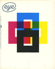
Spring 2002
Reputations: Zuzana Licko
‘It’s not a problem of being a woman in a man’s world. It’s being a type designer in a world that gives little recognition to this art form’
As one of the first type designers to exploit the potential of the Apple Macintosh in its pre-designer days, Zuzana Licko transformed the pixel from low-resolution imitation to high-style original. Her early Emigre fonts not only revolutionised digital typography but also opened up the market for the smaller foundries whose quarter-page ads populate today’s design magazines. She has designed more than two dozen typeface families and oversees the Emigre foundry, which currently offers 300 or so typefaces by the likes of Barry Deck, Jonathan Barnbrook, Frank Heine and Rodrigo Cavazos.
Born in Czechoslovakia, Licko (pronounced Litchko) emigrated to the US with her family as a schoolgirl. She studied architecture, photography and computer programming before taking a degree in graphic communications at the University of California at Berkeley. When Rudy VanderLans, her partner, launched Emigre, she began to contribute fonts to the fledgling ‘magazine that ignores boundaries’. Rather than replicate (on a dot matrix printer) typographic forms already adapted from calligraphy, lead and photosetting, Licko used public domain software to create bitmap fonts. Emperor, Emigre and Oakland appeared in the magazine and were soon advertised for sale when VanderLans and Licko co-founded the Emigre foundry.
Emigre’s development reflected the evolution of digital technology while questioning conventional ideas of legibility and layout. Licko’s highly structured typefaces counterbalanced VanderLans’ organic compositions. The ‘Emigre aesthetic’ lay at the heart of a once-controversial battle on the American design scene, pitting them against Modernists such as Massimo Vignelli, who referred to the new typography as ‘garbage’. The debate did little to slow the popularisation of the Emigre fonts, which by the late 1980s had moved beyond alternative pop cult status into the mainstream (The New York Times, ABC and Nike). The graphic design establishment has since recognised Licko and VanderLans with a 1994 Chrysler Award, the 1997 AIGA gold medal and the 1998 Charles Nypels Award for Innovation in Typography.
Licko’s intellectual approach to type creation continued to find inspiration in the production qualities of technology. In 1986 she created Citizen, which approximated the smoother bitmap printing of the new laser printers. Base-9 and Base-12 originated as screen fonts for Emigre’s website in 1995, and then evolved with a companion printer font. As Emigre began publishing more design theory, Licko developed more ‘classical’ fonts; her designs Mrs Eaves and Filosofia were based respectively on Baskerville and Bodoni. And with issue 60 (see Reviews) Emigre’s latest music-oriented incarnation, Licko and VanderLans have found yet another format in which the publication can continue to be a testing ground and type specimen for Emigre typefaces.
Rhonda Rubinstein spoke to Zuzana Licko about this apparently ideal setup for a type designer and questioned the courteous but curiously reticent designer on a variety of other type matters, all (via email) in 9pt Monaco.
Rhonda Rubinstein: Do you have a maxim?
Zuzana Licko: I’ve never thought about having a maxim . . . it might be: ‘Question the obvious’.
RR: And what typeface would it be set in?
ZL: That would depend on the context, of course. But for general print reproduction I would pick the last one I’ve finished, as I’m still trying to get better acquainted with the most recent designs.
RR:What is your greatest accomplishment?
ZL: That I was able to design functional and desirable typefaces without mastering calligraphy, which I was taught was impossible.
RR: Your greatest regret?
ZL: Sometimes I wish my career was more involved with disciplines that generate tangible items, like designing textiles, clothing, or shoes. I find it difficult to find good-looking shoes that are comfortable. I often pick up a comfortable shoe and think, if they had just done this or that differently, I’d wear it.
RR: After becoming well known for designing radical fonts, you became interested in more traditional ones. Why?
ZL: My interest in reviving the classics (which began in 1995) was sparked by two factors: the sophistication of personal computer technology, and Emigre magazine’s shift towards theory and the subsequent need for text faces to set large bodies of text. Each design gives me the opportunity to study details of classic faces that I’d never fully appreciate or notice through casual observation or usage. For example, working on my Bodoni revival, Filosofia, allowed me to better understand this long-time classic. This kind of scrutiny, in turn, has given me ideas for faces that are not strict revivals, such as Tarzana and Solex.
RR: How do you judge good typeface design?
ZL: It depends on the intended usage, and what criteria you define as being important: longevity of usage, intensity of usage, influence on other designers, etc. It takes the perspective of time to determine which typefaces remain classics, which become icons, and which fade away. Moreover, these perceptions also change, and it is the constant changing of these perceptions that drives our desire for new typeface solutions. In addition, new technologies and environments present new problems for the designer to address. The most successful experimental typeface designs are often those that address the possibilities or limitations of a yet uncharted technology.
RR: But we live and make decisions in the moment without the benefit of a time-lapse perspective. You must have opinions on typeface designs, and criteria for determining whether you want to pursue a particular design.
ZL: For me it’s like the Supreme Court’s definition of pornography: ‘I know it when I see it.’ I don’t have a preconceived idea about what constitutes a good typeface design. It can be a font created by LettError’s random technology, an old classic such as Bodoni, or a new classic such as Matthew Carter’s Verdana. It has to contain some originality, something that makes you think, ‘Hmm, I hadn’t thought about that,’ but originality in itself is not enough.
RR: Your father, a biomathematician who enabled your early computer access, was your first client, with the commission of a Greek alphabet for his personal use. What other people, events and/or things have influenced you most?
ZL: There were at least two important events: meeting Rudy VanderLans, and meeting the Macintosh computer. The Macintosh was unveiled at the time I graduated. It was a relatively crude tool back then, so established designers looked upon it as a cute novelty. But to me it seemed as wondrously uncharted as my fledgling design career. It was a fortunate coincidence; I’m sure that being free of preconceived notions regarding typeface design helped me in exploring this new medium to the fullest. It’s interesting how the gradual sophistication of my type design abilities has been matched by advances in the Apple Macintosh’s capabilities, so it has continued to be the ideal tool for me.
When I started building Macintosh bitmap fonts in 1984, it was a purely experimental endeavour. I didn’t have a client for these fonts, nor did I plan to start a type foundry. It was Emigre magazine that opened up these options. Rudy had started it (with two Dutch artists) as a showcase for émigré artists. Issue 3 was the turning point for my typeface experiments and for the magazine, as it was typeset entirely using my first low-res fonts. We had a lot of inquiries about the availability of these typefaces that no one had seen before. It was the start of Emigre Fonts.
For a while this turned me into a typesetter. Many of the designers who wanted to use my typefaces did not have a Macintosh, so I was selling typesetting with my fonts. As it turned out, the magazine provided me with a reason to continue developing these fonts, as well as a means to promote them. In turn, these unusual type designs contributed to the magazine’s unique character, while also providing an efficient means of typesetting. Using the Macintosh not only cut costs but added a level of design control that otherwise would have been mediated through an outside typesetting service.
RR: Can you describe your working methods?
ZL: While I work primarily on screen, sometimes I begin with rough thumbnail sketches, to give me an idea of the proportions or a detail of a character. Then I try out shapes and serif details directly in the Fontographer drawing window. The only hand drawing I do is on laser printouts, to mark areas that need adjustment, or to sketch alternate forms. Then I eyeball the corrections on screen. At any given time, I have several designs sitting on the back burner. Sometimes I put a design away when I hit a stumbling block, and it may take months or even years to resolve some of these design problems.
RR: In the 1980s your typefaces were criticised as being either ugly or hard to read. How do you look back on those reactions?
ZL: The establishment’s negative reaction towards new forms and technologies is natural. So if this work eventually becomes accepted, it’s a compliment in hindsight, because it means the work was truly innovative.
RR: What have been the most shocking or delightful uses of your typefaces?
ZL: Billboard use can be shocking because you have so little time to react as you’re driving by (Was that Base-9 I just saw?). I often cringe when these huge letters are tracked so tightly that their counters can’t breathe – as tends to be the case on billboards. This is particularly problematic with typefaces such as Base 9 and Citizen that need more breathing space than narrower ones. It makes me wonder how such billboard designs come about. Perhaps it’s premeditated: if the goal is to grab attention, then a jarring use of type will be more effective than a harmonious treatment.
Oddly, some of the most pleasing uses have been those that I didn’t recognise right away to be my typefaces. This sometimes happens in books where the typography and the typeface are so well blended in a traditional sense that the idiosyncrasies (which my typefaces tend to have) are downplayed.
RR: You recently re-released your original bitmap fonts (Emperor, Universal, Oakland and Emigre) from 1985 as the Lo-Res family. What was it like revisiting these typefaces fifteen years later?
ZL: It was interesting to see how much font and page-layout technologies have changed, and how font-making software has improved. The reasons for the re-release were mostly technical, to accommodate new possibilities or new restrictions. For example, when I originally released these fonts, the use of point sizes was limited to a basic set, usually 9, 10, 12, 14, 18 and 24 point. This was quite limiting because each size group of bitmap designs is on a different grid structure, which relates to its resolution; the number in each Lo-Res font name indicates the number of pixels in its body, or ppem (‘pixels per em’). Once the point size restriction was lifted, I was able to fine-tune the grid resolutions so that the capitals are in alignment when the resolutions are scaled to the same size. At the same time, I added the euro symbol, and made the font outlines compatible with recent technologies such as Flash. We also renamed the fonts under one family name, which made more sense within the context of our font library. I wouldn’t be surprised if we have to make additional updates after another fifteen years. We’re already gearing up for OpenType. This format (developed by Adobe and Microsoft) makes it possible to incorporate advanced typographic features into PostScript and TrueType fonts.
ZL: Which is your most popular typeface?
RR: To judge from the volume of sales and usage, it’s Mrs Eaves, my Baskerville revival. I see it everywhere: magazines, book covers, even the junk mail with my electric bill!
RR: How would you explain its success?
ZL: I think Mrs Eaves was a mix of just enough tradition with an updated twist. It’s familiar enough to be friendly, yet different enough to be interesting. Due to its relatively wide proportions, as compared with the original Baskerville, it’s useful for giving presence to small amounts of text such as poetry, or for elegant headlines and for use in print ads. It makes the reader slow down a bit and contemplate the message.
RR: How did you come to work with VanderLans?
ZL: We met at the University of California at Berkeley where I was an undergraduate at the College of Environmental Design and Rudy was a graduate student in photography. This was in 1982-83. After college we both did all sorts of design-related odd jobs. There was no direction. Then, in 1984 the Macintosh was introduced, we bought one, and everything started to fall into place. We both, each in our own way, really enjoyed this machine. It forced us to question everything we had learnt about design. We both enjoyed that process of exploration, of how far you could push the limits. Rudy is more intuitive; I’m more methodical. Yin and yang. It seemed to click, and still does.
RR: How do you deal with the challenges of working with your partner when the tradition of design partnerships often means that the woman gets less recognition?
ZL: Rudy and I are both very detail-oriented and hands-on. This makes it difficult for us to work together. I’m not a great collaborator and neither is he. It’s one reason why I switched my studies from architecture to graphics. I realised that having to compromise with so many outside opinions wouldn’t allow me the kind of creative freedom I desired. I’m no diplomat! Our Emigre collaboration works because we each control a distinct part of the equation. I control my typeface designs, Rudy controls the magazine, and Emigre is the symbiosis.
As for the gender-biased recognition, I don’t know what the perception is from the outside, but I feel that I do get as much recognition for my type designs as Rudy is getting for the magazine.
A bigger problem for me is that type designers in general are under-recognised. For example, it often happens that a graphic designer takes full credit for a logo, even when most of its character came from the typeface. Even other designers tend to forget that there is a high level of creativity in typeface design. So it’s not so much a problem of being a woman in a man’s world, it’s being a type designer in a world that gives little recognition to this art form, and I find this disillusioning.
RR: You named your Baskerville revival after Sarah Eaves, who became Baskerville’s wife and finished printing the volumes he left incomplete on his death. Is the typographic world as male-dominated as it appears from the outside?
ZL: The history of type design is rooted in the use of heavy machinery and lead founding, which have traditionally not been considered women’s work. Today, the discipline is available to any artist who embraces computer technology, but it is one of the more technical specialities within visual design. A type designer does benefit from some understanding of computer programming – another field that women traditionally seldom enter, though maybe this will change. Certainly, the field of type design is more open to women than it ever has been.
RR: How is your personal style and personal philosophy (such as your commitment to recycling) reflected in your work? How do you see the designer’s responsibility in these times?
ZL: To live in harmony with our environment, we will need to treat all life and material as precious. There can be no ‘waste’ because there is no black hole on this planet for its disposal, and storing it ultimately degrades the quality of life. The key to getting rid of waste is to rethink the way we use materials. For example, a container shouldn’t become waste as soon as it’s emptied. Next, we need to realise that what we do at home and at work are connected.
At home I can make the effort to wash an empty container out, then re-use or recycle it. At work, I can take the effort to design a container that is more easily re-usable and recyclable. But neither action will be nearly half as effective as when I do both. This is a very simple example, but I think you get the idea.
RR: Does this ethic show up in your work itself, in addition to your environment?
ZL: Maybe I should be more specific. I was using ‘container’ as a metaphor. It could be the choice of disk packaging or the paper we choose for a catalogue, or any other carrier of product or information. For example, whenever possible we print the Emigre type catalogues on 100 per cent recycled paper, which contains 50 per cent post-consumer waste, and the paper is processed chlorine free. We print 60,000 of these catalogues each year, so the choice of paper makes a significant difference. In addition, we avoid marcoating and other treatments that make the print work less recyclable.
RR: You’ve written that the catalyst for Hypnopaedia patterns was the lack of copyright for typeface designs (the patterns were created by the rotation of a single letterform from the Emigre library). Are you actively involved in such legal issues?
ZL: We address them in the Emigre catalogue and magazine. We do our best to stay informed about changing font technologies and to help establish fair usage standards. It’s something I’d rather not have to spend time on, but it’s a necessity for keeping our business in business. Typefaces are designed by people who rely on sales in order to continue investing in the development of new designs. We try to bring this message across in a variety of ways, and the Hypnopaedia design turned out to be a visual example of the basic copyright issue involved. One problem is that people find it difficult to distinguish between the ornamental design of letterforms and the alphabetic characters that they represent. As a result there is no us copyright protection for letterform designs, because they are seen as purely utilitarian. By rotating the letter designs, taking them out of context and turning them into textures, the Hypnopaedia patterns allow us to make this distinction and appreciate letter shapes on another level, abstracted from their function as alphabetic characters. (Although the design of a typeface is not protected by US copyright, the font software is covered by copyright, which does greatly protect our intellectual property.)
RR: What other type designers do you think are doing interesting work now?
ZL: Much of the interesting type design work these days is being done by individuals. This is a testament to PC technology, which has made the independent type industry possible by decentralising the design of typefaces and production of fonts. This has tremendously increased the choice of typefaces, since it no longer requires a committee of corporate executives to approve investment in the development of a typeface. However, the next phase of sophistication, OpenType, may once again take the manufacture of type beyond the reach of independent type designers. The complexities of designing huge character sets are extremely time-consuming, with diminishing returns (as few of the additional characters may be used by the average user).
RR: Are there specific type designers who you think are doing particularly innovative work?
ZL: Too many to list here, and too many to overlook, which would just get me into a heap of trouble. But every typeface that we’ve licensed for the Emigre library is designed by someone who I feel is doing very innovative work. I’m impressed and amazed by other people’s work all the time. That’s how we end up licensing other people’s designs.
RR: Increasingly, information is being accessed primarily onscreen in websites, kiosks and signage. In addition, the screens are getting smaller as cell phones, watches and control panels carry more information. How do you see typography evolving to meet this challenge?
ZL: The presentation of information on digital devices will change profoundly once the resolution of the displays (LCDS or otherwise) quadruples. At that point, screen displays will be able to show just about any design that can be printed. With the present display resolutions the typography and the organisation of information needs to be very clean and efficient in order to maximise the use of every pixel. I don’t think we’re making the best use of the current technologies: too often it seems that the design of the screen information was hacked together by someone on the product design team, almost as an afterthought.
Professional type designers, typographers, graphic designers and information designers are getting left out of the equation because the manufacturers don’t recognise the importance of the visual interface. Try programming your VCR – I’m sure you’ll think of at least three visual interface improvement suggestions right off the bat!
RR: What new Zuzana Licko typeface release can we look forward to next?
ZL: I’ve had a serif text face in the works for more than a year now, but I’ve had to put it away for the time being due to the upgrade work. Most of the fonts in the Emigre library were released prior to the announcement of the euro currency, so we have to go back and design this character for every font. Since this requires fonts to be regenerated, I’m taking the opportunity to tweak them and add features.
There is a dilemma with my older designs in that I’m often tempted to change details that I would have treated differently if I were designing the typeface today. But, of course, I don’t want to go so far as to change the character of the design; sometimes it’s difficult to draw that line.
RR: What do you think is the most important thing you have learnt?
ZL: That nothing is permanent, yet there is much value in the reincarnation of classics.
First published in Eye no. 43 vol. 11, 2002.
Eye is the world's most beautiful and collectable graphic design journal, published quarterly for professional designers, students and anyone interested in critical, informed writing about graphic design and visual culture. It is available from all good design bookshops and online at the Eye shop, where you can buy subscriptions and single issues.