
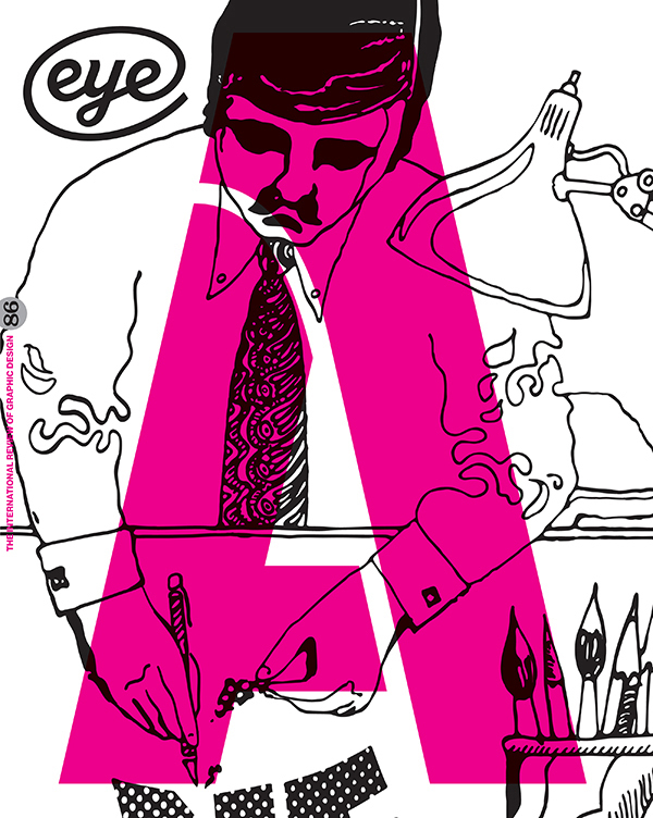
Autumn 2013
Rub-down revolution
Colin Brignall
Malcolm Garrett
Dave Farey
F. H. K. Henrion
Bob Newman
Roger Excoffon
Marcello Minale
Herb Lubalin
Fred Lambert
Aaron Burns
A generation before home computers, Letraset’s dry transfer lettering made desktop typography possible – and gave a small group of type designers new insights into letterform construction through the art of stencil-cutting
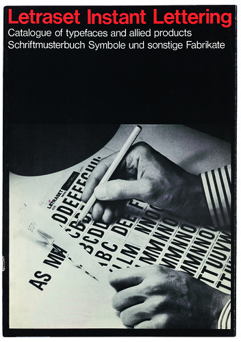
When the London-based company Letraset launched its first dry-transfer typefaces in 1961, its advertisements proclaimed this new letter method ‘revolutionary’. And in its way it was: those sheets of rubdown Letraset fonts – around seven shillings from your local art shop – allowed graphic designers, commercial artists, admen (and in the 1960s it was mostly men), art students, anyone really, to set their own display type, without having to spend time and money sending out lettering to be metal typeset or drawn by hand by specialist artists, as had been the case until then. ‘For “roughs”, finished art, wherever the printed word is to appear, you will find Letraset a natural expedient,’ promised one early ad. This was, it should be remembered, half a century ago and far away in digital prehistory – Beatlemania was still two years away and London had not yet begun to swing.
By 1963, Letraset had distributors in 70 countries and had floated on the London stock market; the following year annual sales increased to £750,000 – a hefty figure by the standards of the day – and some 75 per cent of production was exported (the company received the first of two Queen’s Awards for Exports in 1966). There were certainly rivals – direct competitors such as Chartpak and Mecanorma, and also the new phototypesetting houses, which were producing camera-ready artwork for headlines and display – but by 1974 Letraset’s international sales had climbed to £16 million, by 1978 £46 million. In business terms, then, what had begun as a rather ramshackle operation in the old Wonderloaf bakery in Waterloo had grown into a big money-spinning success. Its cultural impact was even greater, as not only ‘the trade’ but also a whole hobby market of parish magazines, film-society circulars and school newspapers began to use Letraset. It was, says Colin Brignall, who joined the company in 1963 as a junior stencil-cutter and later became type director, ‘as influential in its way as the rag trade and fashion and music’.
And yet the Letraset story – squeezed into what Steven Heller has called the ‘interregnum between hot and cold type, and between photo and digital composition’ – is by and large overlooked in design histories. It wasn’t, for one thing, taken very seriously. Many thought it wasn’t ‘real’ typesetting, and feared that letting anyone and everyone get their hands on it would lower standards (its use in those school magazines may indeed have left something to be desired). But by freeing up access to lettering, Letraset opened the way for a new kind of DIY creativity: the late Willie Rushton of Private Eye (which launched in the same year as Letraset’s dry transfers) said that the magazine would never have got off the ground had it not been for Letraset and his mother’s back bedroom.
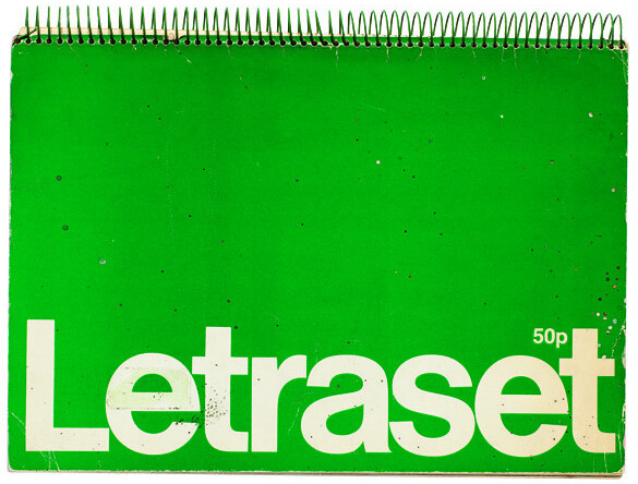
Cover of 1966 Letraset catalogue for dry transfer lettering in English and German. The publication includes 68 typefaces – from Albertus to Wide Latin – plus symbols, screens, ornaments and textures.
Top: cover from spiral-bound A4 size Letraset catalogue, 1976.
Pictograms and punk
By the 1970s, punk had got its anarchic hands on Letraset, using it for handbills, record sleeves and posters, the rubdown letters’ tendency to break and crinkle suiting the movement’s rampageous, in-yer-face aesthetic. One story has it that when the Hollywood production designer Alex McDowell (see Eye 60) was a young graphic artist turning out punk-rock sleeves in London, he sent some Letraseted artwork to a small print shop only for an overly keen junior to ‘clean up’ its intentionally raw look.
Later, various Letraset spin-off products – signs, symbols, pictograms, architectural icons and so on – would be used in similarly off-message ways: a dancing couple on the picture sleeve for The Human League single ‘Being Boiled’; Malcolm Garrett’s overhead-view icons for the Buzzcocks’ ‘Love You More’ / ‘Noise Annoys’ cover; and another Letraset seen-from-above man as the Mute Records logo. (Brignall and his colleague Dave Farey used to chat on the phone every week while watching the BBC music show The Old Grey Whistle Test, pointing out Letraset type on the record sleeves that the presenter would hold up to the camera.)
The Letraset ‘liberated letter’ had begun life in 1956 as a wet-transfer system, devised by print designer / lettering artist Charles Clifford ‘Dai’ Davies and print consultant Fred Mackenzie (the patent application is in Mackenzie’s name only), who took the notion of children’s ‘slide-off’ toy wet transfers (as used on plastic model aircraft) and applied it to type. The result was not exactly user-friendly – you had to strip a letter off a sheet, place it on a special dampened screen, then soak for a minute before carefully sliding off and pressing into place. Fiddly perhaps, but still cheaper, quicker and more accessible than the metal alternative – Letraset was on to something.
Those early wet-transfer display fonts were chosen for Letraset by F. H. K. Henrion (1914-1990), the great German-born designer known for his wartime ‘Dig for Victory’ poster, two Festival of Britain pavilions and some of the most iconic corporate identities of his day. ‘Some of these faces are completely new,’ Henrion announced in an advertisement at the time. ‘Others are reconstructed from an odd word found here and there, some redrawn from a nineteenth-century stencil found by accident in an old shop in Paris, others again scaled down from wooden type discovered in the vaults of some North Country printer.’
Before long, though, the wet transfers were superseded by the new improved dry-transfer version – Letraset as we know it – whereby letters were screenprinted in reverse on the back of a polyethylene carrier sheet and overprinted with low-tack adhesive. Here, the user would simply line up a letter using the ‘Spacematic’ guides (or more likely do it by eye), press with a dead ballpoint pen (better than the bespoke burnishing tool) and hey presto or maybe not: many designers recall the frustration of completing a headline only for the very last letter to break, of having to cannibalise letters when others ran out. As one blogger notes, Letraset taught you a lot about letter spacing and kerning, ‘not to mention how to swear’. Moreover, the adhesive sheets, left unprotected, would collect dust, which would show up as bubbles when transferred.
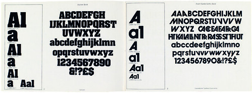
Aachen Bold, designed by Colin Brignall at Letraset and Herb Lubalin’s Avant Garde Gothic Bold, ITC.
A love-hate relationship
It was, then, a love-hate relationship, though more often than not designers of a certain age remember Letraset with warm nostalgia – perhaps because it represents the kind of hands-on work they no longer do, perhaps simply because it conjures up a more innocent age. Partly it is also surely to do with the way Letraset built up its retail business via high-street art shops, where customers could browse through sheets and sheets of beguiling typefaces stored in special display cases, or leaf through the catalogue for new and exciting fonts. Some designers will tell you that footling around with Letraset as kids was what launched them on a lifelong love affair with type; many remember the catalogue with particular fondness. Compare this with phototypesetting, which was costlier, mostly confined to the larger cities, and really only accessible to the professional user.
When the dry transfers started out, there were initially some 35 trusty typefaces, including Helvetica, Grot 9, Futura, Clarendon, Palace Script and Old English, most of them inadvertently ‘pirated’, as Farey admitted in a recent Type Radio interview, from the large type foundries, before licensing and copyright payments were duly agreed – though Monotype for one may have regretted so casually selling its typefaces to what it presumably took to be a one-day wonder. (According to Farey, Monotype’s John Dreyfus initially dismissed Letraset as ‘a toy’.)
Within a few years of the introduction of its dry transfers, Letraset had become a member of the Association Typographique Internationale – a badge of respectability – buying cases of new type which it reproduced with a Heath Robinson-like process involving a Dupont Chronapress machine, pressure-sensitive film and a lot of noisy ball bearings.
Keen to expand its range in the 1960s and 1970s in response to a fast-changing society’s demand for more novelty, more variety, more choice – a demand that hot metal had been unable to meet as industry in Europe struggled to its feet after WW2 – Letraset also bought in fonts from the New York photosetting houses, at the time the fashion-leading Mad Men of the field. There were custom-designed Letraset originals too, the first of which was Fred Lambert’s Compacta, a bold condensed typeface that was both timeless and totally of its era. Like Brignall’s later Aachen and Premier Lightline – muscular and 1960s-deco respectively – Compacta was cleverly designed to take advantage of Letraset’s in-built flexibility, squeezing letters close together, overlapping them – things that were possible only with the greatest difficulty with metal type. And because Letraset was generally for headlines and display rather than body text, its faces – Bob Newman’s Space Odyssey-style Data 70 and Vic Carless’s ‘fractured’ Shatter, for instance – could be increasingly funky and groovy-baby as the 1960s and 70s wore on. In all, 473 original faces would be designed for Letraset, many of them released as part of the Letragraphica collection.
Introduced in 1970, Letragraphica was basically ‘business-class’ Letraset – a subscription service that offered its members early access to typefaces chosen by a committee of designers that included Roger Excoffon, Marcello Minale, Colin Forbes and Herb Lubalin (whose own Avant Garde Gothic Bold was one of the first Letragraphica fonts). ‘The whole point of Letragraphica was to get designers to use it,’ says Farey. ‘It would come out on a Monday, the fonts would be used by designers on Tuesday and by the next week it would be on the streets, in magazines like Honey and Fab 208.’
In addition to the fashionable abundance of its typefaces, Letraset had another edge – quite literally – over the competition. Whereas the company’s early method for making the dry transfers had been of so-so quality and had involved painstakingly lining up individual letters on a grid, the introduction and adaptation of silkscreen printing techniques resulted in clearer, sharper letters. Stencil masters of typefaces would be cut freehand from ultra-thin red Rubylith masking film (manufactured by Ulano in the US) using what was essentially a razor blade fixed with sticky tape to a piece of wood. ‘[Studio manager] Gary Gillot started off by introducing us to the Stanley knife,’ remembers Brignall. ‘Then we found that because of the curve on the Stanley knife you had to lean right over to see where you were cutting, so we got some thin slats of wood and attached just regular razor blades with double-sided.’ From here it was a short photographic step to the final layout needed to produce the silkscreen master for printing.
The stencil-cutting was a matter of more than mere technique: trainee stencil-cutters were required to understand letterform construction – its stresses and proportions and curves – and to cut and recut and recut again until they had the perfect letter. Brignall has said that he ‘could not have wished for a more comprehensive grounding in all aspects of typeface design’.
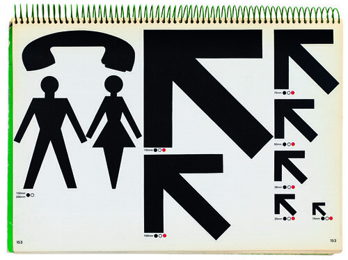
Page from spiral-bound A4 size Letraset catalogue, 1976
Going with the flow
For Farey, ‘It gave us the eye to become type designers. When we started to do stencil cutting we understood the width of characters, the balance of characters… why the bow of a good letter P is wider than the R.’ The job required patience, a steady hand (apparently quite often a left hand) and what seems like an almost Zen-like ability to go with the flow of the type. When in the mid-1990s the Letraset stencil-cut masters were officially housed at London’s St Bride Printing Library, librarian James Mosley likened them to some of the masterpieces of nineteenth-century punch-cutting: ‘I have the same respect for the Letraset stencil cut masters … They represent, to me, breathtaking skill in handling a knife, one of the most unforgiving tools.’ Unsurprisingly perhaps, Letraset’s stencil-cutters often found their skills in demand, as Farey recalls: ‘There were probably twelve or fifteen people who worked in that studio and who went to photosetting. In some cases they were almost like football players, getting a transfer – they would get a call offering to double their money.’ Even years later, when the rubdown letters were in their dog days and Letraset was making the move to digital production, new trainees would still be taught the art of stencil-cutting.
By the late 1980s, Letraset’s star was in decline. In the previous decade, the company had expanded and diversified (and not particularly wisely), acquiring a toy-and-games manufacturer and, most oddly, the stamp company Stanley Gibbons in 1979. ‘Letraset was awash with money,’ says Farey.
In 1981 Letraset was acquired by Swedish paper company Esselte, and in 1984, ITC (International Typeface Corporation – the type company set up by Lubalin, Edward Ronthaler and Aaron Burns in New York in 1970) was ambitiously added to the group.
However by the 1990s, computers and desktop publishing heralded what Brignall calls ‘the death of dry transfer’. Google ‘Letraset’ today, and it brings up marker pens. But once, recalls Brignall, in the glory days, ‘You walked down Carnaby Street and every shopfront fascia had a Letraset font. There was the glamour of it all … the glamour of the 1960s.’
Typefaces on Letraset and Letragraphica sheets.
Compacta, 1963, designed by Fred Lambert for Letraset.
Optex, 1970, designed by Dave Farey, from the Letragraphica subscription scheme. Helvetica, 1957, Miedinger & Hoffmann.

Jane Lamacraft, writer, editor, London
First published in Eye no. 86 vol. 22 2013
Eye is the world’s most beautiful and collectable graphic design journal, published for professional designers, students and anyone interested in critical, informed writing about graphic design and visual culture. It is available from all good design bookshops and online at the Eye shop, where you can buy subscriptions, back issues and single copies of the latest issue. You can see what Eye 86 looks like at Eye before You Buy on Vimeo.