
Spring 2013
Screen prints
Recently discovered posters for the RCA Film Society provide fresh perspective on the intimate relationship between graphics and cinema in the 1950s and 60s.
In 1992, a graphic design student at the Royal College of Art, Michele Jannuzzi – now partner in the London studio Jannuzzi Smith – organised a remarkable exhibition of posters produced there from 1948 to 1965. For me, as a visitor, it was one of those never-to-be-forgotten, eye-opening moments. Many of the posters had been made to promote films shown by the RCA Film Society (RCAFS). These were particularly poignant for a film buff, and they also struck me as some of the best and most characteristic pieces of work.
Later, when I asked what happened to the posters, I was told that they had been sold and dispersed, or had perhaps been acquired by the V&A. After years of association with the School of Communication, it came as an exciting surprise last summer, while researching the history of graphic design at the RCA for a book, to discover that hundreds of early posters, including many designs shown in the exhibition, had been languishing in plan chests in the department all along.
Jannuzzi has put images of some of the posters online but, apart from that, this historically significant body of student work has received no further attention. A handful of images from the RCA slide library can be seen in books about the college, such as Burning the Box of Beautiful Things by Alex Seago (see Eye no. 16 vol. 4), who wrote a general essay about RCA graphics for a poster / catalogue designed for the 1992 show by Jannuzzi – an indispensable resource.
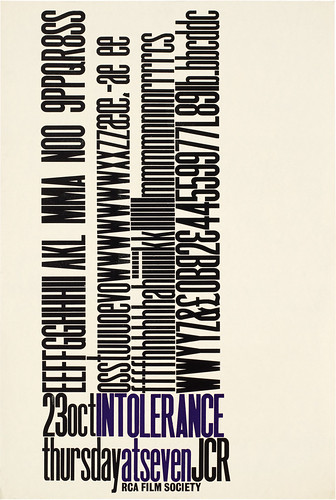
Intolerance (dir. D. W. Griffith, 1916), designer unknown, letterpress, 23 October 1958.
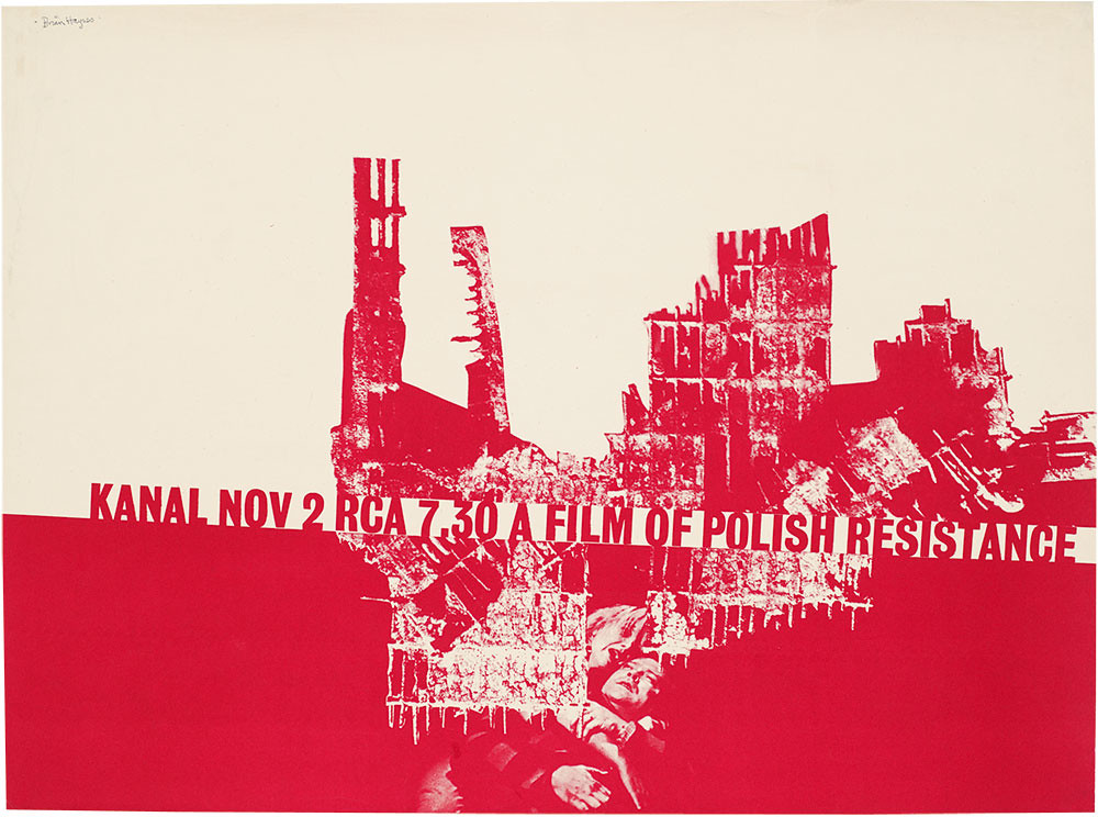
Top: Kanal (dir. Andrzej Wajda, 1956), designed by Brian Haynes, offset litho, 2 November 1961.
After 50 or 60 years, finding out anything about the posters’ creation is a challenge. The designer of the Alexander Nevsky poster, Fred Barter, whom I had hoped to question, died in October 2012. Brian Haynes, co-organiser of the society in 1961-2 and designer of another poster, proved difficult to track down, though Jannuzzi was able to visit him in 1992 and made a recording available to me.
The RCAFS belongs to a larger history that began in 1925 with the founding of the London Film Society. ‘The film society movement stands for the right of the audience to select the films they want to see from as wide a range of the past and present work of the cinema as can be made available to them,’ writes Roger Manvell in The Film and the Public (Penguin, 1955). The mid-century proliferation of film societies around Britain revealed that there was an audience for ‘films made in languages other than English and employing techniques and styles outside the normal pattern of film-making shown in the cinemas’ – in other words, beyond standard Hollywood fare.
According to an unpublished memoir by Clifford Hatts, who graduated from the RCA in 1949 and worked as a designer in television, the RCAFS began in the late 1940s. ‘We called ourselves the Royal College of Art Film Society, adding our name to the postwar growth of film societies – joining the British Film Institute and putting on a programme of mainly classic silent films, catching up on what we knew existed but had never seen.’
He remembers supporters fidgeting about on hard chairs in the RCA common room – a ‘great prefabricated barn’ situated in Queen’s Gate, London – and cheering and stamping their feet during reel changes. Later, the films were shown in the junior common room on the first floor of 21 Cromwell Road, in two rooms opened up to make a long space with a projection room. In the early 1960s, the society moved again, to the common room block in Jay Mews. The screenings were on Thursday evenings and it is thus possible to work out the year many of the (often unsigned) posters were produced from the month date.
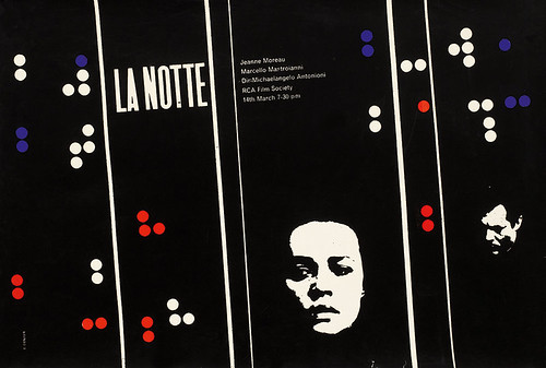
La Notte (dir. Michelangelo Antonioni, 1961), designed by Brian Denyer, silkscreen, 14 March 1963.
‘The film society screenings were very central to college life, nearly always well attended,’ recalls Richard Doust, now a visiting lecturer at the RCA, who studied graphic design at the college in the early 1960s. ‘Like the bar parties, film nights had the sense that they were part of where it was all happening – the RCA had a huge reputation in the 1960s. I remember one year each showing kicked off with an episode of Flash Gordon before the main feature, so you couldn’t really miss a film night! Most of my graphics group went regularly. It was a real social event.’
The year that Brian Haynes ran the society, the 71 films promised for the students’ ‘prolific enjoyment’ (in the words of the programme) included arthouse classics such as Ingmar Bergman’s Wild Strawberries and The Seventh Seal, Otto Preminger’s Bonjour Tristesse, Henri-Georges Clouzot’s The Wages of Fear, Mikhail Kalatozov’s extraordinarily fluid but now little-seen Russian war film The Cranes Are Flying and Andrzej Wajda’s Kanal, for which Haynes did the poster in 1961, using broken-up grid plates from car batteries to represent the battered buildings of the Warsaw uprising.
‘I was the only person who was so unsocial he was willing to stand at the door of the event,’ Haynes told Jannuzzi, explaining how he became an organiser. ‘I hated smoke and booze and crowds and running about. For a year or two I ran the film society, so I would have commissioned all the posters.’
How posters were assigned to individual students remains hazy and the process may have varied with different organisers, who could come from any of the RCA’s departments. Doust recalls that it was ‘always a bit of a scramble’ to design and print a poster in time and suggests that not much notice was given. ‘I think it was mainly voluntary and a chance to show off.’ He doesn’t recall any approval process. ‘One just produced a poster and it went up. I don’t remember much criticism either.’
Haynes’s Kanal poster was printed by offset litho, but there was a heavy demand for litho and it was necessary to book the machines for plate making; this often required the help of a technician, too. The students had easy access to silkscreen equipment, though, and this became the more usual choice. The number of copies depended on how many good prints could be made; ten or twelve would have been typical.
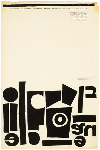
Alexander Nevsky (dir. Sergei Eisenstein, 1938), with short film O Dreamland (dir. Lindsay Anderson, 1953), designed by Fred Barter, silkscreen, 23 October 1959.
The best posters date from the late 1950s to the mid-1960s, the period covered by Jannuzzi’s exhibition; few earlier ones appear to survive. By the late 1960s, the film society had been renamed Warm Thrill of Pleasure and later posters lack the same conviction, fluency and panache. Styles vary and this eclecticism is a considerable part of their charm. The designs are fresh, youthful, unforced and contemporary in mood, without succumbing to the constraints of an over-strict European Modernism, or becoming self-consciously avant-garde. Their sensibility is sometimes ‘Pop’ – especially in the early 1960s when RCA Pop, also seen in the college’s Ark magazine, was flourishing as a fashionable new style – but not invariably.
A good example of this confident lightness of manner is Brian Denyer’s minimalist, sign-like poster image created in 1962 for a screening of Bergman’s Summer with Monika, a bittersweet love story famed for its frank eroticism. Free, personal interpretations of this kind, with no obligation to show studio-approved images of the stars or scenes from the films (though Denyer does so) or the stars’ names, are closer to European conceptions of the film poster during this period than to the formulaic, market-led offerings of mainstream English-language cinema. The postersbenefit, as posters often do, from having a relatively limited amount of information to deliver.
The RCAFS posters also provide a vivid graphic recollection of a period when many felt it imperative to look beyond the routine offerings of the high street cinema chains and provide themselves with a broader grounding in the artistic and intellectual possibilities of film. In the 1950s and 1960s, the crusading film societies, along with a small band of adventurous independent cinemas and distributors, played a crucial and inspiring educational role.
‘Film culture was very important,’ says Doust. ‘I had been one of the founders and ran the student film society at Brighton School of Art before I came to the RCA. Film had a big influence on design thinking in general during that time and was often referenced in our work. There was also a lifestyle dimension informed by films, so traces of what we saw on screen made their way into life and practice.’
For Jannuzzi, finding these forgotten posters as a student, twenty years ago, was no less than a ‘door-opener’. He had seen nothing like them in Switzerland, where he had previously studied. ‘In particular, the works of the 1950s and 1960s tell the story of a period when things were invented, made easy and brought to the attention of a large heterogeneous public,’ he says. ‘These posters demonstrate the will, by means of fabricating images with meaning, to make a new and better world.’
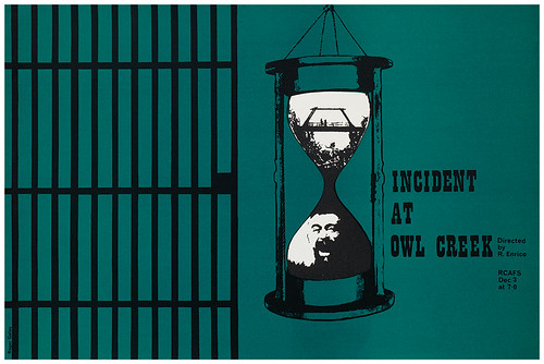
Incident at Owl Creek [An Occurrence at Owl Creek Bridge] (dir. Robert Enrico, 1962), designed by Roger Gates, offset litho, 3 December 1964.
Rick Poynor, writer, Eye founder, London
First published in Eye no. 85 vol. 22 2013

Eye is the world’s most beautiful and collectable graphic design journal, published quarterly for professional designers, students and anyone interested in critical, informed writing about graphic design and visual culture. It is available from all good design bookshops and online at the Eye shop, where you can buy subscriptions, back issues and single copies of the latest issue. You can see what Eye 85 looks like at Eye before You Buy on Vimeo.