
Spring 2019
The enigma of Thérèse Moll

This young designer is credited with introducing Swiss typography to MIT
A young woman caught in an unguarded moment, deep in thought, yet frozen in time. She is wearing a long dark coat that defines her small figure against the background of the elevated dock hovering over the water below. The photograph was taken around 1953. The young woman would be about nineteen years old. She is an enigma. Still.
Thérèse Moll circa 1953. Photograph by Karl Gerstner. Courtesy of the Karl Gerstner Archive.
Top. Cover of prospectus for Micorène: Stimulant de la respiration et de la circulation, 1958, J. R. Geigy propaganda department, Basel.

Thérèse Moll, the young woman in the photograph, was born in Basel, Switzerland on 17 November 1934 and grew up in the Laupenring neighbourhood. Little is known about her early life, although I recently learned that her father worked for a local construction company as a building site foreman. In 1949 at the age of fifteen, she was enrolled in the Vorkurs (foundation course) at the Basler Allgemeine Gewerbeschule (AGS), the School of Arts and Crafts in Basel. The following year, she took the entrance examination for the four-year Fachklasse für Grafik (professional programme for graphic design) with her Vorkurs classmate Dorothea Hofmann (née Schmid) and 30 other students. Competition for places was fierce, as only six or seven students were accepted on to the course each year. The students were judged on the quality of their work and their Vorkurs portfolio. In 1950, seven young students (four women and three men) were accepted on to the programme, Moll and Hofmann included. Triumphant, they sat next to each other in class and shared a steadfast friendship.
Advertisement for Butazolidina for arthritis, 1957.

By 1947, the Basler Allgemeine Gewerbeschule (now known as the Schule für Gestaltung Basel / Basel School of Design), was under the directorship of Berchtold von Grünigen and the tutelage of graphic designers Armin Hofmann and Donald Brun and typographer Emil Ruder. Drawing classes were taught by Theo Eble, Gustav Stettler, Walter Bodmer and Hans Weidmann among others. The faculty numbered twenty teachers. When Armin Hofmann joined the faculty at age 27, Ruder, who had been teaching typography there since 1942, was promoted to head the Department of Apprentices in Applied Art. Hofmann and Ruder made a formidable pair and collaborated on many professional projects. They also developed an educational model linked to their own professional education and to the elementary design principles of the Vorkurs that had been in place at AGS since 1908. Through a combination of their travels, lectures and publications, this pedagogical teaching model was widely disseminated and received international recognition.
Exercise by Moll in which certain parts are blanked out from the lattice grid of black bars. This gives rise to both black and white figures of equal quality.

By all accounts, Thérèse Moll was an exemplary student. As evidenced by her work, she was technically inclined, detail-oriented and dedicated. She clearly thrived in the school’s studio-based environment – all students worked together in one room for the entirety of their four years of design training. Her AGS instructors were not her only source of inspiration. Her classmate Dorothea Hofmann recalls: ‘Armin Hofmann – whom I married in my third year of graphic design education in 1953 – was our teacher. Karl Gerstner took evening classes at the same time in Armin’s graphic design course and he sat next to Thérèse. Both Armin and I and Thérèse and Karl were close friends.’ Thérèse and Karl became a couple.
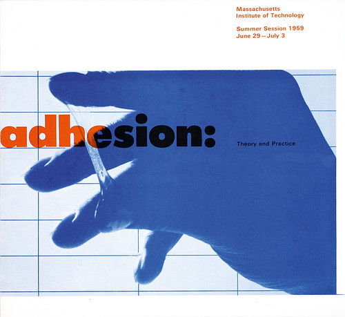
Cover of prospectus for MIT Summer Session, Massachusetts Institute of Technology, 1959. MIT Office of Publications.
In 1955-56, Armin Hofmann accepted a position as a guest instructor at the Philadelphia Museum School of Art and as a visiting lecturer at Yale University in New Haven. While in Philadelphia in 1956, Hofmann was invited to show a selection of students’ work in a small exhibition held at the offices of N. W. Ayer Advertising, in which he included Thérèse Moll’s black-and-white exercises. He also included these same exercises in his lecture on teaching and design education at the Sixth Aspen International Design Conference in the summer of that year.
Front cover of La Svizzera in automobile, a prospectus for Swiss tourism, 1954. It was designed while Moll was working at Studio Boggeri, Milan, Italy.

As a result of Hofmann’s professional activities in the United States, Walter Herdeg, publisher of the trilingual Swiss design magazine Graphis, invited him to write an article on design education. The article ‘A contribution to the education of a commercial artist’ was published in Graphis no. 80 in 1958, and included Thérèse Moll’s black-and-white exercises. The following year, Jean Koefoed, an editor at Reinhold Publishing New York, sent a letter to Armin Hofmann: ‘It is with great interest I have read your excellent article about education of the commercial artist in Graphis magazine. As you undoubtedly know this whole subject is frightfully needed in the country. Nobody seems to have formulated any theory as to how to teach design. Now it has occurred to me that if it was possible to expand this article into a basic textbook on design we would be able to fulfil a great need in this country. Would you be interested in doing such a book?’
Inside spread of La Svizzera in automobile, a prospectus for Swiss tourism, 1954. It was designed while Moll was working at Studio Boggeri, Milan, Italy.

This invitation was just too good to pass up, and Hofmann devoted several years to the development of this book project. In 1965, the Swiss book publisher Verlag Arthur Niggli released Methodik der Form und Bildgestaltung, Aufbau, Synthese, Anwendung and in collaboration with Reinhold published the English version Graphic Design Manual: Principles and Practice, which quickly became one of the most widely disseminated statements of Swiss graphic design principles. The text was heavily illustrated with the work of his students, including Thérèse Moll’s early student work.
Package design for Broxi, detergent made by BP Petroleum, designed by Moll in 1956 while at Atelier Karl Gerstner, 1955-57.

Upon completing her coursework and receiving her Swiss Federal Diploma in March 1954, Moll accepted an assistant’s placement, a kind of short-term internship, at Studio Boggeri in Milan – one of Europe’s great design offices. Antonio Boggeri, who worked primarily with industrial clients in pre- and postwar Italy, had founded Studio Boggeri in 1933. It was the first Italian design studio to provide complete communication services for large industrial companies such as Olivetti, encouraging Boggeri to actively recruit the brightest and most innovative Italian, German and Swiss graphic designers to work with his clients. Moll was only at Studio Boggeri for a short period of about nine months and little of her work survives from that time. She returned to Basel in early 1955 to join Karl Gerstner in his Atelier, primarily working on Geigy projects under the supervision of Max Schmid.
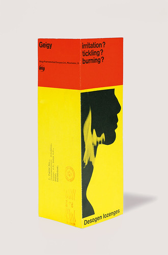
Folded card for Desogen lozenges for inflammatory conditions of the throat. Front and back pages, 1957.
Karl Gerstner had taken the AGS foundation course in 1944. He continued to take design and drawing courses off and on (from 1945-49) while he fulfilled a compulsory apprenticeship with Fritz Bühler, a graphic artist known for his ability to combine sensitive design with a strong sense of advertising. Armin Hofmann and Max Schmid were also working in Bühler’s studio where they developed their lifelong friendship. In 1947, Hofmann left to take up a teaching post at AGS, and Schmid left in 1948 to join the Geigy ‘propaganda’ department, which had been founded by René Rudin in 1941. Schmid brought Gerstner into the Geigy fold as a freelancer before Gerstner formally opened his own design atelier in 1953.
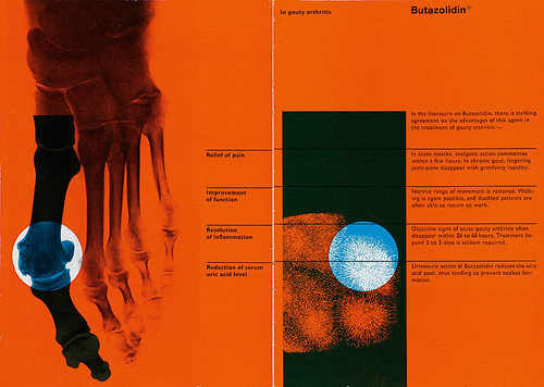
Prospectus for Butazolidina in the treatment of gout, inside spread, 1957.
In 1957, after two years of working in Gerstner’s studio, Thérèse Moll accepted a staff position in the Geigy ‘propaganda’ department working with art director Gottfried Honegger (who replaced Schmid when he moved to head the Geigy office in Ardsley, New York). She stayed at Geigy for one year before deciding to open her own studio in 1958, working with a variety of industrial and scientific clients in Basel.
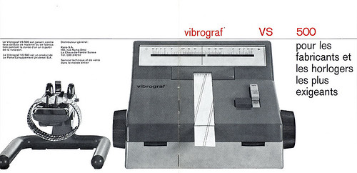
Front and back cover of prospectus for the Vibrograf VS 500 for manufacturers and watchmakers Le Porte-Échappement, Universel S. A. La Chaux-de-Fonds, Switzerland, 1960-61.
Inside pages of prospectus for the Vibrograf VS 500 for manufacturers and watchmakers Le Porte-Échappement, Universel S. A. La Chaux-de-Fonds, Switzerland, 1960-61.

It was during this year that she received an invitation to be a visiting designer from John Mattill, director of the Office of Publications at Massachusetts Institute of Technology (MIT), to work with staff designers Jacqueline Casey and Ralph Coburn. It was Mattill’s idea to invite international designers to help out staffers in the office from January to May, the busiest time in the office, when between 30 and 50 MIT Summer Session course announcements had to be written, designed and printed.
There has been speculation as to how Thérèse Moll came to be invited to work as a visiting designer at MIT. In early 1958, Karl Gerstner embarked on a lecture tour of the US with his colleague Markus Kutter. The tour was arranged by Allon Schoener and Noel Martin, organisers of the 1957 ‘Swiss Graphic Designers’ exhibition that premiered at the ICA Boston and then travelled to venues around the US. Schoener and Martin also organised an extensive tour for Gerstner to visit schools and universities, where he had the opportunity to speak about his work and the new Swiss design movement. One of those universities was MIT. Gerstner must have recommended that Thérèse Moll be invited as visiting designer at MIT for 1959. Moll’s main function at MIT was as a contemporary graphic and typographic designer of Summer Session course announcements. Akzidenz Grotesk, known as Standard in the United States, was probably not available, given the ‘bare bones’ budget for typesetting at the office. Instead, Moll used Futura Extra Bold, demonstrating that the application of Swiss typography and design was more about a design methodology than the use of a particular typeface.
In his book, Swiss Graphic Design: The Origins and Growth of an International Style 1920–1965 (2006), Richard Hollis states: ‘Swiss graphic design is a concept inseparable from the grid. In typography, the use of the grid grew from the nature of letterpress printing … type metal, cast on a rectangular base, was composed in horizontal lines arranged in vertical columns, and locked in a rectangular framework. Unlike the infinite scale possible on digital systems 50 years later, type and spacing material were produced in fixed sizes: typography was a modular system.’
Prospectus cover for Secticon, 1960-61. Le Porte-Échappement Universel S. A., La Chaux-de-Fonds, Switzerland.
Inner page of a prospectus for Secticon clocks, 1960-61.


Thérèse Moll is credited for introducing her American design colleagues to modular typographic systems and ‘ragged right’ configuration for running text blocks, which was not widely practised in the US at that time. In Posters: Jacqueline S. Casey: Thirty Years of Design at MIT (1992), Casey (see Eye no. 68 vol. 17 ) credited Moll for inspiring what became known as the ‘MIT style’. Casey wrote: ‘Thérèse Moll, a young Swiss designer, was the critical visitor. She introduced the office to European typography. She had been well trained in the design of modular systems. This use of proportions in designing publications series became a useful tool for developing MIT’s image. Although much has been modified by time, technology and the work of other designers in the office, the basics that Thérèse brought with her are still operating today.’
Upon her return from the US, Moll accepted a staff position at Le Porte-Échappement Universel, a Swiss watch company. The design work she accomplished while on staff was her most sophisticated and technically proficient – as shown by the prospectus for the Vibrograf VS 500 and the catalogue for the Secticon clock.
Prospectus cover for Secticon, 1960-61. Le Porte-Échappement Universel S. A., La Chaux-de-Fonds, Switzerland.
Cover of a prospectus for Secticon clocks, 1960-61.


On 27 September 1961, Thérèse Moll took her own life. She was just shy of 27 years old. In the three years that I have searched for information on this gifted and courageous young designer, I was told that everyone who knew Thérèse agreed that she died far too soon, and had such a promising career ahead of her. Her death shook the professional design community. One can only wonder what she might have achieved, and who she might have inspired, had she lived longer.
Elizabeth Resnick, design educator, curator, writer, Massachusetts, US
First published in Eye no. 98 vol. 25, 2019
Eye is the world’s most beautiful and collectable graphic design journal, published quarterly for professional designers, students and anyone interested in critical, informed writing about graphic design and visual culture. It is available from all good design bookshops and online at the Eye shop, where you can buy subscriptions and single issues. You can see what Eye 98 looks like at Eye Before You Buy on Vimeo.