Summer 2008
The new, weird America
Michael Stipe’s early R.E.M. sleeves were a strange fusion of the DIY spirit of punk and the mystery of America’s Deep South.
In the pre-internet, pre-file-sharing (and pre-CD) years of 1982-87, R.E.M.’s sound, both propulsive and pastoral, accompanied by literate, elliptical lyrics, felt like a transmission from another planet. The seven LP sleeves that accompanied the music looked equally alien.
R.E.M.’s members met as students at the University of Georgia, in Athens. Singer-lyricist Michael Stipe had been studying art before dropping out of his senior year to focus on the band. Stipe had no formal design training but forcefully took the reins in developing the band’s visual story, using I.R.S. Records’ in-house designers to assist in executing his vision. What resulted was a mysterious and original American synthesis of the high-art aspirations of UK practitioners such as Peter Saville and Vaughan Oliver with the handcrafted DIY spirit of punk.
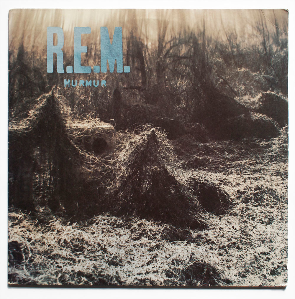
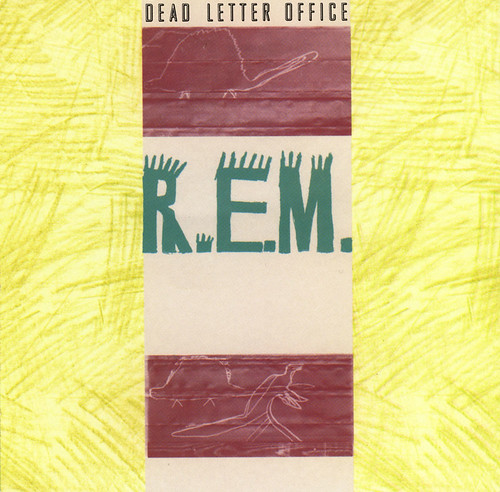
Top: Murmur, 1983. Michael Stipe with Ann Kinney, Carl Grasso, Sandra Lee Phipps. Below: Dead Letter Office, 1986. Design: Michael Stipe with Ron Scarselli. Cover art for R.E.M. albums (I.R.S. Records, 1980s).
R.E.M.’s music from this period was partially inspired by the band’s American South origins, drawing upon the sleepy, gothic poetry that the area’s landscape and history evoke. Guitarist Peter Buck described the South he knew as ‘a strange, slow, surrealistic place’, and Stipe took this to heart when creating sleeve artwork. Murmur, R.E.M.’s first LP, from 1983, quietly sets the stage with a quaint yet sinister feeling shot of a kudzu landscape on the front and an aged image of an old wooden bridge on the back, both shot near Athens.
Just as Sonic Youth used fellow downtown New York artists’ work on their sleeves, Stipe began to employ folk artists from Georgia to complement his image-making. The front cover of the 1984 album, Reckoning, was a painting by the Reverend Howard Finster (before Talking Heads, M&Co. and the Venice Biennale curators knew anything about him).
Stipe weaved tactile, inventive uses of language, typography and photography into his sleeve dioramas. An impressionistic ambiguity extended to the images of the band members. The more conventional snapshots of the early albums led to projections reminiscent of 4AD sleeves on the murky South-infused Fables Of The Reconstruction (1985).Ultimately, the band members became more obfuscated, with only a hint of Stipe on the photo-layered cover of Document (1987), and completely abstracted in the form of architectural details on the back cover of Dead Letter Office.
Once R.E.M. jumped to a major label, Stipe’s lyrics became more direct and the sleeve art lost much of its alluring mystery. But the I.R.S. Records covers still cast a spell. While each has its own distinct visual identity, tuned to the music it encases, when viewed together they represent a notable chapter in sleeve design that still influences much of the independent rock art seen today.
First published in Eye no. 68 vol. 17 2008
Eye is the world’s most beautiful and collectable graphic design journal, published quarterly for professional designers, students and anyone interested in critical, informed writing about graphic design and visual culture. It is available from all good design bookshops and online at the Eye shop, where you can buy subscriptions and single issues.