Summer 2002
Time Out covers
Pearce Marchbank’s covers added an editorial edge to a listings magazine
In the late 1960s, Central School of Art and Design experienced something of a revolution. As a knock-on effect of the student agitation at Hornsey School of Art, the curriculum was rearranged to allow students greater flexibility between disciplines. As a result, Pearce Marchbank, who entered Central in 1966 to study graphic design, spent some time as a painter. However he found he missed the machinery of mass reproduction and soon returned to graphics. Marchbank’s graphic heroes included George Lois, best known for his Esquire covers, a series of witty word and image one-liners (see Eye no. 29 vol. 8), and Willy Fleckhaus, renowned for having reordered the relationship between graphic design and editorial at the German magazine Twen (see Eye no. 3 vol. 1). Marchbank began working as an editorial designer while still at college, rushing around the corner from Central in Southampton Row to the Bloomsbury offices of Architectural Design (AD) where he worked as art director.
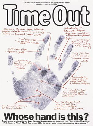
No. 535, 18-24 July 1980. When Time Out ran a feature about palmistry, Marchbank tracked down a celebrity and took a hand print from him (in indelible ink, the story goes). He sent the print to a palmist, whose handwritten analysis was cut up to caption the print on the cover. Readers who turned to the feature article discovered that the hand belonged to Brian Eno.
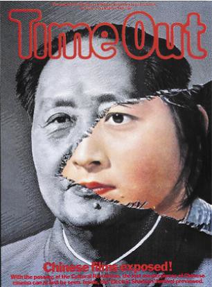
Top: No. 546, 3-9 October 1980. Two found objects – a cloth banner bearing Mao’s image bought in a Chinese shop and a picture of the girl – fitted together perfectly. Marchbank ripped the banner and laid it over the image of the girl’s face. He then scanned them directly on to a drum scan belonging to a colour originator who shared premises with Time Out. Common enough today, direct scanning was unusual at the time. The colour originator became caught around his machinery. The cover drew attention to a festival of Chinese cinema.
Graduating in 1969 with a first class degree, Marchbank then worked on a British version of the US magazine Rolling Stone. After the project’s major investor, Mick Jagger, pulled out, the magazine began falling apart, but the editorial and design team stayed together to produce the low-budget, underground publication Friends. For Marchbank, the contrast between AD and Friends could not have been greater. Whereas AD was produced using letterpress typesetting, Friends was effectively an early direct input magazine: to save time and money its writers typed their copy direct on the IBM golf-ball typesetters in house style (Times for text, Univers for captions) whereupon Marchbank pasted it directly on the page. Despite leaping several technological decades in a few months, Marchbank remained consistent in his structured typographic approach. Friends stood out from the ranks of the underground press – so typographically straight that, perversely, it looked weird.
No. 190, 12-18 October 1973; no. 399, 25 November-1 December 1977; no. 96, 17-23 December 1971.
Marchbank arrived at Time Out in 1970, just before the listings magazine changed format (A5 to A4) and frequency. Editor / founder Tony Elliott, who had seen it change from a folded sheet to a fortnightly paper, was considering the move to weekly publication. Marchbank did not just deal with design, he also adopted a quasi-editorial role restructuring content. As the publication expanded, new listings sections were needed to make the magazine easier to negotiate. Marchbank helped carve out these categories and is proud of initiating a dedicated space for fringe theatre, a thriving sector of the cultural scene of that time. Marchbank was also instrumental in creating the Time Out left-leaning news section, bringing from Friends a coterie of journalists who included David May, Jonathon Green and Jerome Burne.
A few months after he joined the magazine, Marchbank redesigned its logo. Revisiting some work he had done for his degree – a project in which the weight of out-of-focus photographic letterforms was determined by the length of exposure – he experimented with the propensity of phototypesetting to produce blurred outlines. The Time Out logo is created from two sets of slightly out-of-focus Franklin Gothic characters shot as line, the smaller reversed out of the core of the larger. Marchbank ran the resulting typographic halo through a half-tone filter, lending it the appearance of a gentle glow, suggestive of a radiant neon sign. This logo was intended to be a stopgap, but so far it has lasted more than 30 years.
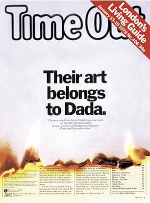
No. 406, 10-16 January 1978. The ‘burning’ cover used to preview a big art exhibition in 1978 is among the best known of all of Marchbank’s designs for Time Out. The cover creates the illusion of being consumed by flames from the bottom up, with the next leaf visible behind its charred remains. The production of this cover required a degree of design heroics. Usually, the contents and letters on page 3 would be the last part of Time Out to go to press, but in this case it was put together several days in advance so that Marchbank could use it as a prop. The design team rejigged the format, putting information that was already fixed at its foot, leaving the rest free for last-minute changes.
The most important factors determining the design of early Time Out covers were time and money. In general, the magazine’s editor decided which story would occupy the cover on Tuesday and would expect completed artwork from Marchbank by Thursday. Elliott recalls that Marchbank disputed about 40 per cent of editorial decisions regarding the covers and Marchbank himself tells, with amusement, of the time that he rejected Mick Jagger in favour of London’s canals. Marchbank often found himself producing an image overnight. To be able to meet these tight deadlines, Marchbank recruited a team of photographers and illustrators. Often choosing to front Time Out with a hand-drawn image, Marchbank preferred illustrators who were able to fulfil an editorial idea. The illustrators Peter Brookes (now the political cartoonist on The Times) and Mick Brownfield, whose work appeared regularly on Time Out covers throughout the 1970s and 80s, were both able to create beautiful, intricate pieces in an afternoon. Marchbank’s preferred photographers were Red Saunders and Gered Mankiewicz, who shared a studio in an old chapel in Hampstead. The chapel was a suitable site for big, messy shoots and Saunders and Mankiewicz were very amenable to Marchbank’s tightly art-directed photographic requirements. Marchbank recalls that ‘Time Out’s cover shots were often composed in the back of the camera through film marks showing the cover with all the type and logo in position.’
No. 240, 4-10 October 1974; no. 88, 22-28 October 1971; no. 499 9-15 November 1979.
Marchbank believes that he might have been one the first graphic designers to have a process camera in his own studio. In the 1960s this was a large and ungainly piece of equipment, about the size of a large deep freeze, which had to be housed in a darkroom and fed with a variety of unpleasant chemicals. By participating in the workings of the process camera, Marchbank cast graphic design as an intensely material activity, one that included the physical manipulation of imagery and the mess and randomness of photographic technologies. Marchbank did not use photographic processes simply to reproduce pictures. Anticipating computer programmes such as Photoshop, he employed these techniques to create entirely new images by playing with focus, exposure, distortion and photographic filters.
Marchbank worked on and off for Time Out for thirteen years, and produced his last cover in 1983. Two years before that, the magazine had been off the streets for more than four months due to a bitter strike over Time Out’s equal pay policy (whereby everyone from janitors to editors received the same wage) which had been in force since the magazine’s inception. Tony Elliott wanted to abandon equal pay and expand Time Out’s business activities, but his largely underground-recruited newsroom were having none of it. By the end of the strike a large part of the magazine’s staff had left, many going to work on the newly launched, left-wing (and GLC-supported) City Limits. Marchbank, meanwhile, had been approached by Richard Branson to work on his high-budget Time Out competitor Event.
Time Out saw off both rivals and survives today, but in the process became a more PR-led consumer title. Marchbank’s return to the magazine was a noncommittal affair that lasted only a few months. The magazine never regained the political and social agenda that made it such a vibrant force throughout the 1970s. Marchbank’s Time Out covers are brilliant examples of imaginative, robust, on-the-fly editorial design. With more than twenty years’ hindsight, their content renders them even more exceptional.
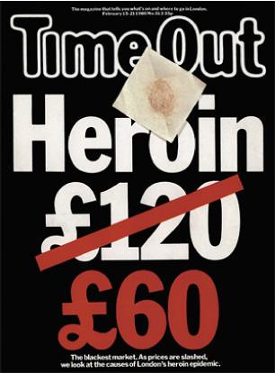
No. 513, 15-21 February 1980. Demerara sugar plays the part of heroin on this cover. The cut-price drugs story behind the cover was shocking enough to attract the attention of television evening news.
Emily King, design historian, London
Eye is the world’s most beautiful and collectable graphic design journal, published quarterly for professional designers, students and anyone interested in critical, informed writing about graphic design and visual culture. It is available from all good design bookshops and online at the Eye shop, where you can buy subscriptions and single issues.