Autumn 2011
Trust in Modernism
Pentagram
Lloyd Northover
Robin and Lucienne Day
John McConnell
Douglas Cooper
Hans Schleger
Paul Porral
The John Lewis Partnership’s co-operative ethos has informed 50 years of corporate identity.
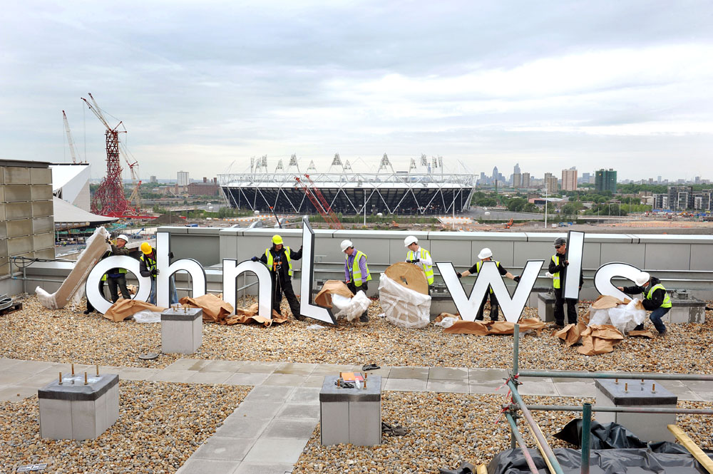
Above: Construction workers erect modified Gill Sans lettering for the new John Lewis department store at Westfield Stratford City in east London – the partnership’s first custom-built store in twenty years. Photograph: Michael Walter at Troika, 2011.
With 33 department stores in the UK, the latest of which opened this autumn in east London, the John Lewis Partnership (JLP) is one of the best known brands in Britain. When it comes to design, it is a big business, commissioning work from designers as well as maintaining an in-house ‘brand creative’ team – 55 people at the last count.
The company’s positive attitude to design dates back to the early 1960s, when it took on the formidable Robin and Lucienne Day as design consultants. Although the terminology of the time was ‘house style’, there was no doubt that the Days saw their remit as inclusive of every visual aspect of the operation; ‘all the outward facets of our operations’, as an internal report to the then chairman, Bernard Miller, described it.
This set the scene for later developments. In the late 1980s and early 90s my company, Lloyd Northover, worked as a consultant to help John Lewis update its identity. So I was curious to know what had changed since the Days’ era. At a time when many retailers are struggling, could design be part of the John Lewis success story?
Paul Porral’s role as ‘head of brand creative’ since 2008 puts him in charge of the look and feel of the brand as customers experience it, including all the company’s publications, packaging, own-brand developments and in-store communications.
Porral says that he has been greatly helped in this aim by the way John Lewis managers are prepared to listen, evaluate, consider and then champion the agreed decision. This co-operative ethos is a direct consequence of the company’s structure and business model. As a democratic partnership, its shares are owned by its staff, and it has no external shareholders and no City institutions to account to, so the business invests on its own terms.
Customer input
As a department store chain, John Lewis cannot afford to exude a self-conscious design aesthetic: it has to cater for a range of tastes. John Lewis knows what its customers want: good selection, good service and a clarity and straightforwardness in everything. Customers used to getting a good product and a good service tend to be vocal when things go wrong. At John Lewis, customer feedback finds its way back into the design brief for each project, whether commissioned externally or undertaken in-house. Over the years the company has maintained a consistent thread across its stores and its communications. This springs, in part, from a ‘progressive’ view of the business as continually improving British domestic lives with things that have enduring usefulness. The design derives, perhaps unconsciously, from a kind of British Modernism: slightly pared down, lacking in overt decoration and simple in form, colour and texture. At times this can convey a rather dour image, which the design team have been working to make softer, particularly in catalogues and customer publications such as Edition magazine (launched in Autumn 2009), which combines high production values with intelligent, informal editorial.
The company has also renewed its focus on the meaning of the John Lewis brand, particularly in fashion, an area in which it has at times been behind the curve. There has been a conscious effort to establish a continuity and crossover between graphics and merchandise in the look and feel of products. This lends an authenticity to own-branding – too often ignored by retailers when they source products – which reconfirms the John Lewis desire to integrate the different aspects of design, so that branding is a key part of the development process.
Any new work is set against the strong visual identity, which appears consistently on trucks, carrier bags, ticketing, signing and storefronts. The most recent iteration of the identity was developed by Pentagram in 2000, updating the design that Lloyd Northover introduced in 1989. The main visual component of the earlier identity is the diagonal stripe pattern, which works at different scales and can be extended to any length and used in different contexts. Since 2001, the brand’s typography is in a bespoke variant of Gill Sans. Individual weights have been developed for different applications, thus subtly changing the tonality of the text as necessary. (See panel, p.68.)
Another important component is the colour. Green has been the single most consistent element in the mix, a choice made long before its current popularity for ecological resonance. It was John Spedan Lewis (1885-1963), son of the original John Lewis, and founder of the partnership, who started the colour theme by using green ink in his fountain pen, thus distinguishing his communications from all others in the business. The specification of the shade has changed over the years, and today a palette of greens is used to suit a range of contexts. Conscious that any identity can become an inflexible constraint, the process of evolving design at John Lewis, as Porral describes it, is about ‘pushing it and holding it back’, a continual testing of what works and what doesn’t: ‘It’s about being appropriate and relevant.’
It is also about keeping an eye on things, he says: ‘Shopping habits, fashion trends, technology. We have to keep looking at things from the customer’s point of view, but do what’s right in our terms, too.’
Marketing is a good example of this. For most of the company’s history the idea of TV advertising did not seem right in John Lewis terms; but when it did embrace this wider approach to marketing in 2003, the company gained a new confidence, as well as better sales figures – a permission to be more experimental.
Credibility
When, in 2001, John Lewis ventured online, it held to its principles, setting out the range of merchandise clearly, with easily accessible information and a straightforward buying process. The channel was new, but the approach to displaying its wares was essentially the same. While there are no salespeople (‘partners’ in John Lewis terms) to give helpful information when needed, the website provides a clear digital equivalent. Although there is no store directory or sign system that customers find in the stores, the website is easy to navigate, easy to shop, easy to transact. The site is simply another channel through which the customer can interact with the brand. The purpose, often quoted by retailers but rarely achieved, is a consistency of service – right through to home delivery.
Internet shopping has also influenced the tangible and experiential aspects of shopping at the store. The new John Lewis at Westfield Stratford City in east London – the partnership’s first custom-built store in twenty years – promises ‘a whole new shopping experience’, reflecting a recent emphasis on the tonality of departments. Shopping in the beauty section needs to be a different experience from, say, electrical goods; traditional furniture needs a different context to contemporary designs; and so on.
With publications too, Porral believes there is a need to be ‘credible’ in each context. In fashion, for example, using natural settings, natural light and a natural colour palette helps provide both reality and inspiration to customers, not just an artificial presentation of merchandise. ‘From time to time we need to change the pitch and the volume,’ Porral says. ‘This follows through design and photography, to writing copy.’
Collaboration
This breadth of thinking about how and where design makes an impact is communicated across the business, and finds its way into the conversations John Lewis has with its designers.
‘They have a wonderful openness to new ideas and directions,’ says Pentagram’s Harry Pearce. ‘They accept criticism of their existing attitudes and vigorously hunt for better solutions.’ He believes John Lewis has a good understanding of ‘both good and bad’ design. In my own experience, working with John Lewis was rewarding because you knew they were taking you seriously. If the company adopted your design, it wanted it to resonate and to stick.
My practice worked with one of Porral’s predecessors, Douglas Cooper, who joined the company in 1979 as design co-ordinator and retired in 2002. Cooper was quite clear about our brief. Referring to the John Lewis carrier bag in 1989, he said: ‘We want the new design, on both the bag and everything else, to feel as if it has been there all the time, and we want it to last for the next 25 years.’ With a few tweaks and some fresh typography, it is still standing.
Tim Greenhalgh at Fitch, who has been working with Porral’s team since 2010, agrees on the collaborative nature of the client relationship. We were quickly made to feel part of the team,’ he says. The downside of this intimacy, he says, is that you need to remain objective, and not lose the perspective that makes an outside design input valuable to a business in the first place.
In essence, the John Lewis brand itself is ‘a balance between love and trust’, says Porral. ‘That’s the dynamic that influences our thinking, looking and speaking. It’s important we get that right, and focus on responding to people’s needs. We have to inject the love and keep the trust; it’s not easy. There’s something clear, uncluttered about the brand, but expansive, too. I suppose I’m a Modernist at heart,’ he concludes.
Somehow this is what I suspected all along, that the John Lewis design story is a continuation of British Modernism, with form following function, but not taking itself so seriously that there is no room for flex and change and texture.
House style
In 1962, John Lewis appointed Robin and Lucienne Day as design consultants, with a brief to produce ‘a distinctive family relationship, idiom or handwriting in all outwards facets of [the partnership’s] operations’, or as it was coming to be known, a ‘house style’. Although the Days were essentially furniture and textile designers, they were influential across all design disciplines and robust in their recommendations, one of which was that Hans Schleger should create a logo for the partnership.
Schleger, who styled himself ‘Zero’, was one of the pioneering designers of corporate marks and identity schemes in the years after the Second World War. He understood that the logo was just one part of the mix in creating an identity for the business. ‘Your image,’ he told a John Lewis reporter, ‘includes the friendliness of your selling assistants.’
In 1965 John Lewis set up its own design committee, and appointed an in-house design co-ordinator, Graham Heywood, who worked there until his death in 1977.
By 1966, on the recommendation of the Days, graphic designer Peter Hatch had been appointed to review John Lewis stationery and packaging. Hatch introduced international paper sizes, Helvetica type and ranged-left layouts to all stationery – further commitments to Modern convention. His carrier bags, with a geometric diamond design reflecting the Op Art imagery of the time, helped establish recognition on Britain’s high streets, and the theme was continued in his packaging for the Jonelle own brand.
To achieve consistency, a partnership design manual was introduced in the mid-1960s, bringing together the input of Schleger, Hatch and the Days.
The Days also advised on the appointment of design staff. One of their recruits was Douglas Cooper, who joined in 1979 and built up an internal department, focusing on both store interiors and graphics.
Between 1987 and 1989, Cooper worked with Richard Negus, who had taken over from the Days as external consultant. On their recommendation, Lloyd Northover was given the brief to update the whole John Lewis Partnership identity, and make an explicit link between the department stores (many of which retained the names of their original owners) and the supermarkets (which were all known by the Waitrose brand).
Building on Hatch’s geometric model, Lloyd Northover introduced a diagonal stripe pattern, which provided a visual connection between the stores and the supermarkets. In order to cope with a multiplicity of applications, the pattern was designed to be extended, enlarged or reduced, according to the context.
At the same time, in a break with the sans serif tradition, Elan capitals were specified as the typeface for store names, supported by Helvetica for all other information.
In 2001 John Lewis reviewed its identity again. On this occasion Cooper worked with Pentagram, and John McConnell (see pp.12-29) in particular, who had been engaged earlier to work on store design.
By 2003 McConnell was overall design consultant, and he developed the current identity, with a new logotype based on Gill and the use of the same typeface across the board, combined with a more asymmetric layout.
Under the direction of John Lewis’s head of brand creative, Paul Porral, Pentagram has since implemented an extensive company-wide programme that includes signing, ticketing and packaging. Porral has also been working with the retail consultancy Fitch.
Evolving type
From store signing to ticketing, customer correspondence, leaflets, advertising and websites, typography plays a crucial part in shaping the identity of a department store group such as John Lewis.
As an early adopter of Modernist themes in retailing, John Lewis used Helvetica from the 1970s to the 90s. A classical note was struck in 1989 with the introduction of Elan capitals for the store names in the John Lewis Partnership (including many acquired stores such as Coles Brothers and Pratts, which were still known by their original names until the 1990s).
At the time, John Lewis design co-ordinator Douglas Cooper wrote: ‘The principal typeface which was used to identify the partnership was Helvetica. When it was first brought here from Switzerland in the 1960s, it was a wonderful example of clean, Modern typography. Since then it has been used by all and sundry as the chief letter form for information graphics. We wanted to find another typeface, exclusive to us.’
In a booming, competitive period for high street retailing, the choice of Elan (Albert Boton, 1985) promised more stylish, less utilitarian department stores. However, Helvetica remained in use for everyday communications across the business.
It was not until this century that Gill Sans was introduced as the John Lewis type family. Interviewed in 2001 for the John Lewis in-house magazine, Cooper had acknowledged the need for further change: ‘The new typeface we will be using on everything from signage to stationery is very elegant and looks contemporary – ironic really, as Eric Gill designed it in the 1920s.’
As the John Lewis brand replaced nearly all other store names, the typeface was adapted by Pentagram to create John Lewis and Peter Jones logotypes, with chamfered initial letters that echo the diagonal pattern that forms part of the identity. In 2001 a bespoke version of Gill was introduced to create better legibility and flexibility, and in 2009 a further range of weights was designed. The light and ultralight weights initially appeared in the fashion and beauty departments and in Edition magazine. Now, as part of a consistent typographic policy, the full range of Gill adaptations is in use across all departments and communications.
Jim Northover, designer, writer, consultant, chairman of Lloyd Northover, London
First published in Eye no. 81 vol. 20 2011
Eye is the world’s most beautiful and collectable graphic design journal, published quarterly for professional designers, students and anyone interested in critical, informed writing about graphic design and visual culture. It is available from all good design bookshops and online at the Eye shop, where you can buy subscriptions and single issues.